Excel Chart Templates is a dynamic, interactive library of charts and graphs. Download free, reusable, advanced visuals and designs! With the help of data visualization, you can support decision-makers.
Getting started in charting is easy, but getting good at it is not easy. We hope our definitive guide on custom charts and graphs will help you tell your story using data visualization.
Table of contents:
All charts are free, and you can download and use them quickly. However, if you are working on an Excel dashboard, you should have to use them. This section is built (not just) for pros. You can create all the demonstrated charts from the ground up, but we recommend using free templates.
If you need more power without coding, check our data visualization tool:

Free Excel Chart Templates
This definitive guide will help you how to tell stories with data using charts and graphs. If you want ready-to-use custom chart templates, check the list below!
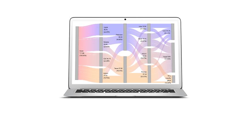
Sankey Diagram (Flow Diagram)
The Sankey diagram is a high-level data visualization tool, not just in Excel. We use it to show and follow the flow of resources. The main advantage of using it is that the flow chart lets you visually show and analyze complex processes quickly. The main graph uses a group of shapes. You can find a detailed description of how to build the template using custom calculations and 100% stacked area charts.

You can select blocks to highlight the chosen path and generate custom views, which is useful for decision-making support. Dynamic visualization allows you to build various scenarios without rebuilding the chart. Creating the Sankey diagram without the d3js library is almost impossible, but here is an Excel example.
Mekko Chart (Market Segmentation Graph)
The Marimekko chart is the most powerful tool for examining the overall market. It is also known as a market map and helps drive discussions about growth opportunities. You can segment an industry or company by customer, region, or product.
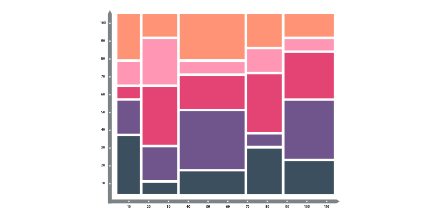
It makes it easy for your audience to understand each part or bar’s relationship to the total. The graph breaks down a market by combining multiple bars into a single map using a variable-width 100% stacked bar chart. In the example, you will learn how to convert sales data of each region across different products. It is easy to calculate the individual parts of total sales. Read our definitive guide!
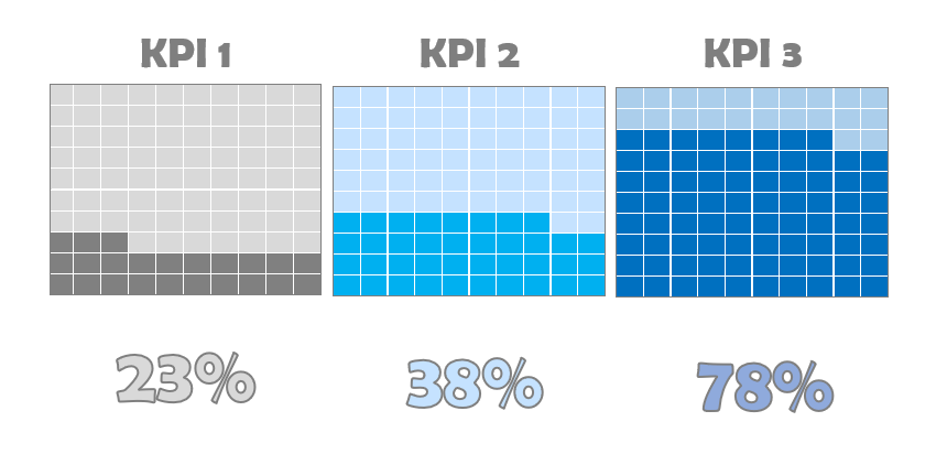
Progress Circle Chart
Sometimes, simplicity is the ultimate sophistication. For example, you can combine two doughnut charts and apply custom formatting to create an infographic-style visualization in Microsoft Excel.

The main advantage of using progress charts is saving space on the main dashboard screen. So, first, learn how to build this stunning graph in minutes and save it as a reusable Excel template. Then, if you are in a hurry, download the template.
Dynamic Chart Template with Rollover Hyperlink Effect
Everyone loves advanced dynamic charts! Take a closer look at the template. If you want to visualize multiple periods on a graph, we recommend using the “mouse-over” method.
First, create a Named Range for the actual selection. After that, create a line chart using the dynamic range. Next, carefully plan the design of the navigation area. Finally, implement the hyperlink rollover effect using the Excel HYPERLINK and ISERROR functions.
Here is the guide on how to build it.
Stream Graph
You can create various graphs in Excel, like a stream graph. We use multiple stacked area charts and custom formatting for overlapping. If you are working with numeric data types, a streamgraph is a smart choice to show the evolution of a variable on a flowing shape.
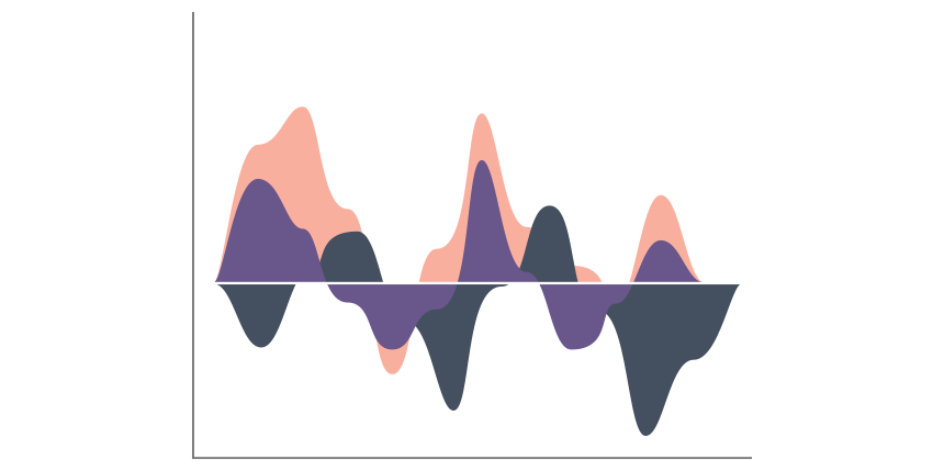
If you want to understand how the stream chart works quickly, you can imagine that you want to see how sales have evolved over a given period in multiple locations.
We rarely use area or stacked area charts in Excel, but the exception proves the rule! Nevertheless, the graph is famous; you can create it in Excel, Power BI, Java, Python, or R to present your data visually effectively.
Sales Funnel Template
Sales Pipeline is a powerful custom chart; it is based on a combination of an area chart and a scatter plot. Following the sales activity from the first cold call to the purchase is a must-have visualization.

If you want to learn how to track sales activities, read our guide.
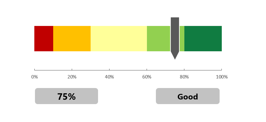
Gauge Chart
The gauges (speedometers) logic is simple: it provides information about a single data point (value). Therefore, using red, yellow, and green colors (that follow RAG reporting – red, amber, green), it’s easy to compare the actual value to a goal (plan value). We have said quite many times why we love this graph.
The template uses a combination of a pie and a doughnut chart.
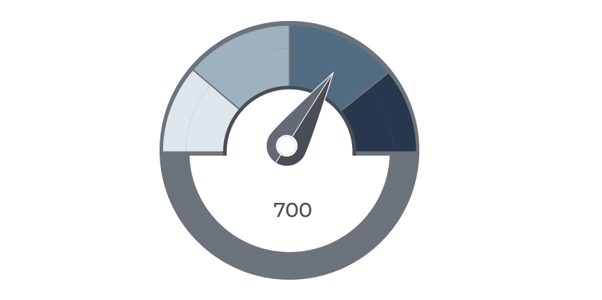
A dual gauge provides more flexibility, and you can display multiple KPIs. It is helpful if you want to create a plan versus actual performance comparisons between two periods. Gauge charts are easy to read and grab the attention of the audience. Almost all BI solutions use this graph to support strategic decisions.
Filled Radar Chart
We want to introduce a special combo chart named filled radar for comparison purposes. If you like infographics, this graph is yours! Instead of showing the values in a pie chart, you can demonstrate the sales performance by product or region like in a radar chart.

You can learn more about the visualization.
Conditional Formatting Bar (or Column) Excel Chart Templates
Learn how to create a grouped chart design to analyze the variance. Excel’s conditional formatting is a great feature! We recommend this method to highlight the plan vs. actual data. In the example, the first series is based on the actual data for the sales of five products. First, use the MAX function to find the largest data in a range. After that, highlight the maximum value using blue. On the right side, it shows the variance. If you want to create an advanced bar or column chart based on conditional formatting, the following template is for you!

Let’s see the trick! Select the chart! Right-click and click ‘Format data series.’ Under the Fill group, select the ‘Invert if negative’ checkbox. Pick your preferred colors! If the value is positive, use green as usual. Elsewhere, we’ll apply red. Right-click and choose the Group command from the context menu. That’s all! Take a closer look at the template and download the practice file. The first step is to create a conditionally formatted chart to define intervals and create groups using the IF function.
Learn more about the relationship between conditional formatting and Excel charts.
Bubble Chart Template
A bubble chart is a member of a scatter chart type. In this case, we replace the data points with different size bubbles. We recommend using it to visualize your project milestones or sales over time.
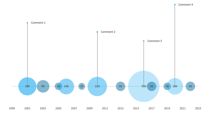
Prepare and organize your data, then insert a bubble chart. Next, create data points for the chart labels (comments). Next, modify the label positions and clean the chart area. Then, create error bars to connect the bubble graph and the labels. Finally, add values and the description for the comment labels.
Radial Bar Chart
A radial bar chart in Excel provides easy comparison options for multiple categories. Use the circular bar template to show the sales visually effectively. Unfortunately, Excel does not support this custom chart template by default, but no worries!

Click on the chart area and select a data point. Next, Right-click, choose the Select Data option and swap rows and columns. After that, you can apply the No Fill option on all rings. Read our step-by-step guide and download the template to learn more about comparing categories.
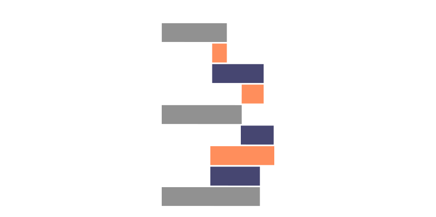
Panel Chart (Small Multiples)
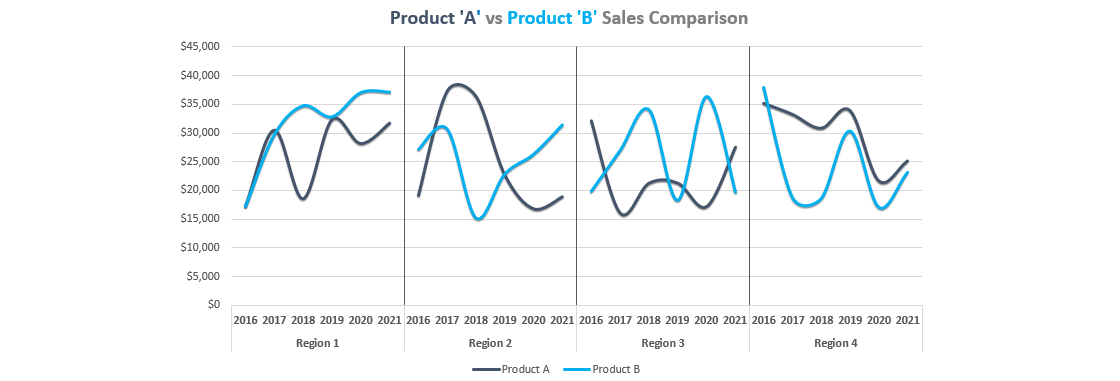
Take a closer look at the small multiples (panel charts). Instead of busy lines or column graphs, you’ll get grouped graphs. To build sales comparisons, make your data table first. After that, summarize your data. Finally, calculate the position of the dividers for the x-axis. The best thing is that you don’t need to use pivot tables. Instead, check our step-by-step tutorial and create your chart template!
Progress Bar Chart (Score Meter Template)
The horizontal progress bar chart (or score meter template) shows the actual value on a percentage scale. You can create it using a few simple steps using stacked bar charts.
Insert a stacked bar chart, then add two series to create an indicator clearly showing the selected value. You can create multiple categories, such as quality scales, using different colors. Learn more about this template.
People Graph

Do you like infographics? Use the people graph instead of columns or bars to present your data set using shapes and icons. The result is a great-looking graph. So, it’s easy to tell a story based on your data. Please take a closer look at our latest infographics. The article provides free Excel chart resources.
Microsoft Excel 2013 and newer versions are required to use this chart template. You can find the add-in under the ‘Insert Tab’. Select the data range, then click the people graph icon. A new infographic will appear; you can apply various formatting tricks like themes, shape styles, and colors.
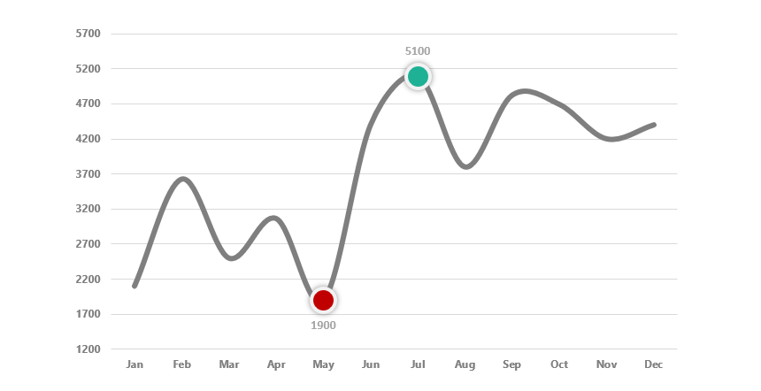
Forecast Chart
The next one is a basic chart template. For example, in some cases, you want to show the actual and forecasted values on the same graph. What’s the secret?

Create three series and use the IF function. If the latest data point (value) exceeds the actual value, apply a green arrow elsewhere and use a red marker. To build it, we’ll combine three simple line charts to create a forecast. Read the guide!
Sparklines
Use sparklines to show data trends! In a nutshell, sparklines are tiny in-cell graphs. With its help, you can offer powerful insights in a small space, which is important if you want to tell your story on a single page. We use three types in Excel: line, column, and win/loss.

It is good to know that a sparkline is not a chart object but a shape within a cell.
Bullet Chart
What are bullet graphs? In Excel, a bullet graph is based on multiple stacked column charts. Apply a different chart type for the indicator: a stacked line chart with a marker. To create a visualization, select the data and insert a bar chart. After that, swap rows and columns. We are using the ‘Switch Row / Column’ command. This step merges the multiple bars into one. To highlight the target value bar, change the series chart type, then format the bar. Use various colors for the zones.

A bullet graph is a real alternative to gauges. It transforms data using length and height, position, and color to show actual vs. target using bands. You can save more space using bullet graphs. Without using and advanced chart design, you can easily tell a story using segmented bar charts. In our detailed guide, you can learn how to track progress easily.
Waterfall Chart Templates
To support financial reports, you frequently use waterfall charts. Building the graph in seconds is easy if you have Excel 2016 or a newer version. For Excel 2010 and Excel 2013 users, we provide an in-depth guide and free templates.
Dumbbell Chart (Dot Plot)
The Dumbbell plot (or dot plot) is based on two data series. To create a dot plot chart template, select the data and insert a basic scatter plot. After that, calculate the x-axis (category) positions and the width of the lines. Use standard error bars to connect the dots.

Next, format the markers and change the dot colors. Insert the category labels using a text box. Finally, clean up the chart by deleting unwanted parts. The dot plot is a great alternative to the stacked column charts.
You can find the step-by-step guide to creating the template here.
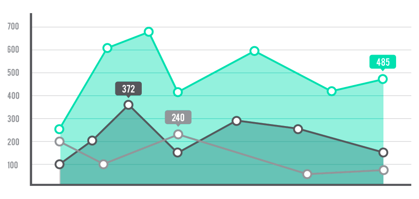
Highlight Data Points in a line or bar chart
Sometimes, we must highlight one or more data points in a line or a bar chart in Excel. The method is straightforward: create one or more additional series, find the high and low points, and finally use the NA function to hide the unnecessary data points. Format the marker to create a stunning visualization in a few steps.
You can find more examples here.
Dynamic Charts
Sometimes, we use a dynamic chart design to display the key metrics from a vast amount of data. Apply Excel Form controls (drop-down list, spin, radio buttons) to improve your graphs.
Use the first template to highlight a data point based on your selection. The second is a combination chart example; it uses two dynamic lines and a bar chart. Finally, learn how to create interactive tooltips for your visualization.
Org Chart
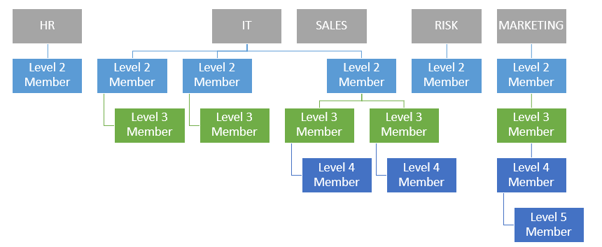
This template is a bit special. If you are working with Microsoft Excel, you’ll face some limits. Building a company structure from the ground up using SmartArt (built-in shape objects) is a time-consuming task. How to speed up your daily work and routine tasks? We know the correct answer. Use our free add-in and build an org structure in seconds. You’ll find a useful article about making a human map using powerful VBA tools. Get the add-in!
Interactive Chart Tooltips
Sometimes, you have a small space to show multiple charts for multiple categories. Using Excel form controls (radio buttons), you can build custom visualizations using interactive tooltips.
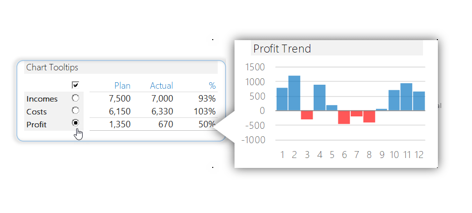
The following template uses the linked picture method. Using the radio button, you can show three different chart types regarding categories and variance: Sparklines for Incomes, a Pie for Costs, and finally, a clustered column for the Profit.
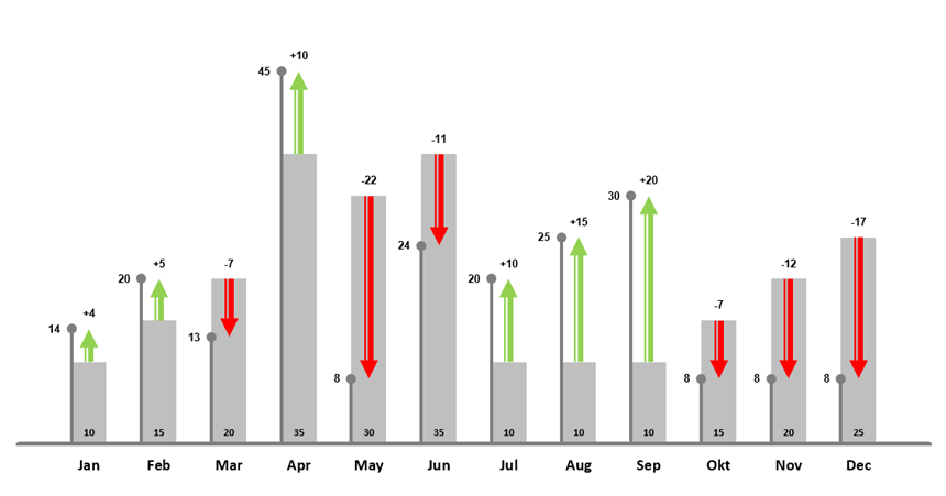
Plan Actual Variance Chart
If you want to create an attention-grabbing visualization for plan versus actual purposes, use the variance chart template. The graph clearly shows the differences between the plan and actual values month by month.
Learn more about visualizing the plan vs. actual comparison using advanced graphs and templates.
Traffic Light Excel Chart Templates
In Project Management, you have various tricks to track and show a project’s status. First, you can apply a formula-based rule and traffic light icons in conditional formatting. Furthermore, there are color-formatted shapes to highlight the KPIs.
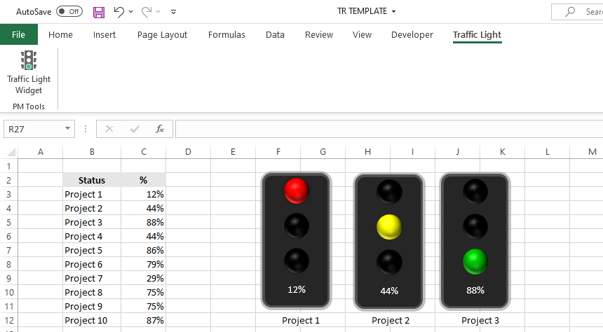
The best way to implement a stoplight is by using automated charts. Learn how to use our free widgets and manage multiple indicators simultaneously. It’s a straightforward reporting tool.
Waffle Chart Template
I met with the waffle chart several times while reading newspapers and magazines. Another name for them is a pie or square pie chart. However, a square or waffle chart template is a valuable alternative to other Excel graphs.
The most significant advantage of using a waffle chart is that it is exciting and forwards the attention to your dashboard. On the other hand, inserting it into your document can be confusing. However, the graph contains information presented as cells and values, so it is tricky to clean it up and export it as a built-in Excel chart.
Multi-Layer Doughnut Chart
The built-in Excel chart enables you to make further customizations. We will display multiple series and make the graph visually appealing. In the article, you can find step-by-step instructions on how to build the template.

Tornado Chart
A tornado chart helps you to create quick comparisons using a modified bar chart. You can find more information on how to build it.

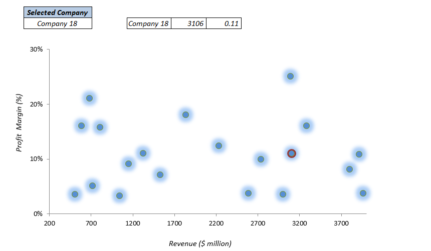
Quadrant Chart
The quadrant chart uses a scatter plot. For example, the chart helps you understand the performance under two parameters. We frequently use it to create a SWOT analysis in Excel.
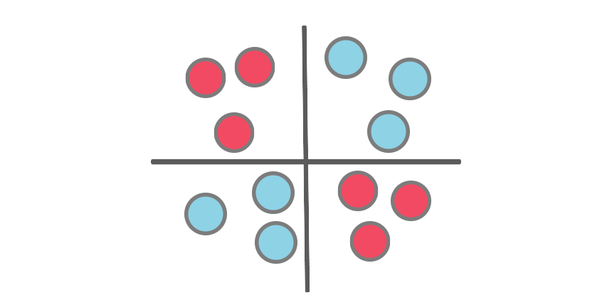
You can download the free template.
Polar Plot Template
We will analyze the service level performance using two companies in the example. The Polar plot is a great choice if you want to measure -for example – customer satisfaction score.

As usual, our chart guide contains a practice file.
Pareto Chart
The Pareto chart demonstrates the relative weight of the examined factors and helps us focus the development effort on the most important factors. A few improvements in the key factors can bring larger results instead of working on less critical fields.
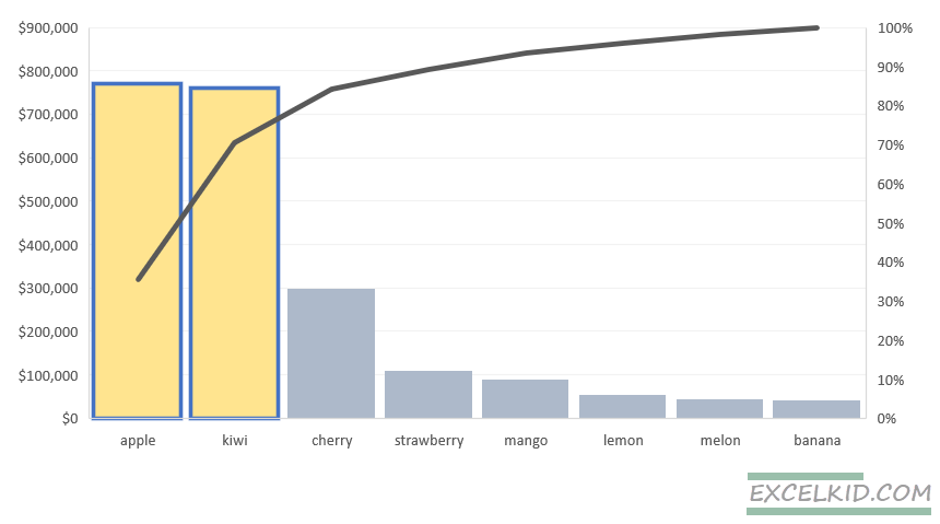
Learn more on how to create it.
Small Multiples Chart Template
Small multiples are great if you want to visualize multiple series of data using a single, easy-to-readable graph. In the example, we will use a sales figure to show the weekly sales performance of sales reps.
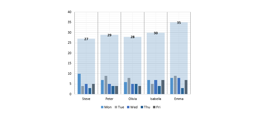
Here is how to transform a sales data set into small multiples.
How to create Excel Chart Templates (Step-by-step guide)
The following guide explains the basics of Excel charts and provides an overview of creating a chart template in Excel. Furthermore, we will demonstrate how to combine two different chart types and save a graph as a chart template.
Create chart templates using built-in Excel charts to change the default look of your graph. Our goal is simple: Build reusable charts for specific projects. We will explain all the steps to create, save, and manage a chart template based on custom graphs.
Keep in mind the following rules:
- Get rid of junk parts: The newly inserted chart contains unwanted elements. Using proper chart formatting, you need to remove the extra legends, labels, borders, or grids.
- Create easy-to-read charts: To improve readability, format the chart first. For example, remove the background and decrease the gap between bars.
- Use a proper color scheme: “Less is more” when discussing colors.
Combine two chart types (Create combo chart) in Excel
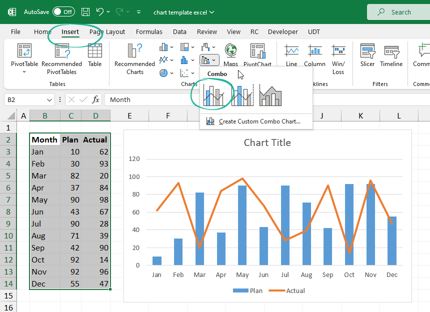
The example will show you how to create a simple plan / actual chart using a line and a clustered column chart. First, select the data you want to display. In this case, we use the range B2:D14.
Locate the Insert Tab on the ribbon and click the Combo chart icon.
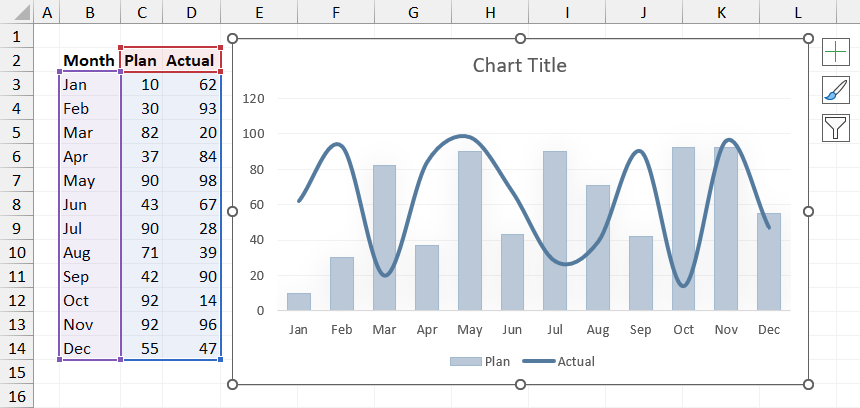
Customizing Excel Charts
Before saving a chart as a template, it is worth applying some formatting steps to improve the visual quality of the graph. You can customize the following properties:
- Chart Title
- Colors
- Gap with
- Axis
- Legends
How to Save a Chart as a Template in Excel
Steps to save a chart as a template in Excel:
- Right-click the selected chart, then select ‘Save as Template’.
- Add a name for the new template in the File name box.
- Click Save to save the chart as a chart template (*.crtx)
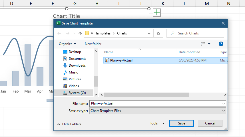
That’s easy! After that, open a new project: your saved chart template will appear and be ready.
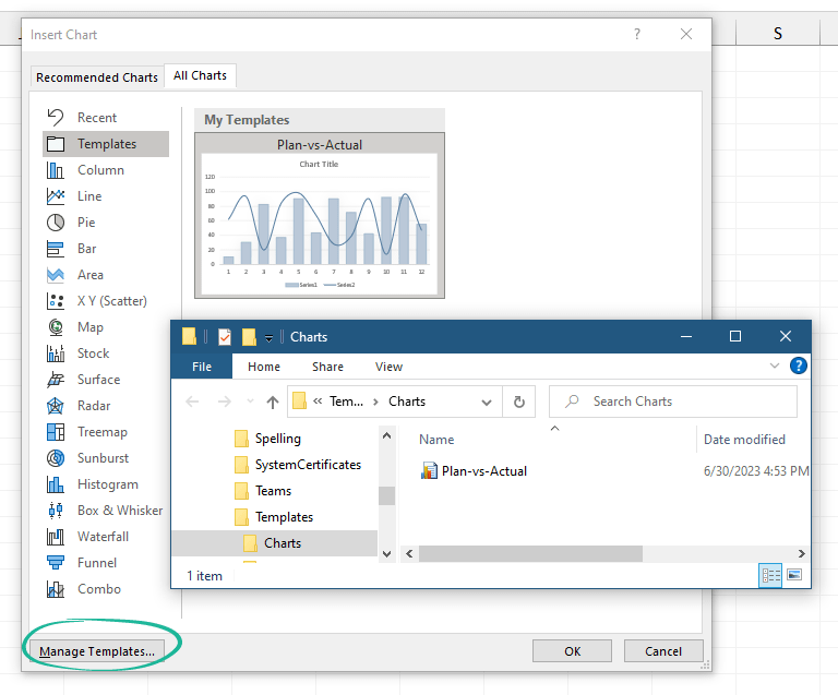
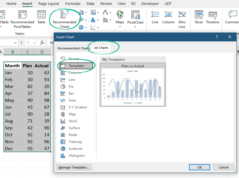
How to use Chart Templates?
Now we have a saved custom graph; let’s see how to use it!
Steps to insert a chart template:
- Select the data that you want to display
- Click on ‘Recommended Charts‘ under the Insert Tab
- Select the All Charts Tab
- Choose the Template
- Click OK
How to delete, rename, or move Excel Chart Templates?
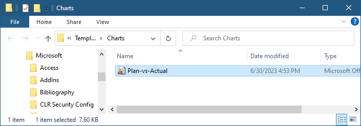
Where do I find chart templates in Excel? Excel will save all chart templates to your computer (local drive). You can find your prepared chart under the location below.
The default location is:
C:\Users[username]\AppData\Roaming\Microsoft\Templates\Charts
Click the ‘Manage Templates’ button to get the Template Gallery from Excel. Delete the chart if it’s not necessary anymore.