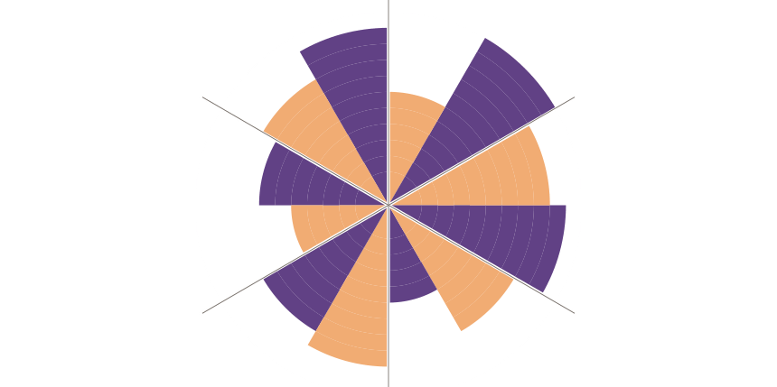
The radar chart in Excel is a combo chart that uses an infographic design to compare two or more key variables on a two-dimension level.
This tutorial will explain how to create a radar chart in Excel. We will use named ranges, custom formulas, and various visualization tricks. We use the radar chart to compare two products in two periods based on multiple categories.
How to create a radar chart in Excel?
Learn how to create a radar chart in Excel to compare sales performance using data visualization.
Check out our free chart templates if you are interested in chart design.
Prepare Data
Before we take a deep dive into the tutorial, let us take a quick look at the initial data set:
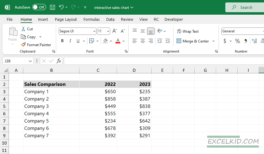
The data set is simple; we will use three columns and the range B2:D9. The first column contains the companies that we want to compare. We store the two periods’ sales data in the second and third columns.
Create Named ranges
Using named ranges, we can manage complex formulas easily. To build a radar chart, create the following named ranges:
Rng:
=OFFSET(chart!$B$2,,,COUNTA(chart!$B$2:$B$30),2)The formula creates a range that starts from B2 using the Chart Worksheet. The height of the range is determined by the number of non-empty cells in column B.
arr_1:
=IF(MOD(INT(ROW(chart!$1:$360)/360*ROWS(rng)*2),2),INT(INT(ROW(chart!$1:$360)/360*ROWS(rng)*2)/2)+1)The formula adjusts the row numbers to be zero-based before performing the calculations and gets different values based on whether the calculated value is even or odd.
arr_2:
=IF(MOD(INT((ROW(chart!$1:$360)-1)/360*ROWS(rng)*2),2),0,INT(INT(ROW(chart!$1:$360) /360*ROWS(rng)*2)/2)+1)The formula returns the column number of the leftmost cell in a range that is dynamically determined based on the number of rows in the “rng” range.
arr_pie:
=TRANSPOSE(arr_c^0)The formula transposes the values of arr_c and replaces all non-zero values with 1 while leaving the zeros unchanged.
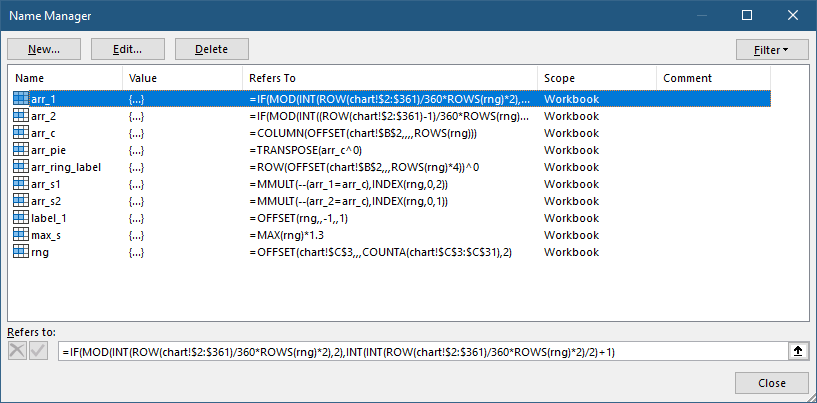
arr_ring_lab:
=ROW(OFFSET(chart!$A$1,,,ROWS(rng)*4))^0)We draw the radar chart labels using the result.
arr_s1:
=MMULT(--(arr_1=arr_c),INDEX(rng,0,2))Then, the formula above multiplies each element of the converted array (1 and 0). It uses the corresponding element from the second column of the ‘rng‘ range.
arr_s2:
=MMULT(--(arr_2=arr_c),INDEX(rng,0,1))The result is the corresponding element from the first column of the ‘rng’ range.
max_s:
=MAX(rng)*1.3The result will be 30% higher than the maximum value in the range.
Compose the radar chart
The radar chart is a combination chart. Let us see the main components.
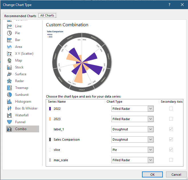
- Period 1: Filled Radar = arr_s2
- Period 2: Filled Radar = arr_s1
- Label 1: Doughnut = arr_ring_label
- Chart label: Doughnut = arr_pie
- Slice: Pie = arr_pie
- Max Scale: Filled Radar = max_s
As usual, we prepared an Excel file for learning purposes. You can download the practice file here. Happy charting!
Additional resources: