Polar Plot

Polar Plot is not a native chart type in Excel. Learn how to create it to compare two variables using a polar coordinate system.
Data visualization in Excel is a powerful and versatile tool that transforms raw data into visually appealing and easy-to-understand formats. This process involves using Excel’s robust features to create charts, graphs, and interactive dashboards that effectively communicate complex information. Excel’s data visualization capabilities are particularly valuable for business analysts, data scientists, and anyone seeking to make informed decisions based on data trends and patterns.
Polar Plot is not a native chart type in Excel. Learn how to create it to compare two variables using a polar coordinate system.
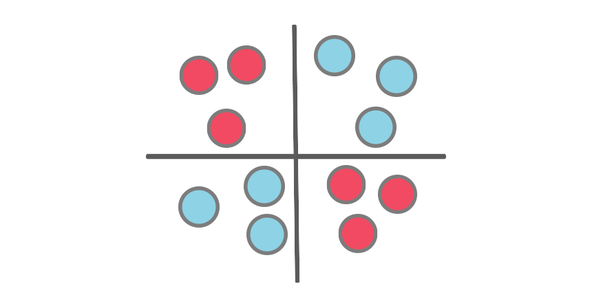
This step-by-step tutorial will show you how to create a Quadrant chart in Excel to support SWOT analysis.

This tutorial will show you how to create a Tornado chart in Excel using two clustered bar chart series and proper axis formatting.
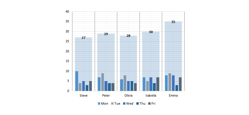
In this tutorial, we will show you how to use a small multiples chart in Excel to create a weekly sales chart.

Learn how to create a multi-layer doughnut chart in Excel using advanced data visualization for dashboards and reports.

Learn how to create a dumbbell chart (dot plot) in Excel to emphasize the change between two points across multiple categories.

Learn how to create a radar chart in Excel to compare sales performance using data visualization.

Learn how to create a gauge Chart in Excel! It is a combination chart: a doughnut that displays the zones, and a pie section indicates the actual value.
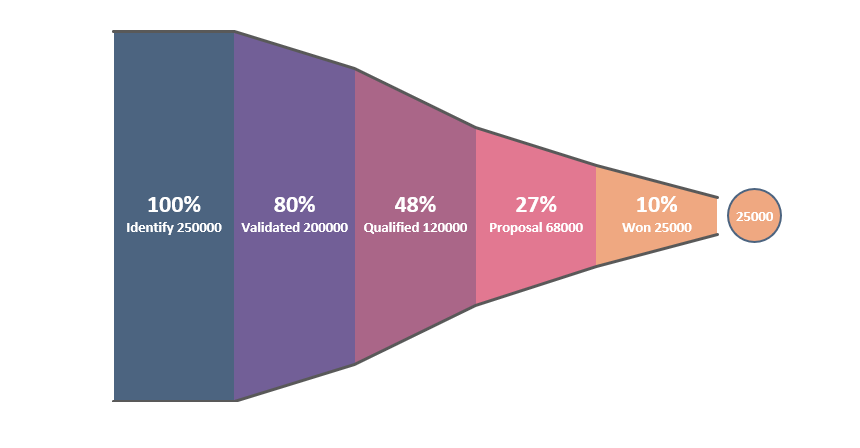
Create a sales funnel chart in Excel to tell a story from the first call to the completed purchase and track the process using a pipeline.
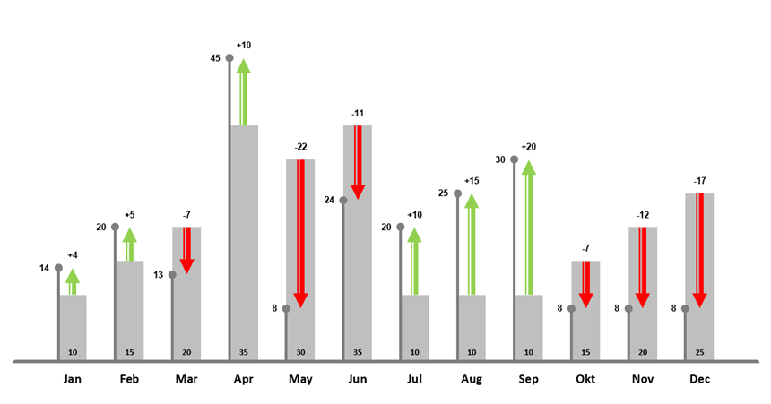
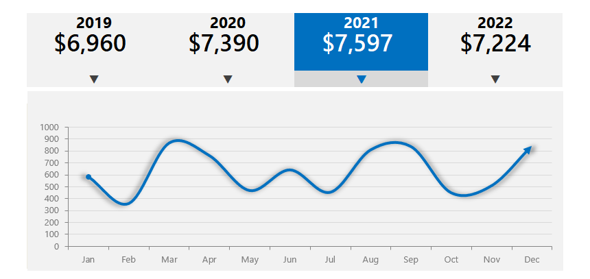
The Excel Plan Actual Variance Chart lets you display the monthly variance using custom data visualization.
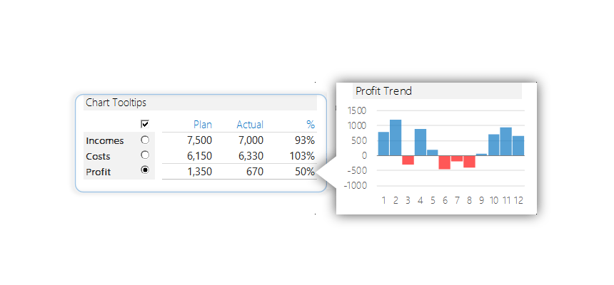
Would you like to see some great interactive chart tooltips In Excel? With the help of these, the chart speaks for itself.
Learn how to create a dynamic chart using the hyperlink rollover effect with the mouse hover method in Excel.