Waterfall Chart

Excel waterfall chart (bridge chart) shows how a start value is raised and reduced, leading to a final result.
Data visualization in Excel is a powerful and versatile tool that transforms raw data into visually appealing and easy-to-understand formats. This process involves using Excel’s robust features to create charts, graphs, and interactive dashboards that effectively communicate complex information. Excel’s data visualization capabilities are particularly valuable for business analysts, data scientists, and anyone seeking to make informed decisions based on data trends and patterns.
Excel waterfall chart (bridge chart) shows how a start value is raised and reduced, leading to a final result.
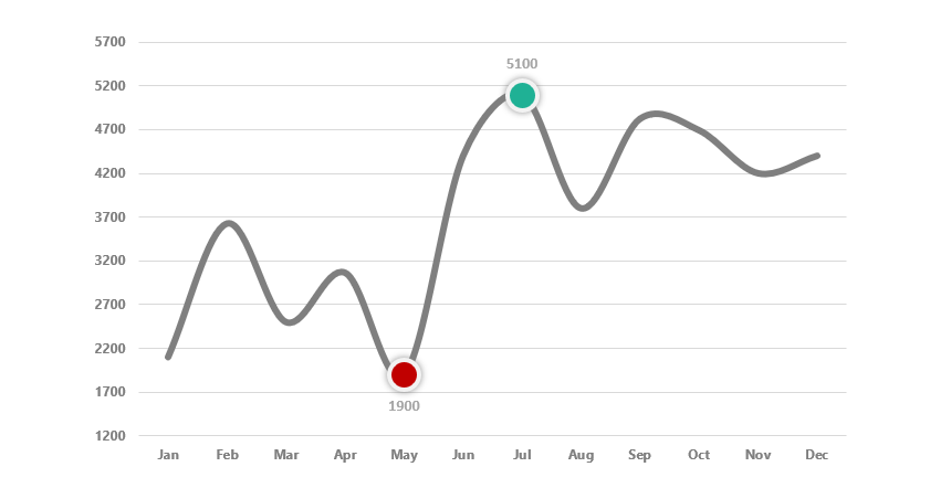
To highlight data points (high and low points) in an Excel chart, use custom formulas and multiple chart series.
This tutorial will show you how to use conditional formatting for column or bar charts in Excel using multiple data series.

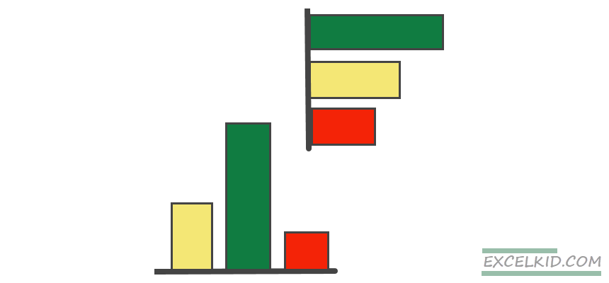
The Pareto Chart uses bar graphs to show the relative portion of each factor to the total and identify the most significant factor.
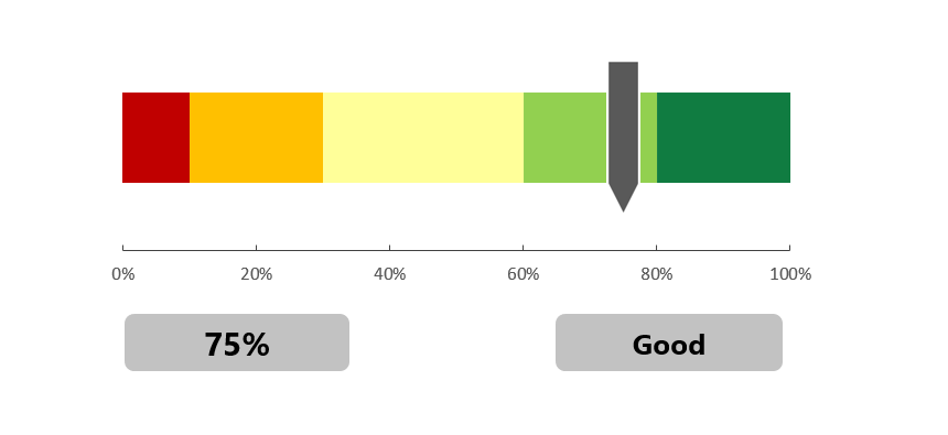
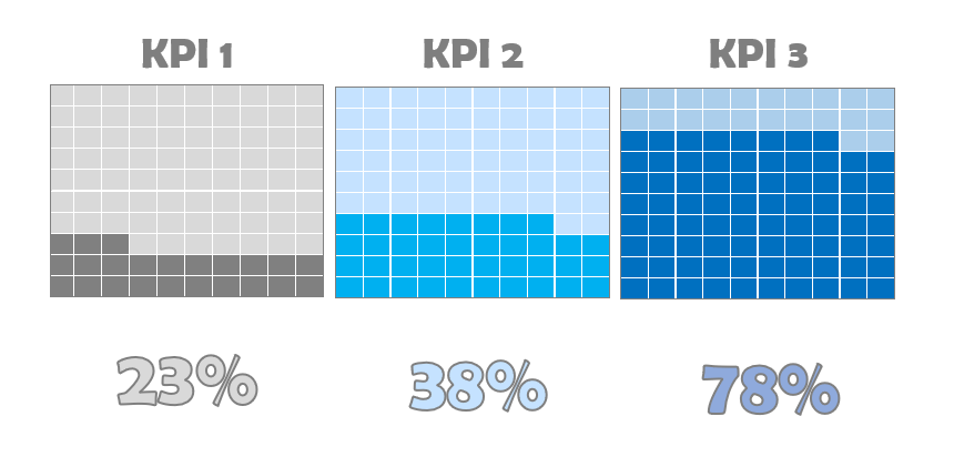
The Excel Progress Bar (or score meter chart) is a stacked bar-based graph that displays a single variable on a percentage or quality scale.
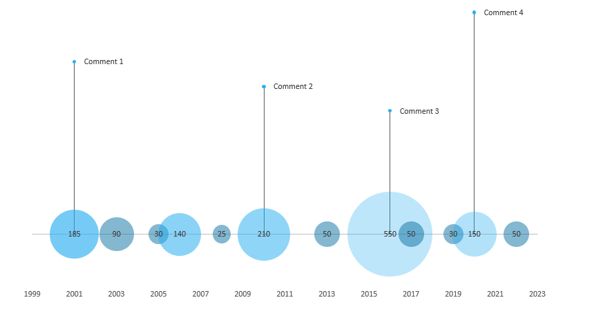
Learn how to create a custom bubble chart based on a scatter plot in Excel to visualize your data over time.

Using a stream graph in Excel, you can visualize multiple categories and easily recognize highs, lows, and patterns.
A waffle chart in Excel adds the beauty of the visualization to the advancement path directed to your target.

The progress circle chart displays the percentage completion towards a goal. We’ll use special formatting tricks in Excel.

Data visualization is king! Learn how to create a radial bar chart in Excel to compare sales performance.
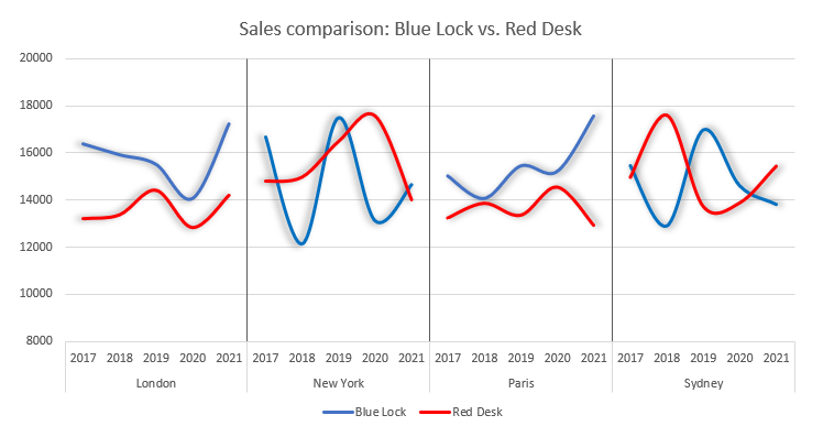
Using a Panel chart (small multiples) is a great decision if you want to compare products or sales and show the data on the same scale.

Learn how to use traffic lights in Excel! Traffic lights are built for performance tracking and enable you to display project status effectively. In most cases, it’s not easy to create a native traffic light in Excel. Instead, you can use conditional formatting, shapes, named ranges, and linked pictures; if you are not in a … Read more