The Excel Progress Bar (or score meter chart) is a stacked bar-based graph that displays a single variable on a percentage or quality scale.
Today’s tutorial will explain how to build a progress bar using multiple stacked bar charts. If you are interested in data visualization, look at our chart templates!
How to create a progress bar (Score Meter) in Excel
#1: Prepare data and define slicers
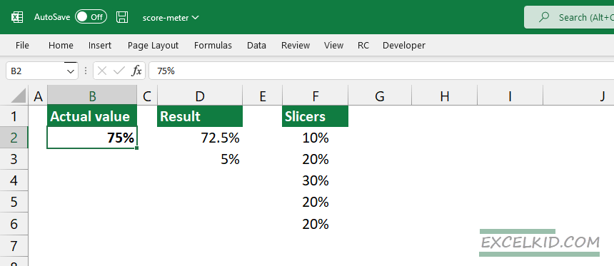
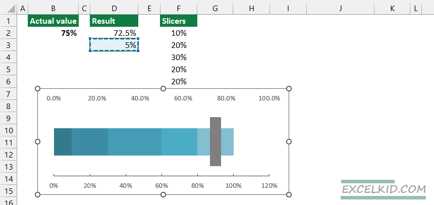
First, prepare the data for the progress chart. Because we are working with a percentage-based scale between 0% and 100%, we need to set up the following values:
- Actual value: a numeric value in cell B2 that is less than equal to 100%
- Indicator position: the width of the indicator will be 5%; calculate the position based on the following formula: =B2-2.5%, in this case, 72.5%
- Indicator width: 5%
- Slicers: Use five values in column F to prepare a five-grade scale. Note: SUM(F2:F6) must be 100%.
#2: Insert stacked column charts
You can transform stacked columns into a score meter chart. First, select the F2:F6 range, then locate the Insert tab on the ribbon.
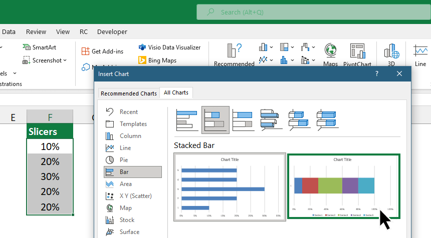
Under the Charts Group, select the Recommended Charts icon. The Insert Chart window will appear. Next, select the “All Charts” Tab to insert a stacked bar chart and close the window.
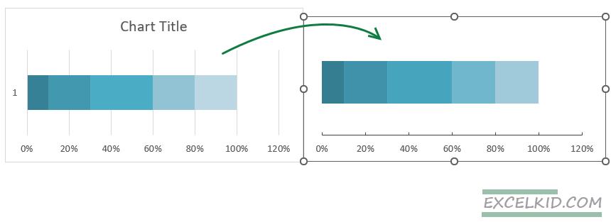
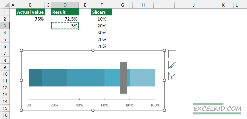
#3: Format the score meter chart
The next step is to format the score meter chart. To do that, remove the unnecessary components. Delete titles, borders, and labels to clean the chart up. Right-click on the chart, then use “Format Axis”. We use the 0% – 100% range, so under the “Axis Options”, set the maximum to 100%.
After the cleanup, the progress bar chart looks like this:
#4: Add a new series to create an indicator
You can add two additional series to create the indicator for the actual value. Select the value in cell D2, then press Ctrl + C. Click on the chart area and press Ctrl + V.
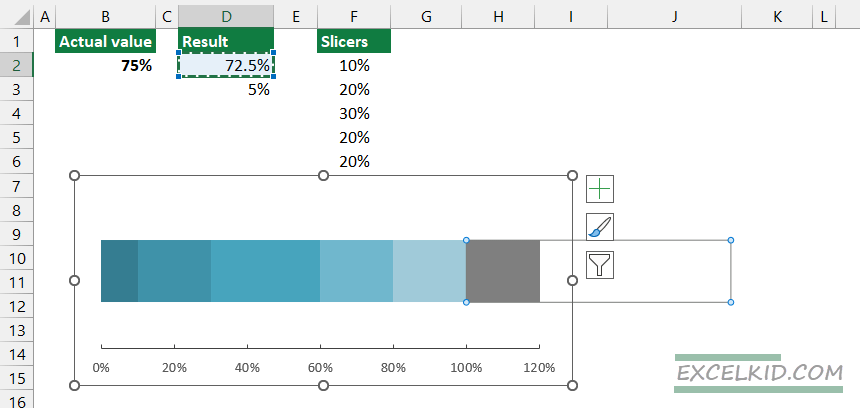
Repeat the last step using the value in D3.
Finally, set both axes maximum to 1 (100%).
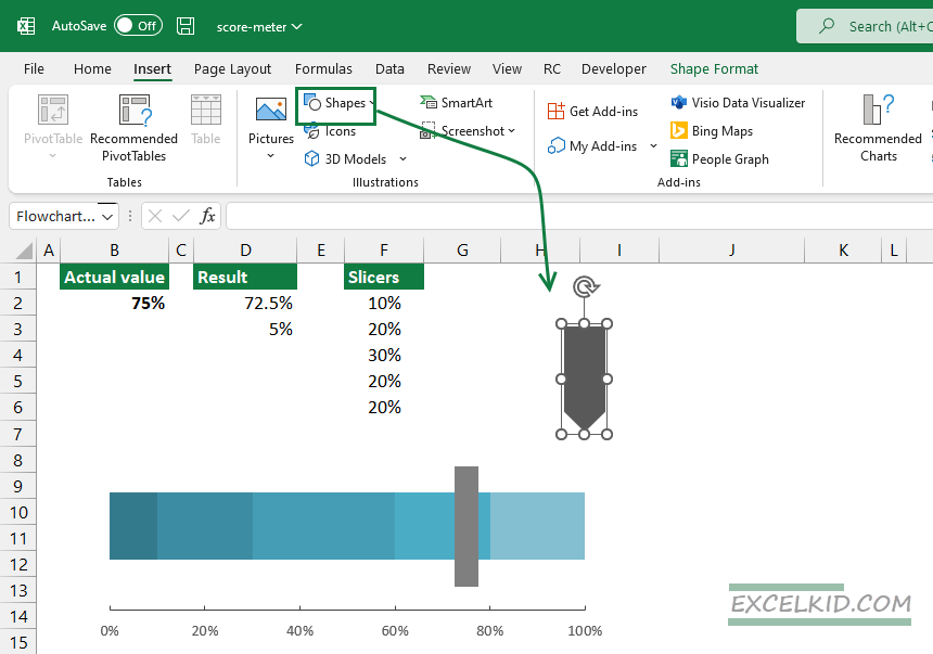
#5: Insert a Progress Bar indicator (shape)
We’ll use an arrow-style shape to display the actual value in the example. Under the Illustration Group, choose a shape, then click Insert.
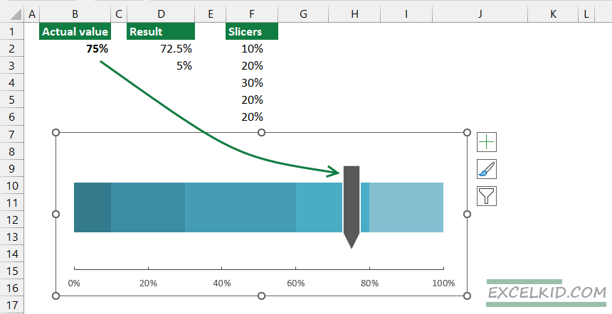
Format the shape!
Press Ctrl + C to select the shape to show the indicator on the chart. Next, click on the grey section in the chart area and press Ctrl + V. Now, you can display the actual value using an arrow-style icon.
#6: Create dynamic labels
The XLOOKUP function can create dynamic labels for the progress bar chart. Enter the following formula in cell B7:
=XLOOKUP(B2, H2:H6, J2:J6,,-1)The formula will return the corresponding category based on the lookup value.
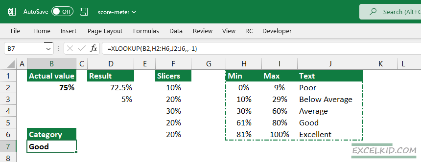
In the example, use cell B2 as a lookup value. The lookup array is in the range H2:H6, and the return array is in the range J2:J6. The actual value is 75%. The formula will find the matching item and get the category from the same row, “Good”.
#7: Assign values to the labels
Finally, we’ll prepare two labels for the score meter. Insert two rectangle shapes and fill them using your preferred color scheme.
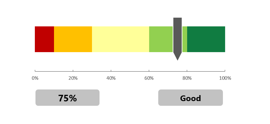
Select the shape to link the actual value and category to the shape, then press the equal sign using the formula bar. Finally, enter the values and format the widget: increase the font size and align them.
Additional resources: