Learn how to create a custom bubble chart based on a scatter plot in Excel to visualize your data over time.
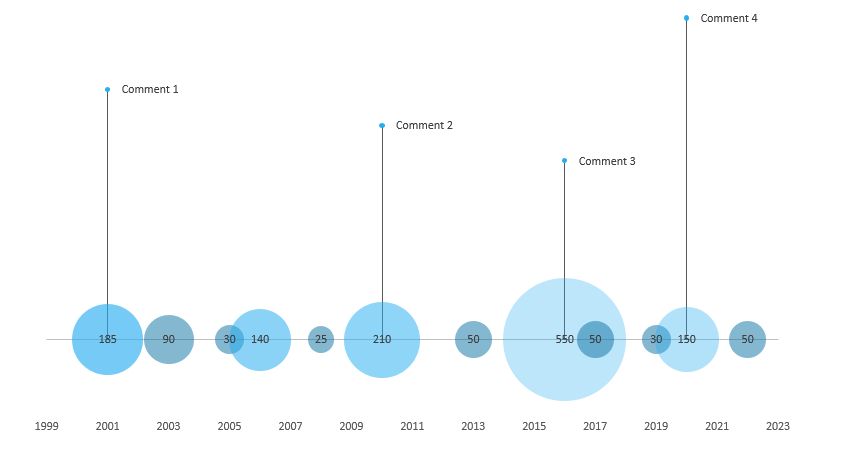
The difference is between the standard scatter plot and bubble chart, in which we use various-sized bubbles for the different data points. For example, see the picture above; the values are proportional to the displayed bubble sizes. This property helps you to track sales, revenues, or costs over time. You can find more chart templates here.
Today’s tutorial is a step-by-step guide; we will detail all the necessary steps.
How to create a Bubble chart in Excel
#1: Prepare and Organize your data
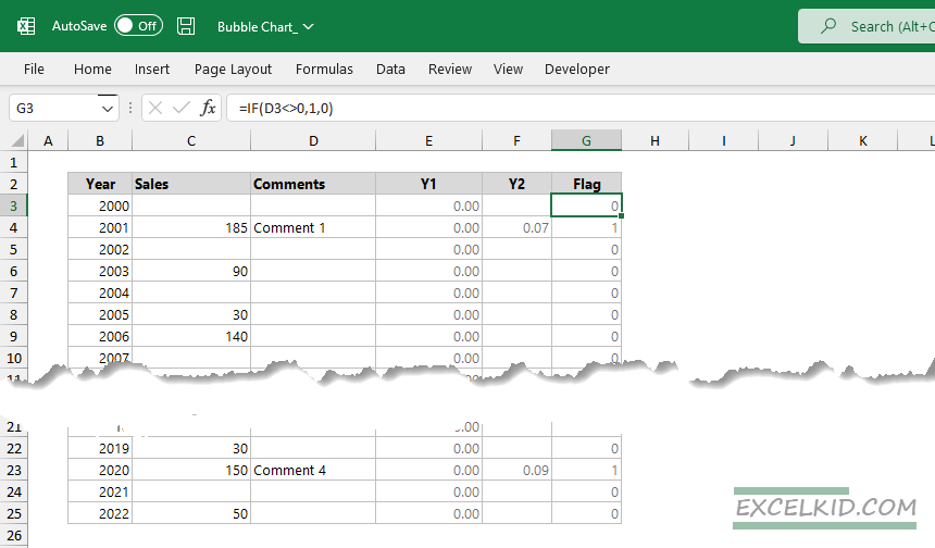
In the example, we will track and display the sales over 20 years. First, we need to arrange the data. Create six columns using the following headers: “Year”, “Sales”, “Comments”, “Y1”, “Y2”, and “Flag”.
In column D, you can enter the comment you want to show above the given data point. The Y1 and Y2 points help you to align the connection lines between the bubble chart and the comments. Finally, use a simple logical expression in the Flag column to check whether the Comments filed are empty.
#2: Insert a bubble chart
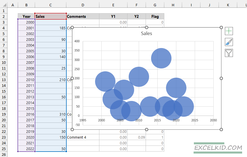
Once your data is ready, select the B3:B25 range and choose the Insert Tab. Then, under the Charts Group, click on the Bubble chart icon to insert the chart.
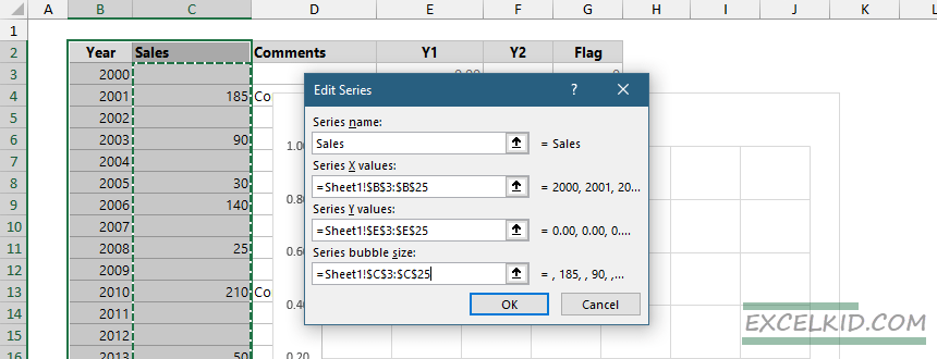
To modify the chart, right-click on the chart and choose the “Select Data Source” option.
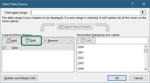
Then, under the “Legend Entries” group, click “Edit”. In this section, you can customize the selected series. First, add a name for the series, for example, “Sales”; column values determine the bubble sizes. After that, select values for Series X: click on the arrow icon and select the B3:B25 range. Next, repeat this step for Series Y values: use the E3:E25 range. Finally, under the “Series Bubble size” section, select the C3:C25 range and click OK to close the dialog box.
#3: Create data points for the Bubble Chart comments
As we stated, you need to create connectors above the data points. Select the chart area and right-click on it. Click on “Select Data” and click “Add” to add a new series.
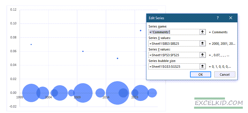
The setup looks like this:
- Name: Comments
- X values: B3:B25
- Y values: F3:F25
- Bubble size: G3:G25
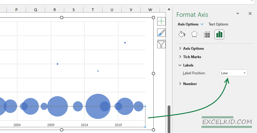
#4: Modifiy label positions
To make the chart easy to read, change the X-axis labels! Select the labels, then look at the Format Axis tab. Select the “Labels” group and adjust the label position to “Low” using the drop-down list.
#5: Clean and customize the Bubble Chart
Apply some minor improvements to remove the unnecessary chart elements. In addition, we recommend you delete the following parts: vertical axis, gridlines, and borders.
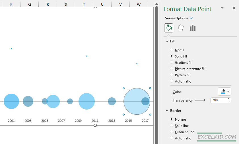
If you want to highlight one or more data points, you can do that easily by using different colors and transparency. To modify the default color and transparency, select the bubble series. Right-click on the bubble you want to change and choose “Format Data point”. Under the “Fill Group”, set the “Transparency” to between 50% and 70%.
#6: Create error bars
The bubble chart is almost ready. You must create a vertical line connecting the bubble and the corresponding comment. Select the Chart Design Tab and click the “Add Chart Element” icon. Choose “Error Bars” > “Standard Error“.
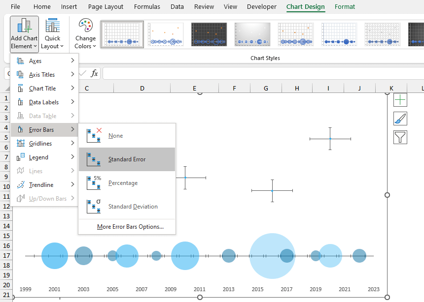
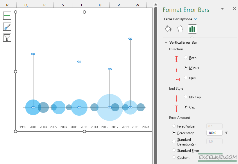
Select the error bar and use the following steps: delete the horizontal error bar from the chart. After that, under the “Direction” group, choose “Minus” and set the “End Style” to “Cap”. Finally, use the percentage field under the “Error Amount” section and enter 100%.
The result looks like this:
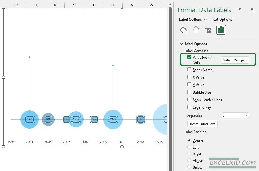
#7: Add values and comment labels
Select the “Sales” series, right-click, and choose “Add Labels”. You will see only zeros, but don’t worry! Right-click on the labels; the “Format Data Labels” will appear. Under the “Label Options”, check the “Values From Cells” checkbox. Select the B3:B25 range. Finally, set the label position to “Center”.
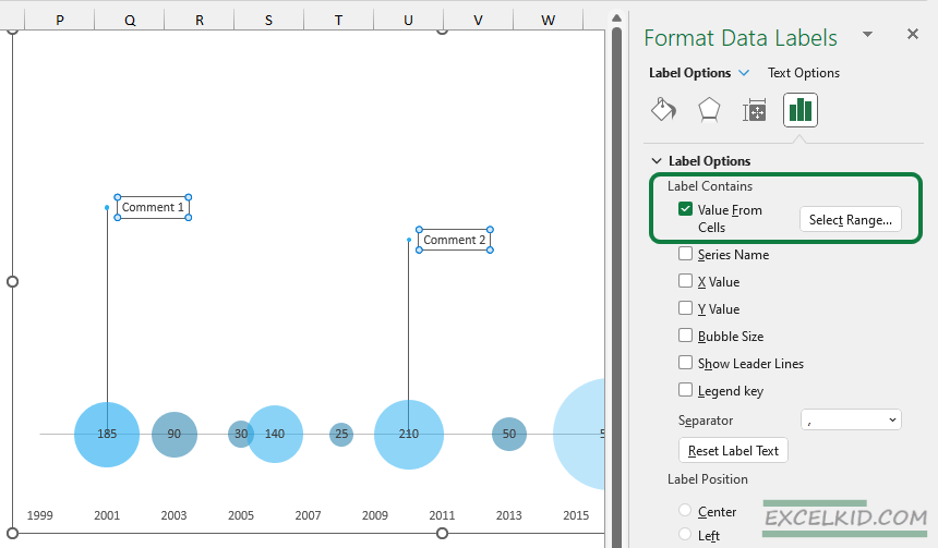
Last but not least, add your notes to the source table.
In the example, we have four comments. First, right-click to select the comment series, then click “Add Labels”. Next, navigate to the “Label Options” and choose “Value From Cells”. Finally, select the column that contains comments.
Additional resources: