Ultimate Dashboard Tools (UDT) is a high-performance dashboard and chart add-in for Excel. With its help, you can generate advanced charts and widgets in real-time. The powerful chart add-in has many features to help you create advanced reports. The tool is built to tell a story using data and advanced charts, graphs, and diagrams.
The next-gen Sankey Diagram is now available for the Windows and Mac versions.

UDT chart add-in has reached a significant milestone! Join 150,000 professionals worldwide and make smarter decisions faster. Thanks to our valued customers for their steadfast support and trust in our product. We are offering our product at competitive prices to reach a wider audience. The add-in takes care of a lot of technical stuff in the background. You don’t have to write any code when using our software. The chart add-in runs great on Mac!
Check our Chart Tools in motion
Here is a short showcase of how the add-in works with Microsoft Excel.
Take a closer look at the examples and see what you are missing
Don’t Just Take Our Word for It
One day I got in contact with UDT, and I must say: From day 1, I was surprised by all the benefits you can have to build up your report to visualize your data. A very easy and simple way to amaze your Board of Directors.

Didier Brackx
CEO, Xenturion BVBA
UDT consistently opened my mind to new ways of visualizing my data and customizing presentations to fit my audience. More importantly; I reached out when I needed assistance, and received more in return. I remain a fan.

Ivo Mekkole, MBA
Sr. Analytics Product Owner, Humana
UDT is an amazing customization tool, you can come up with gauge charts for various KPIs in no time. All risk managers are encouraged to use UDT-powered visualizations.

Sarkis Kawoukjian, CPA
Head of Internal Audit – Fertitrust S.A.
Features
ONE TIME FEE, NO subscription
Flexibility: Create almost any kind of chart and dashboard
Automated: Various chart types in a single click
Easy to use: Zero programming skills required
LIFETIME future upgrades included!
Read the FAQ before buying the tool and learn more about the charts.
Latest release: v11.0
- Powerful Gauge Chart and Dual Gauge Chart
- Sankey Diagram (Income Statement support!)
- Radial Bar Chart
- Polar Area Chart (Windrose Diagram)
- Sales Funnel
- Bullet Chart, Waterfall Charts
- Org Chart Creator, Score Meter Chart
- TreeMap Chart, Mekko Chart, Traffic Light widgets
- Variance Charts (8 types)
Download the documentation (which contains chart examples) for more information about the chart tool.


High Performance
UDT instantly improves your dashboard’s performance and visual quality. So forget configuration headaches and enjoy the most amazing results!
Easy To Use
The chart tool automatically applies the best practices. You don’t need to be a rocket scientist to set it up.
Great Support
Support is the backbone of our product. We are ready to assist if you have questions or issues with our plugin.
Compatibility:
- Windows version: Excel 2013, Excel 2016, Excel 2019, Excel 2021, and Microsoft365 (Office365)
- Mac version: Excel 2016, Excel 2019, Excel 2021, and Microsoft365 (Office365)
Install the add-in in seconds and create a stunning Excel dashboard using our data visualization tools!
Pricing
We provide two payment gateways: Stripe for all card types and Paypal.
25% Discount with UDT Paypal Program! Why is the product cheaper when I purchase through PayPal? There’s just one reason for this: over the past few years, Visual Analytics Ltd. has established such an excellent business relationship with PayPal that we’re able to offer further discounts from the prices listed here. Use the PP25 coupon code and buy the tool with a discount of 25%. Learn more…
Volume discounts
We offer HUGE volume discounts on purchases of 2 licenses or more. You can install the add-on of up to 5 Workstations. If you are an Excel instructor or a team leader, you can provide group training cost-effectively to maximize shared learning.

We are delighted to see a growing interest in our product from India. Currently, we can offer purchasing options exclusively through PayPal for customers from India. You can purchase the tool using this link.
Ultimate Dashboard Tools – Excel Add-in – Chart Examples
Here are a few examples below!
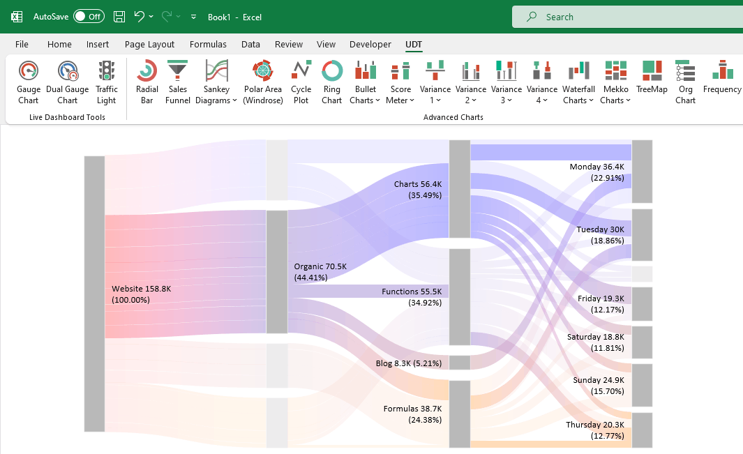
Sankey Diagram (Flow Diagram)
Sankey Diagram is a brand new visualization in UDT; it shows relationships between different data points. With its help, you can create flow diagrams and various breakdowns in seconds.
Visualize your customer journey or analyze your website traffic using the Sankey diagram.
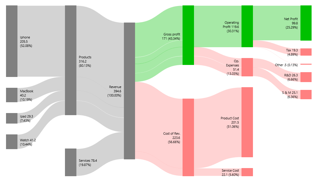
Convert an Income Statement to a Sankey Diagram
A new feature debuts in v11. After several months of intensive coding, our dream has finally come true, and now you can easily convert an Income Statement into a Sankey Diagram.
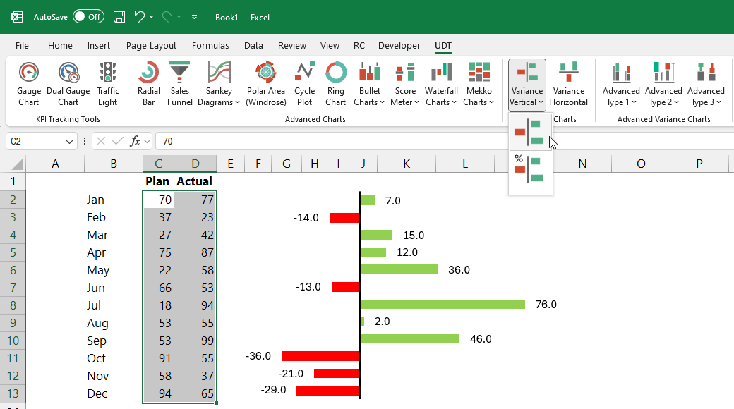
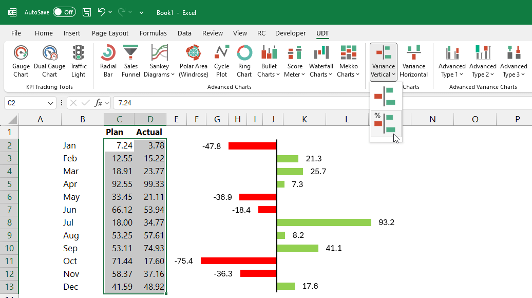
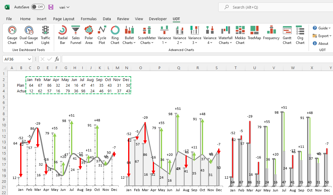
Vertical Variance Charts
In the new version, we have significantly improved the variance charts, and we have also enhanced the handling of labels.
Many of you have also requested that deviations be displayed in percentage form from now on. We are pleased to announce that this development has been completed!
Enhanced Clarity: Presenting deviations as percentages offers a clearer, more intuitive understanding of performance differences. It’s easier to grasp that a 25% deviation is significant, rather than interpreting absolute values.
Advanced Variance charts
Look at this powerful section; you can create various variance charts with a single click! You only need to highlight the plan and actual data rows. It is good to know that the dynamic chart principle is also in effect. If we change the value of one cell, then the chart will change in real time.
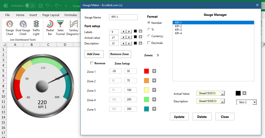
Gauge Chart Builder
Creating Gauge charts in Excel is easy if you use automated solutions. Connect the actual value to the gauge with a single click, add multiple zones, and customize zone colors. Change the default skin or use the chart without a skin. With no limits on the number of gauges, enjoy fully automated operation and stability. The latest UDT version supports up to 12 zones for gauges.
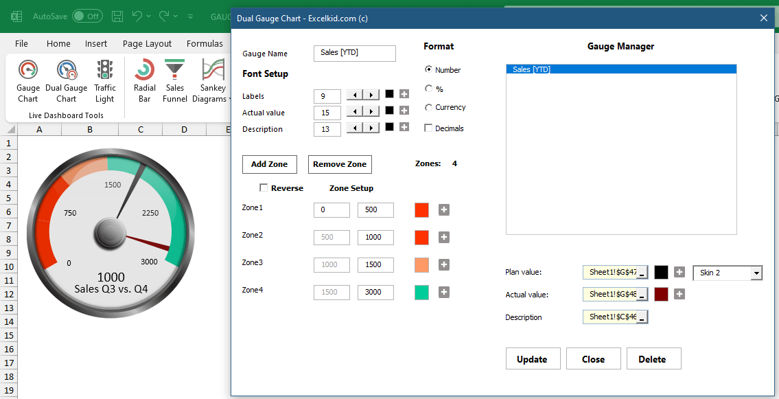
Dual Gauge Chart
There are several ways of showing variance to the target. If you like gauges, you can use them for comparison purposes. For example, in the picture below, we demonstrated how to compare the Q3 vs. Q4 performance. The chart displays the variance between the plan and the actual value.
Radial Bar Chart
A radial bar chart (circular bar chart) is an eye-catching visualization. We’ll fully support Excel’s latest data visualization trends in future releases! The primary function is comparison. First, select the data and click the Radial Bar Chart icon.
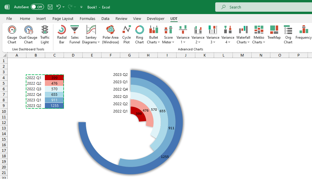
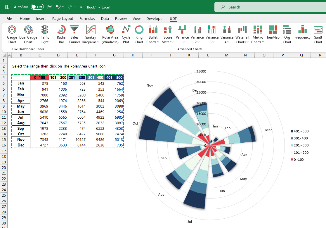
Polar Area Chart
Use the polar area (Windrose chart) to visualize the sales distribution easily. The polar area chart presents data in a circular format; the length of each slice around the circle indicates what you want to measure. In the example below, we display the sales distribution for 12 months. Looks great!
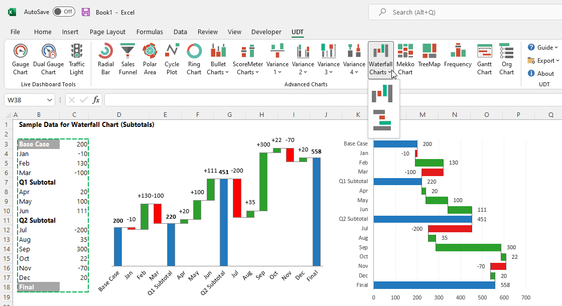
Waterfall Charts (Vertical and Horizontal)
A waterfall chart is great if you want to show the positive and negative contributions to the net value. By default, Excel supports horizontal Waterfall charts only. The function provides horizontal and vertical chart types and enables you to use subtotals.
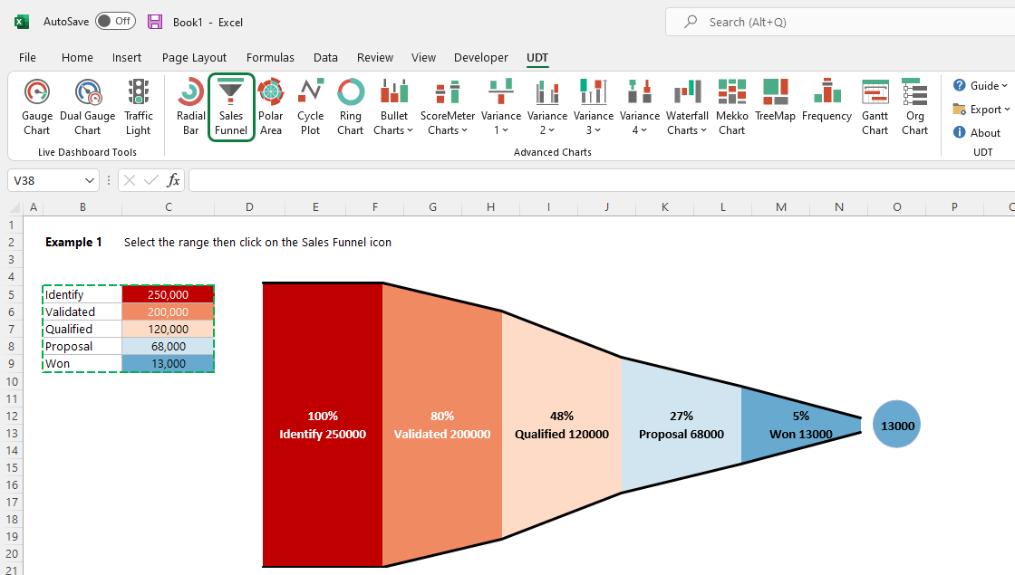
Sales Funnel
If you are in Marketing, this tool is yours. At the top of the sales funnel chart, there are a large number of potential customers. However, at the end of the funnel, only a small fraction of these customers purchase your service or product. The chart helps you to break the purchasing process down. Select all stages you want to visualize and click on the funnel icon. Automate repetitive tasks with our funnel graph so your sales team can spend less time on data entry!
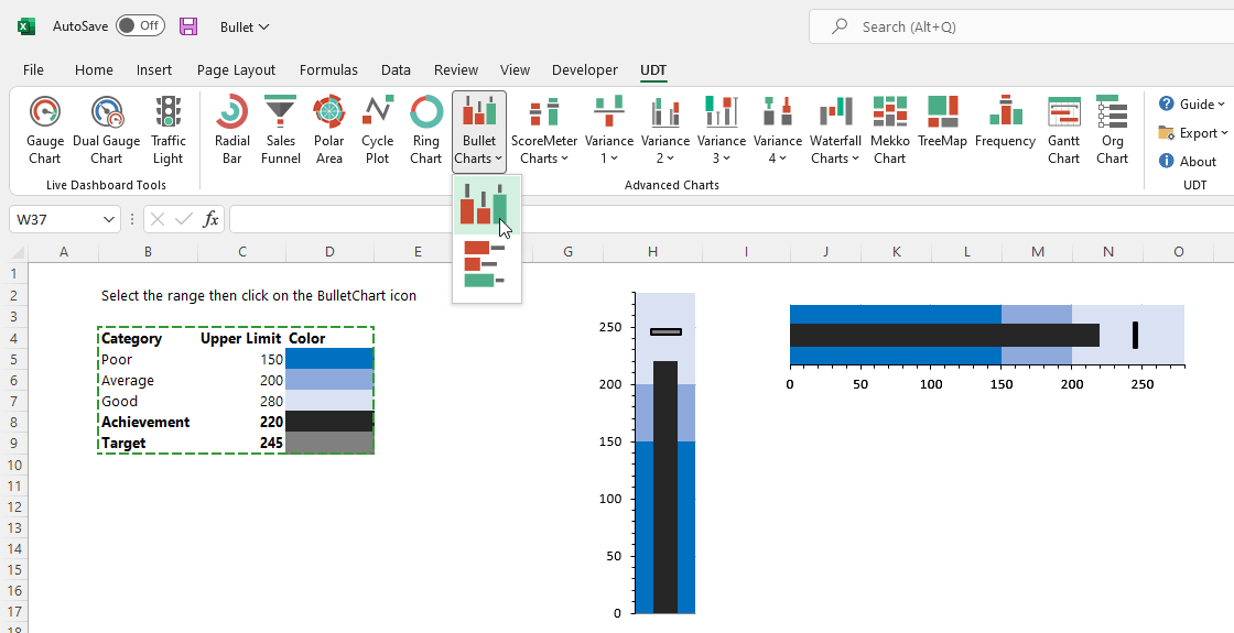
Bullet Graph
Bullet charts are a variation of a bar chart developed by Stephen Few to display multiple measures and create easy-to-read visualizations. In addition, the bullet graph is a space saver, and you can use it vertically or horizontally.
Marimekko chart
Marimekko chart (aka mekko chart) is the latest visualization type of chart add-in. In a mekko chart, the column widths show one set of %, and the column stacks show another set of %. If you want to create this complex chart manually, you’ll need time and patience. However, from now the mekko chart is fully supported! Highlight the columns containing the base data. After that, you don’t have to do anything but click on the bullet chart icon on the ribbon.
Sharing
The add-in creates portable dashboards. Share your work with colleagues or with your boss! First, install the add-in, then create and modify advanced charts. You can view the dashboard without trouble if the add-in is not installed on the PC. Just change the actual values, and the chart will be reflected.
Download the documentation and check all supported chart types.
Our partners