
Sankey Diagram in Excel provides detailed, multi-level flows of values between categories to tell a data-driven story using visualization.
It is good to know that this type of visualization is not available in Excel by default. You can build the flow diagram manually or use custom chart add-ins. If you want to learn more about chart templates, we recommend our definitive guide. Before diving deep into data visualization, it is worth knowing what a Sankey diagram is and how to use it.
Table of contents:
- What is a Sankey Diagram?
- How Sankey Diagrams Works
- How to use the Sankey Diagram?
- How to create a Sankey Diagram in Excel?
- Sankey Diagram Excel Example: Revealing Relationships
- How to make a Sankey Diagram in Excel manually?
- Why is the Sankey Diagram important?
- Frequently Asked Questions
What is a Sankey Diagram?
The Sankey Diagram helps us drill down a complex data set and return a detailed overview of how the data flows and changes between stages.
Behind the raw data, you will find some insightful details:
- How the data flows and changes from the start to the end
- Highlight highs, lows, and peaks between the selected stages
- Identify the critical point, like a resource usage or cost structure
The point of creating a Sankey Diagram is to reduce the time spent on analysis and support decision-makers. Not just in Excel, you can use the diagram for various purposes.
How Sankey Diagrams Works
Take a closer look at how Sankey diagrams work. Imagine you’re trying to explain a bunch of complicated info, but you want to keep it chill and easy to understand.
- Choose Your Story: First, you decide what story you’re telling. It could be about how your marketing cost is used and how people navigate a website. The “story” is all the movements you’re tracking.
- Identify the Nodes: Now, figure out where the main activity starts, changes, or finishes.
- Map the Journey using flows: Next, you draw the lines or “flows” connecting your nodes. These show the path from one node to another.
- Add the Details (Width and Colors): You use different widths for the flows to show more or less energy, cost, or money moving. Then, add colors to sort things out or make points clear.
- Make Smart Decisions: Now, use your diagram to make decisions. Need to study more? Change some variables and test a new scenario. It is fast and easy.
How to use the Sankey Diagram?
The goal is simple: “Follow the flow”. Get a quick overview of significant changes in your data across multiple stages using the Sankey Diagram. In real life, we always working with dynamic data. Accordingly, tracking changes and visualizing the flow between two or more stages is essential. The main point of the analysis is to follow how and why the data changes.
You can use the diagram for various purposes. For example, it is easy to analyze costs, website traffic or track issues of a software development project. Sankey Diagram is a Swiss knife.
How to create a Sankey diagram in Excel?
To create a dynamic flow diagram, use the steps below:
- Install the UDT for Excel chart add-in
- Select the data you want to visualize
- Click on the Sankey diagram icon
- The chart will be inserted automatically
Let us see the details!
Install the UDT Chart add-in
The diagram is a part of our data visualization library. After the installation, you’ll see the UDT Tab on the ribbon.
Create a Data structure
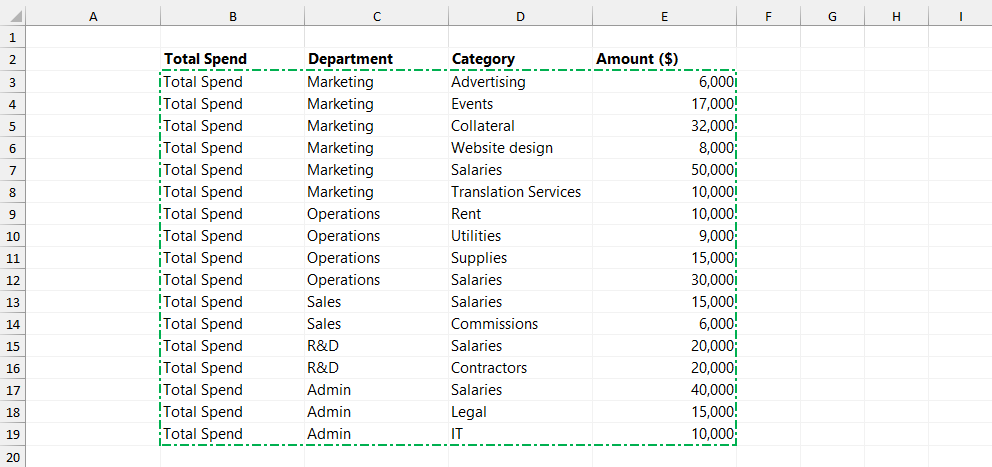
The next step is to set up your data. To create a Sankey diagram in Excel, use the following structure. The selected range should contain a minimum of three rows. In addition, the last column should contain positive numbers.
In the example, three columns contain categorical data (Total Spend, Department, and Category), and one column contains numerical data.
Here is a sample data:
Insert the diagram
To insert a new diagram, select the data, and click the Sankey icon:
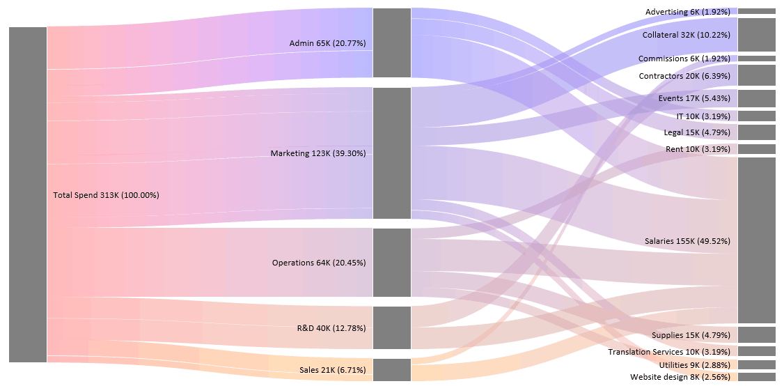
After clicking the icon, the add-in generates the flow diagram in real time and shows the connections between stages. The diagram transforms the cash-flow data into a stunning visualization.
Insights
The diagram speaks for itself, but it is worth spending a few words to highlight the essence.
- In Level 1, the total amount spent is $313,000.
- At Level 2 (Departments), the size of the nodes shows the amount spent by different departments. In the example, it is easy to check that the Marketing department had the highest expenditure while the Sales department had the lowest.
- Level 3 breaks down the data into multiple categories;
- We spent $155,000 on Salaries, which is 49.52% of the total cost; this is the highest amount.
- The Advertising category had the lowest expenditure of $6,000, which made up only 1.92% of the expenses.
Sankey Diagram Excel Example: Revealing Relationships
The Sankey Diagram’s main advantage is its ability to uncover patterns. Furthermore, it provides more insight instead of analyzing huge data tables. So, using high-level views is outstanding.
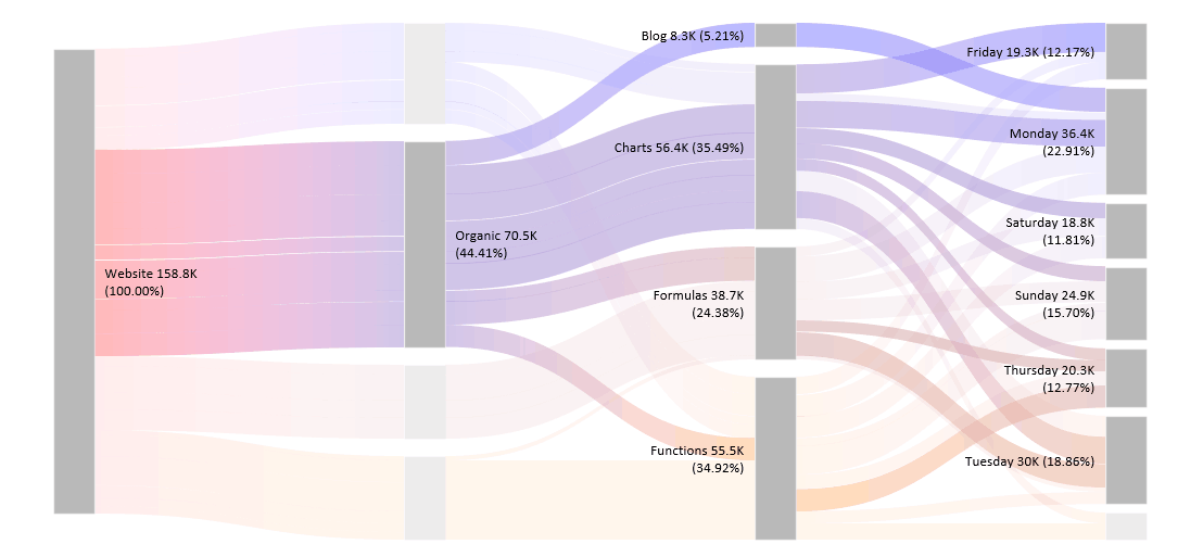
You can click on the main blocks like the example below. In this case, you selected the Marketing Department and got a breakdown ASAP.
Take a closer look at the highlighted stage! In Level 2, the selected department had the highest expenditure, $123,000, 39.30% of the total cost. Level 3 breaks down the cost flow of the Marketing activity into six categories. In the example, we spent various amounts on Advertising, Collateral, Events, Salaries, Translation Services, and Website design. Based on this highlighting feature, you can select any department to analyze the cost structure. It is very useful when you want to take a closer look at the given category.
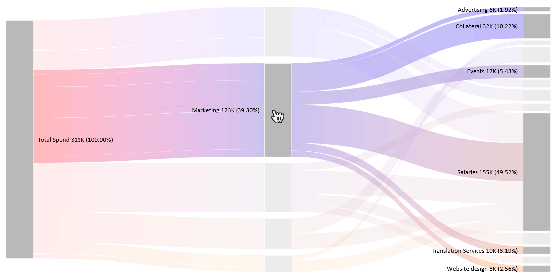
So, creating an analysis based on the chart can take only minutes. To reset the layout, click on the diagram background. You can take a closer look at the example!
In the following video, we prepared various data sets to demonstrate the power of the Sankey diagram.
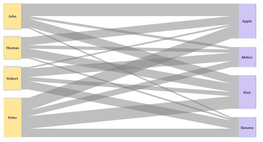
How to make a Sankey diagram in Excel manually
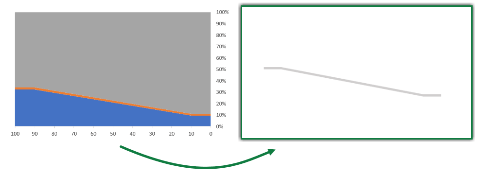
This guide will explain building a Sankey Diagram in Excel without add-ins. The trick is to build multiple charts and merge them into a final diagram. If you make the shaded lines partially transparent and overlap them, it is possible to construct a Sankey diagram. The connectors use 100% stacked area charts, and the start and end blocks are based on 100% stacked column charts. We will show you how to transform a sales table into a Sankey Diagram.
You can download the practice file.
Setting up the data
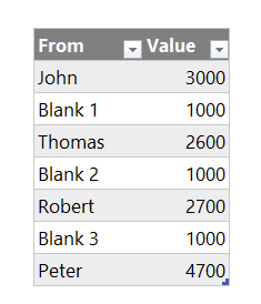
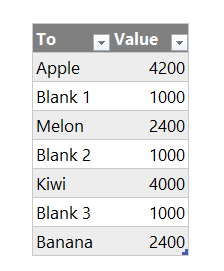
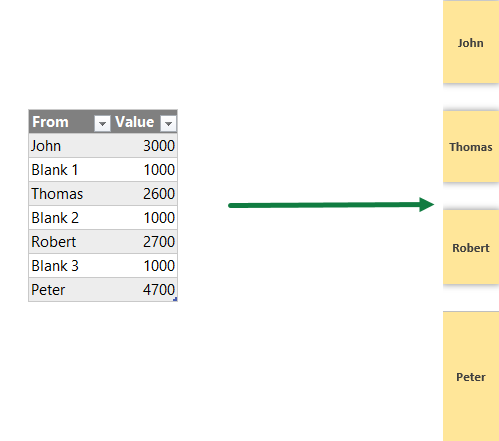
For the sake of simplicity, we will use a 4×4 matrix to create a Sankey Diagram. Each row represents the starting point of the diagram. We use the columns to calculate the endpoint. The numeric data set will show the flow rate.
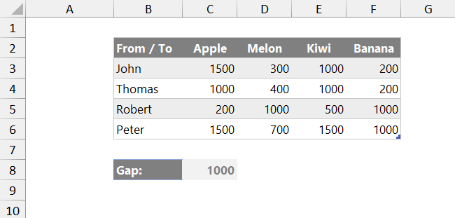
We have an additional field, which is a named range, Gap. The reason for using these values is to ensure spaces between categories.
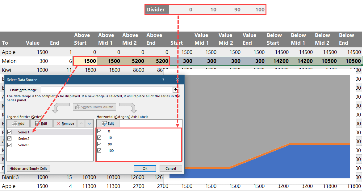
Calculation tables
To create the structure for the Sankey Diagram, we will use three tables and one named range.
- Table names: Lines, StartBlock, EndBlock
- Named range: Divider
Lines table
The Lines table uses our initial data set, and we will create a table containing all row and column combinations. To separate the row categories, insert an additional row. The goal of creating additional rows is to insert blank spaces between the chart components.
Here is our data table:
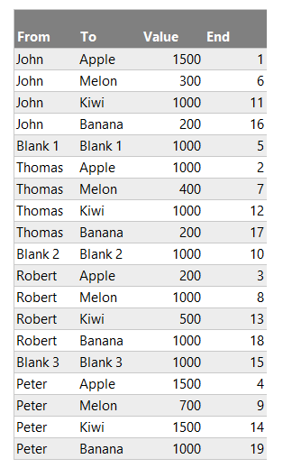
The values in the Lines table are linked to the original table. Let us see the formulas!
Value column:
=IF(LEFT([@From],5)="Blank",Gap,INDEX(Data,MATCH([@From],Data[From / To],0),MATCH([@To],Data[#Headers],0)))The “End Position” column decides the order of the lines (connectors) at the End of the Sankey Diagram.
Append the Lines table
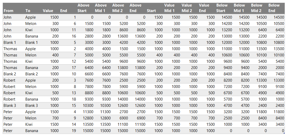
To insert a 100% stacked area chart, we need to calculate the following data points:
- The gap above the line
- Value of the line
- The gap below the line
Insert some additional columns to perform the necessary calculations.
Explanation:
Above Start: =SUM(Lines[[#Headers],[Value]]:[@Value])-[@Value]
The formula returns a value and determines the blank area’s required size at the starting point.
Above Middle 1: =[@[Above Start]]
The value is a simple cell reference from the AboveStart column.
Above Middle 2: =[@[Above End]]
The value is a simple cell reference from the AboveEnd column.
Above End: =SUM([Value])-SUMIFS([Value],[End Position],”>=”&[@[End Position]])
The formula returns the required space above the Sankey line at the endpoint.
Start value, Middle 1, Middle 2, End Value =[@Value]
- Below Start =SUM([Value])-[@[Above Start]]-[@Start]
- Below Middle 1 =SUM([Value])-[@[Above Middle 1]]-[@[Middle 1 Value]]
- Below Middle 2 =SUM([Value])-[@[Above Middle 2]]-[@[Middle 2 Value]]
- Below End =SUM([Value])-[@[Above End]]-[@[End Value]]
StartBlocks Table
The StartBlocks table collects each row category from the source table, and we apply a gap row for every other row.
The formula in a value column: =SUMIFS(Lines[Value],Lines[From],[@From])
EndBlocks Table
The EndBlock table works the same as the StartBlocks table. The difference is that we use each column category linked to the main Data table. After every nth row, insert a Gap row.
Formula: =SUMIFS(Lines[Value],Lines[To],[@To])
Divider named range
The final part of the calculations is a named range called “Divider”. We will use the named range as a horizontal category axis. It establishes the starting and ending points of the chart’s gradient.

Chart Overlapping
All calculations are ready, and it is time to create the chart section for the Sankey Diagram.
Create the individual shaded Sankey lines
Each row of the Lines table represents a 100% stacked area chart that uses three data series.
The next step is to format the chart. Right-click on the axis and click Format Axis. Under “Axis Options”, check Date Axis. Another important thing is to check the “Dates in reverse order” checkbox.
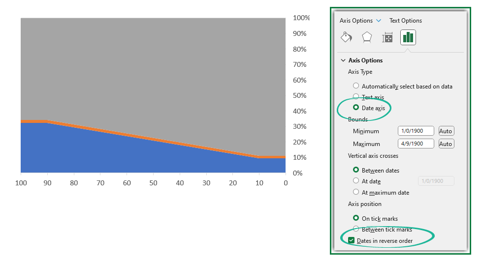
Finally, clean up the chart area. Delete legends and the chart title. Apply “No fill” for the chart background.
Repeat these steps for all rows! As you see, the Sankey Diagram connectors are based on multiple small charts.
Create the Sankey blocks
The last step is to create the start and the end blocks using two 100% stacked column charts.
Apply the following formatting setup for the blocks:
- Plot series in reverse order
- Fill the blocks.
- Set the “Gap” sections with “No Fill”
- Add data labels.
Use the same method for the end blocks. Finally, align the connectors properly between the start and end blocks; our Sankey Diagram is ready.
Why is the Sankey Diagram important?
Sankey diagrams are important for many reasons, especially when you want to understand complicated flows without getting a headache. Here’s why they’re a big deal:
- Get the Big Picture Quickly: Sankey diagrams display everything in one easy-to-understand visualization. It is like getting a bird’s-eye view of a busy city. You can see where things start, where they end up, and what routes they take to get there.
- Spot the important details: The Sankey Diagram clarifies where most resources (like energy, money, or web traffic) go. This helps you focus on what’s important and what you need to change.
- Ability to understand complex activities: Some things are super complicated, with many parts and pieces. Sankey diagrams break these down into something way easier to get. They can turn pages of boring numbers into a colorful visualization that tells the same story.
- Make better decisions: When you see how resources move and change, you have what you need to make smart decisions.
- Communicating Clearly: If you have tried explaining something complicated, you know it is sometimes tough. Sankey diagrams are great for sharing because they clarify your point without much back and forth. They’re like a universal language for tough ideas.
Frequently Asked Questions about Sankey Diagrams
You can use the diagram for various purposes. Its main function is to visualize a particular resource’s flow (money, time allocation, various activities) between two or more categories.
One of the great advantages of the Sankey Diagram is that it is customizable, like most charts in Excel, and offers different views.
You can use a data set that contains various categories. The main point is that you can only use numbers in the last column of your data set.
If you want to use another chart type, the Sales Funnel is the recommended type of visualization. If you are in Sales, follow the activities from the first cold call to purchase using a Sales Funnel.
Avoid creating complicated diagrams! Remember the following rule: use a maximum of 3 or 4 nodes and try to keep the number of flows below 10. Without these conditions, the diagram loses its most important property.
The wider node represents greater resource usage between the two categories. It is crucial to identify non-efficient or less efficient areas or activities. Sankey Diagram provides a quick analysis tool; you can easily identify the critical points. Just create a different scenario based on the result and regenerate the chart.
Final words
Creating a Sankey Diagram using the earlier method is not difficult but time-consuming. The main disadvantage of this solution is that you can implement additional calculations when the structure has changed. We recommend using a dedicated Excel add-in to build an effective Sankey Diagram fast without struggling with manual calculations.