
Learn how to create a Gauge Chart in Excel using a combo chart: a doughnut shows the zones, and the pie section indicates the actual value.
This step-by-step tutorial will show you how to create a gauge chart from the ground up. But first, we would like to give you a closer look at the speedometer kind of graph.
Table of contents:
- What is an Excel Gauge Chart?
- How to create a Gauge Chart in Excel?
- Gauge Chart Tools for Excel
- Pros and cons of using Gauge Charts
- Case Study: Satisfaction Survey using Gauge Chart
- Plan vs. Actual visualization using a Dual Gauge
When we talk about KPIs, speedometers are essential. We’ll assess the pros and cons. Learn all about chart templates!
What is an Excel Gauge Chart?
The concept behind the gauge chart is the car dashboards. How easy is it to read the current speed? A speedometer uses two chart types. A doughnut chart shows multiple zones; the pie chart indicates the value.
The gauge chart provides quick visual feedback. In addition, it offers a custom visualization to show various activities to measure KPIs. Today, it is a key instrument for dashboards.
How to create a Gauge chart in Excel?
After a short intro, let us see the main part of the article and create the chart using a few steps. Then, we will take a deep dive into the details. Gauges are a key dashboard element; we can even call it the standard.
#1 – Prepare data
The first step in creating a Gauge chart is preparing a table. The table contains data points for the doughnut and the pie charts. In the example, we use a single table. Using these data sets, you can build a chart easily.
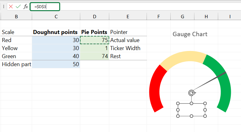
First, let us see the data for the doughnut chart. Range C3:C6 contains three zones (red, yellow, and green) and a hidden part. Use the following rules: The sum of the visible zones should be 100. The sum of all zones (visible and invisible zones) should be 150.
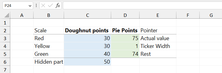
Prepare data for the pie chart series. Use the setup below: The value in cell D3 is the value you want to display in the Gauge chart. The value in cell D4 is the pointer size. If you want to use a thin needle, use 1 or 2. Formula to calculate the value in cell D5 =150 – D3 – D4.
The pie chart series uses three data points. The doughnut series has four data points. The table is ready; go to the next step.
#2 – Insert a custom combination chart
First, select the data and use the range C3:D6. As stated above, the doughnut chart uses the data in column D. The data in column E is for the pie chart series.
Click on the Insert Tab on the ribbon. Next, select the “Combo Charts Group” icon to create a custom combo chart.
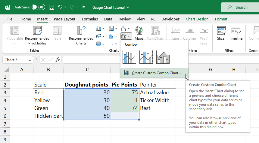
Finally, click on the ‘Create custom combo chart’ icon. The “Insert Chart” dialog box will appear.
#3 – Choose chart types and axis for the data series
Take a look at the Insert Chart dialog box. Select the proper chart type for Series 1 and Series 2. Series 1 represents the data points for the Doughnut chart. Under the Chart Type group, select the doughnut chart type for Series 1. For Series 2, use a pie chart.
Use the “Secondary Axis” checkbox for the pie chart series.
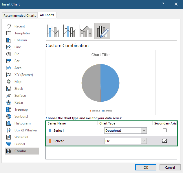
Click OK to insert a combo chart.
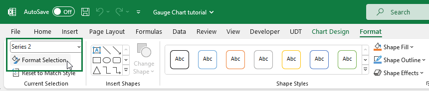
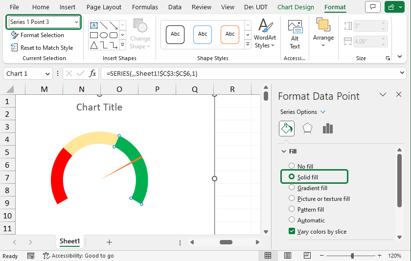
#4 – Select the Pie chart and Format Data Series
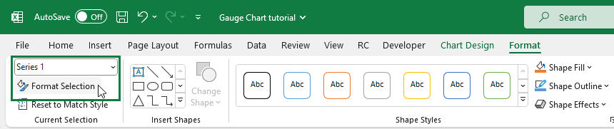
Select the chart area. Next, click the Format tab on the ribbon. Finally, choose the Pie series (Series 2) using the drop-down list in the top-left corner. You can find this tool in the ‘Current Selection’ group.
The next step is to set the angle of the first slice for the selected chart. Click the Format Selection command In the Current Selection group.
The “Format Data Series” will appear on the Task pane. You can find it on the right side of the window.
Under the “Series Options”, locate the “Angle of the first slice” option. Then, move the slice to 240 degrees to the angle of the first slice field.
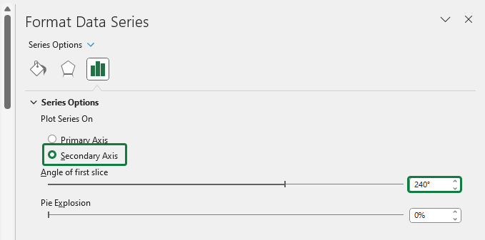
Note: in other cases, you can move the slice to 270 degrees.
#5 – Format Data Series (Doughnut Chart)
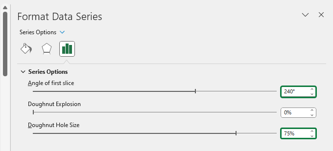
Click on the doughnut chart. Select Series 1 (Doughnut chart series) under the Format Tab > Current Selection group. Choose Format Selection.
Take a look at the Format Data Series tab. Under the Series Options group, you can set up the Doughnut hole size.
Change the default value. Set the Doughnut Hole size to 75%.
#6 – Create a pointer for the Gauge Chart
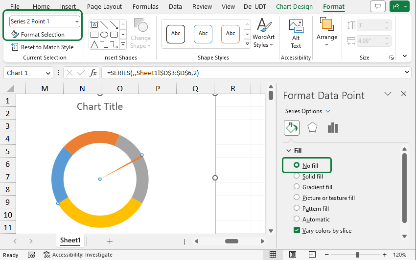
To create a pointer for the Gauge chart, hide two data points from the three. The main point is to hide two data points from the three and create a pointer for the Gauge chart.
You can navigate between data points using the Ctrl and left / right arrow keys. In the example, use “No Fill” for Point 1 and Point 3. Leave Point 2 untouched. First, click on the Format tab, then locate the Shape Styles group. Finally, change the Shape Fill of each point.
#7 – Create zones for the Doughnut chart
Use the same method as the step above. Select the Dougnut Chart series (Series 1) and apply “Shape Fill” for each point. Use red for Point 1, yellow for Point 2, and green for Point 3.
Use “No fill” for Point 4.
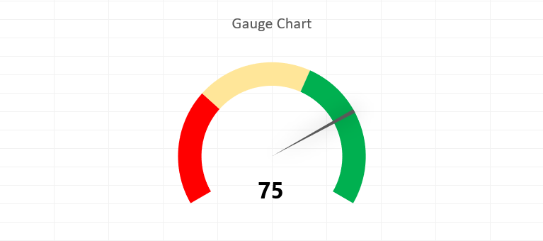
#8 – Clean up and customize the chart
The gauge chart is almost ready. Select the chart, then right-click. Choose “Format Chart Area”. Under the “Format Chart Area” section, apply “No Fill” for the chart background.
Delete the legends, select them, and press the Delete key. Next, select the pointer and add a custom fill color, for example, grey.
Finally, change the chart title.
#9 – Create labels for the Gauge chart
It is time to connect the actual value to a text box. Insert a new text box. Use an equal sign (“=”) to add a data label. Next, browse the cell value (D3) to connect the value to the text box. It’s good to know that the Excel Gauge chart is dynamic. The chart will reflect when you change the value in the linked cell.
Let us see how the actual value changes between 0 and 100. First, edit the value in cell D3. Then, modify the upper and lower limits. Remember the rule: Red zone + Yellow zone + Green zone must equal 100.
Note: If you want to use a dynamic chart title, remove the original chart title and create a new textbox. Place the description (chart title) in a new cell and link the value to the text box. The method is the same as the actual value.
Download the practice file.
Gauge Chart Tools for Excel
In the first part of the tutorial, we demonstrated the step-by-step way to build a gauge chart. However, sometimes you are in a hurry and must create advanced gauge charts quickly. We have an answer for data visualization challenges! To create and manage unlimited numbers of speedometers, use our solution.
This lightweight tool dramatically enhances Excel’s functionality. In addition, it works with Excel without any trouble. Instead of long hours before, creating a dashboard is only a matter of minutes.
To create an Excel Gauge Chart, follow the steps below:
- Install the Gauge Chart utility.
- Click the chart icon.
- The visualization is ready to use.
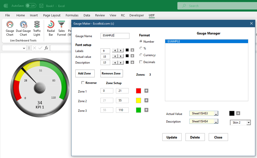
The tool lets you customize your charts using a simple, intuitive interface.
Pros and cons of using Gauge Charts
Is it worth using Gauge charts or not?
Advantages of Gauge Charts
Let’s see why it is so popular! The reason is simple. A Gauge Chart provides actionable insight more efficiently. Here, we’ll see a list containing the advantages of the chart. Using speedometers is a perfect decision if your goal is the following:
- Using one or two key performance indicators.
- Create an alert when KPIs reach a threshold value.
- Create sales vs. target comparison.
- Check the current rating of a product.
- Track project status.
- Create unique dashboards
Disadvantages of Gauge Charts
There are many advantages, although there are some disadvantages also. It is not recommended to use gauge charts if:
- You can show more than two values.
- You prefer simple chart types.
- Not interested in the topic of KPIs.
- You do not have enough space.
- You can display more than two data points.
Case Study: Satisfaction Survey using Gauge Chart
In the picture below, we show a custom solution. Visualizing the result of a customer satisfaction survey is very easy using automated charts.
Creating a speedometer using the regular method can take 10 minutes; using the chart tool can take 10 seconds.
First, add a chart name, then create the zones for the values. Furthermore, you can add or remove zones with a single click. Finally, you can customize the colors, fonts and add a linked cell that contains the actual value.
It is a straightforward solution to build dashboards.
Plan vs. Actual visualization using a Dual Gauge
A dual gauge chart is built to create a plan versus actual comparisons. It is a huge mistake that the speedometer cannot display variance. More than one data point on a Gauge chart is not usual. All the same, it is visually compelling.
Let us see an example:
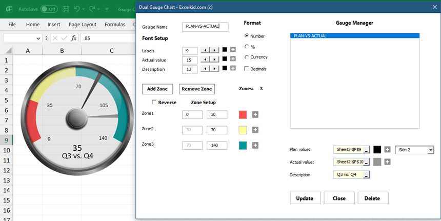
In this case, we want to display the plan and the actual value using a single gauge chart. So, first, add a plan value, then browse the actual value. Finally, click the Create button, and the chart is ready.
Excel Gauge Chart Templates
Now, we know almost everything about gauge charts. In this section, you can find various gauge chart templates. All templates are free and provide help if you want to build your chart.
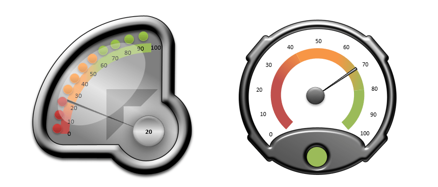
Download the practice file containing four custom gauges.
Alternatives of Gauge charts
There are situations when it’s best to use other solutions. For example, we can show the trend with line charts. The bar chart is great for comparisons, and the bullet chart can be helpful if your goal is to create a target vs. an actual comparison.
Read our tutorial about Excel heat maps. Maps represent the relations of complex data sets where colors display values.
Final thoughts
Speedometers provide great data visualization possibilities in Excel. We can examine one value (radial gauge) or differences (dual speedometer chart); its use is evident. So what can we say about that little group of people who reject its use at first glance? We recommend walking with open eyes in the world of Excel and BI.