A bullet graph is a great data visualization in Excel to show key performance indicators using a quality scale. We will show you how to build a bullet graph in Excel using a few steps.
A bullet chart is an industry-standard and widely accepted tool for displaying the differences between plan / actual values. If you need to build a dynamic dashboard in Excel, this chart is yours.
How to build a bullet graph in Excel
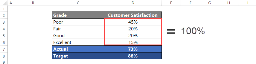
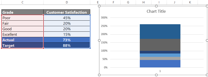
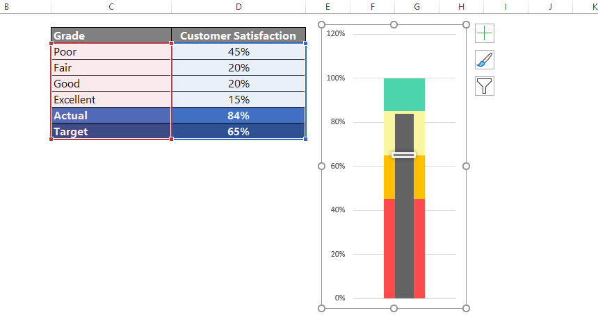
Let’s arrange the data to create the initial data set! The first four rows will show the quality scale. Next, insert a new row and add the actual value. Finally, place the target value in the sixth row.
One more important thing: the sum of the first column must be equal to 100%
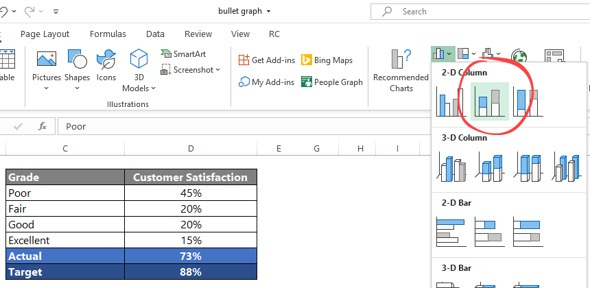
Select range C2:D8 and insert a stacked column chart.
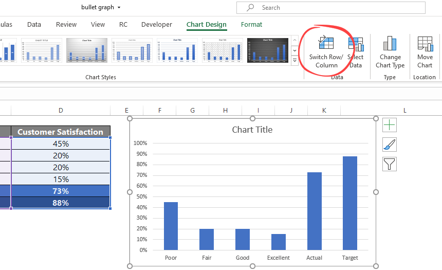
Swap rows and columns
The result is a simple, stacked column chart. We need to swap data over the axis. The data on the X-axis will move to the Y-axis and vice versa.
To do that, select the chart. Next, go to the ribbon, select the Chart Design, and apply the ‘Switch Row / Column’ command.
This function merges the bar charts into one! From now on, all data points are shown on a combo chart. OK, now we have six different areas.
The first four-part is the grade section; the fifth is the target value.
The last one will show the actual value.
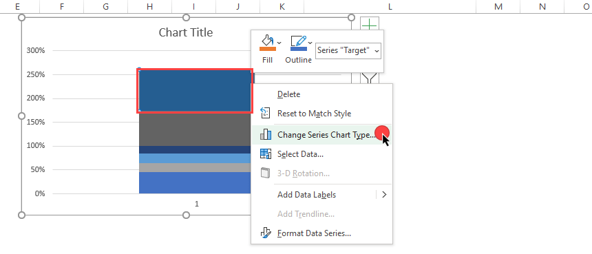
Highlight the target value bar
Let’s see how to highlight the target value section. You can find it at the top of the bar chart. Right-click on the top section and select the ‘Change Series Chart Type’ from the menu.
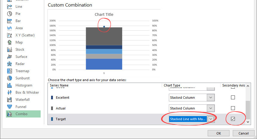
Tip: We’ll work on a single data point (target value) in this phase. Don’t forget: the bullet graph contains six different elements.
We must change the chart type, so use the ‘Stacked Line with Markers’ type on the right-side pane.
Click on the secondary axis checkbox; now it’s active. First, you have to see a filled circle as a target value.
Format the Actual Value Bar
In the picture below, we selected the actual value row. Next, select the secondary axis checkbox!
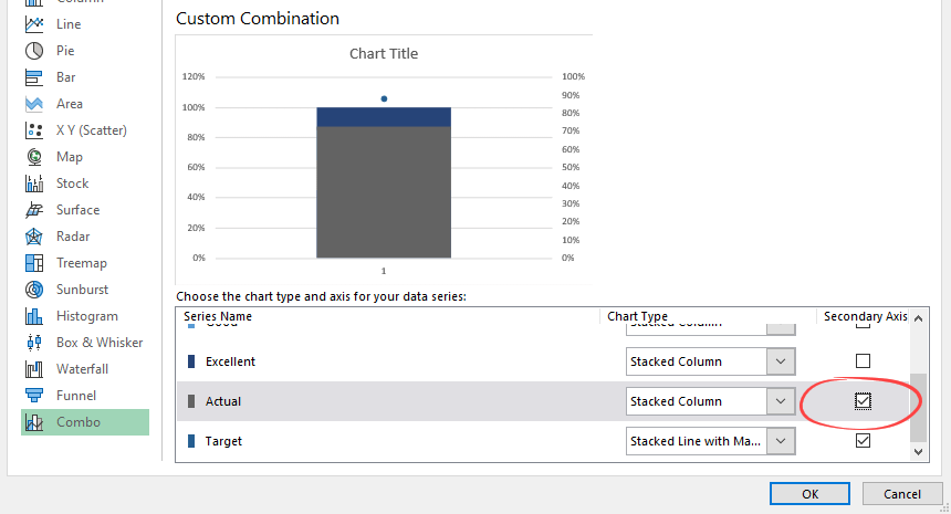
Click OK to close the window.
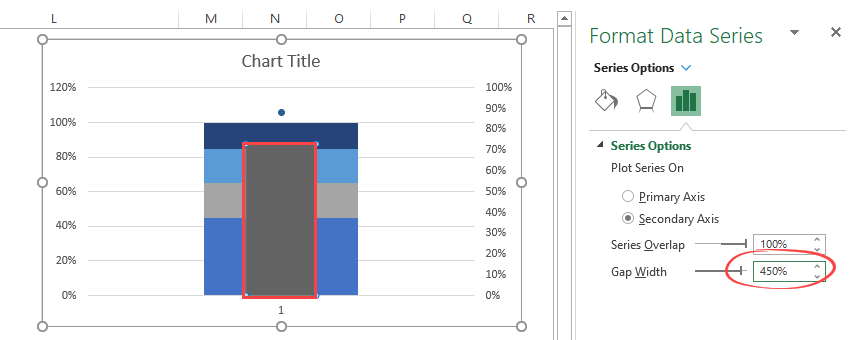
Modify the Bullet Graph structure
We’ll apply a simple trick: right-click on the bullet graph area. Now select ‘Format Data Series.’ (If you prefer this method, use the Ctrl + 1 shortcut.)
We will change the ‘Gap width’ from default to 450% in the example. Using this small transformation will set the width of the chart.
We have set the small marker as a Target Value, as we mentioned above. It’s time to create a bullet graph marker from a single data point.
Select the data point. After that, right-click and choose ‘Format Data Series.’ To increase the size of the point, apply the steps below:
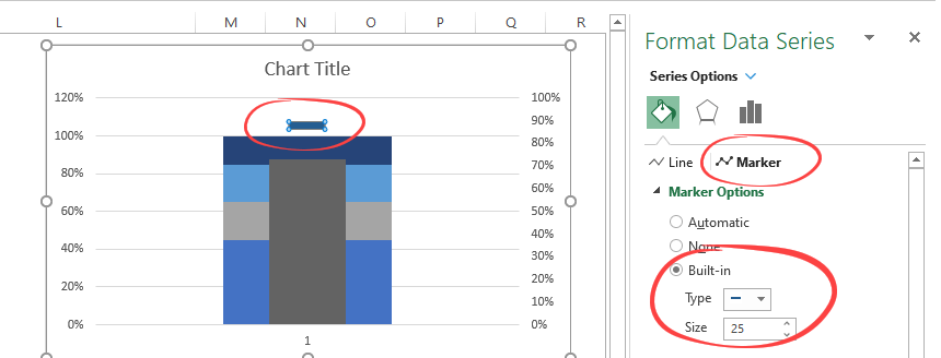
Locate the Fill & Line tab. Select ‘Marker Options’ and choose a line-type marker. Because the indicator is slightly thin by default, increase the built-in marker size to 25 or 30. Now the bullet graph looks better.
It looks like we are ready! We have only two simple steps left. First, clean up the chart area and remove all unnecessary chart elements.
Because we want to display only one axis, delete the axis on the right side of the bullet graph! Select the axis and press the ‘Delete’ key.
Finally, you should pick a color scheme that is perfect for your concept. We recommend using the classic KPI color scale from dark red to green.
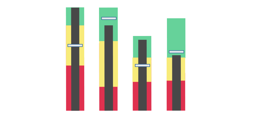
Here is an example:
Now we do have a good-looking graph! So, the selected color combinations depend on the dashboard you need to create. Of course, you can use the one from the example, but we believe the KPI markers combination of red-yellow-green.
Bullet Graph Add-in for Excel
If you want to create bullet charts ASAP, we recommend using our chart add-in. We are familiar with VBA programming, so we’ve created a simple and clean user interface for you.
We first list the qualitative categories and the plan / actual values. Then, in the second column, we list their stripes. And the third column is exciting. We can pre-set the color of the given bars, so the combinations’ possibilities are endless.
Should I use Gauges to replace bullet charts?
At the end of the article, it is timely to ask this question. Let’s see the advantages and disadvantages on both sides.
A bullet chart is a versatile tool (as you can see), but it has its limits. The biggest of them is that we can mostly use it only between a 0% and 100% range. This fact dramatically affects its utility. On the other hand, its advantage is the small space it requires. So naturally, the chart add-ins have such benefits that experienced report developers can fully take advantage of.
Experts recommend the gauge chart to show KPIs on a dashboard. The gauge chart presents an outstanding user experience that is unlike other charts. We don’t understand why it is not a default chart type in Excel. On the other hand, 8 out of 10 CEOs would vote for the speedometer type of display.
Thanks for being us! Download the workbook and stay tuned.
Additional resources: