In this article, you will learn about key performance indicators. Is it easy to create a KPI? From the technological view, yes.
Before we dive deep, just a few words about creating a useful KPI. Remember that context is key if you work in analytics and your job involves KPI reporting or dashboard design. When you share numbers without context, you ask the end user to draw their conclusions. Don’t do that!
Context is Key
It’s like a doctor telling you that your Triglyceride index is 12.9, just walking away. Should you be happy? Concerned? What the heck is a Trygliceryde index anyway, and why should you care? The same logic applies to BI and Key Performance indicators. Context makes raw numbers mean something and helps people interpret them correctly.
Here are a few simple ways to add context to your KPIs:
- Measure against comparable periods
- Compare against targets or benchmarks
- Show trending and seasonality
- Compare against highs and lows
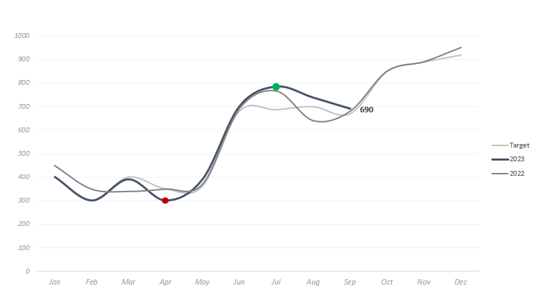
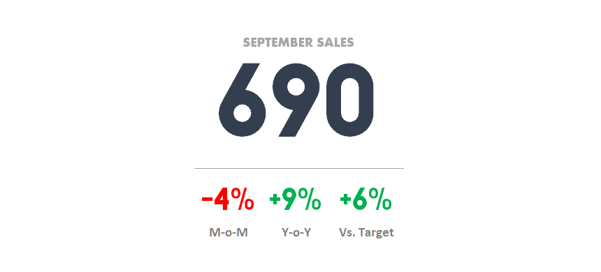
In the example, we could have just shown the September Sales figure of 690 and called it a day. But by adding context, you can tell a much more meaningful story; sales are down a bit this month but still above target and better than last year. We see an upward trend in 2022, but still well below our July high. Based on the seasonality, we can expect a strong Q4.
KPIs are essential when you build dashboards in Excel. We have to give these values to create a key performance indicator. So keep your eyes on the business goals.
What is the right chart type for KPIs?
Use gauge, bullet, or some built-in Excel charts to show the indicators! Of course, it depends on the content, i.e., according to a given period, branch, product group, or other criteria.
But the challenge does not lie here but in the choosing of KPI. Could you tell which one is that 5-10 KPI, or can we call it a performance indicator by which you can monitor the achievements of your field? Could you create 5 or 10 KPIs with your field’s success criteria and your department’s value-saving ability?
What is the most important KPI?
Let’s say that you are a CTO. You are a very busy man with not much time on your hands. Wouldn’t it be good to have a report that you can look at every morning and see the values that your department has added to the company’s success?
You can see that all IT procedure is running fine, and you can track the IT expenditure compared to the plan, see the levels of the IT projects, and see how the goals and expectations of your department are realized, etc.
It would be good if there were only a few indicators, and it could be arranged. But what should these indicators be? Again, thanks to the business intelligence solutions, displaying the KPIs is not a great challenge. However, choosing them is a complex and time-consuming task.
Build KPI Templates from scratch
Multiple departments and significantly related business processes can be mapped within a company. These days, we can apply 50+ indicators at a moderately sized company. We want to show everybody the world of performance measuring with the help of the articles of the KPI category.
A performance report can be a valuable tool for reaching business goals. But, was this enough reading for you? This article aims to show you how to build better reports.
As usual, key performance indicators can be linked to three statuses. If the indicator is red, we know something is not going well with the examined process, and we must intervene immediately. Although we are not too far from the plan, the yellow sign alerts us that the reviewed procedure, in our case, the marketing, needs increased focus. The green light needs no explanation when we see this on the report. Then, all is in the best order.
Case Study
Save your time and boost your productivity using KPIs. We recommend using the template if you want to keep your key performance indicators up-to-date. Multiple reports are not necessary anymore!
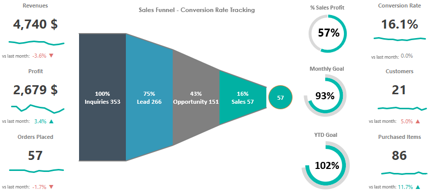
You can navigate easily between worksheets using the menu on the ribbon. This free KPI template uses a grid layout and allows you to track the most important sales metrics. You can compare the most important indicators and check the monthly and YTD goals.
The template demonstrates the business impact of the recommended actions. Decision-making gets easier!
We use a sales funnel to get helpful information to evaluate a company’s performance. The simplified design provides the best readability for end users. For example, if you want to display a monthly breakdown, the best choice is to create a drop-down list.
You can track these KPIs below:
- Conversion Rate
- Monthly Goal
- YTD Goal
Conclusion: Everything wants KPI
These days, business intelligence systems have KPI support. With their help, we can create a performance report to place our most important indicators. In addition, we can give a management tool by which they can oversee the fields under their responsibility; they can see all of its movement and notice right away if it differs from the balance course.
This is a sharp weapon that Business Intelligence Solution providers utilize. They make people believe that they will create reports of these KPIs if they buy their product. Afterward, they have nothing to do but look at the report during the morning coffee and ensure everything is going well. As in charge of business intelligence, we help systematically gather existing KPIs. Unify the KPIs, but it is the management’s task to choose the most important management indicators in the future.
Check our data visualization and chart add-in if you are in a hurry.
Additional resources: