Use a Call Center Performance Dashboard in Excel to track KPIs, like Abandon Rate, FCR, or Abandon Rate.
The task is simple. Create a simple template using a weekly basis to take a quick overview of the call center’s performance. This article is a part of our Excel dashboard tutorial.
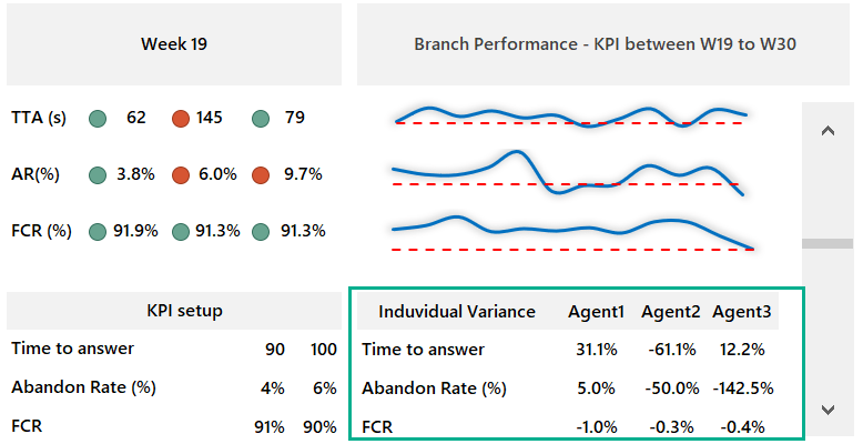
How are call center metrics measured? In the example, we’ll use three common call center metrics. Take a closer look at this KPI template and download the practice file.
We’ll use three KPIs:
Time to answer: We are using seconds to measure this KPI. The most used rule is to answer 90% of calls within 20-25 seconds. In the example, you can freely configure the required and accepted range.
Abandon rate (%): The abandoned calls rate shows how many clients disconnect before they can speak to an agent. Rate = Abandoned calls / Total inbound calls.
First Call Resolution: FCR measures the percentage of customer calls that are resolved in a single interaction.
Call Center Performance Template
Essential tools:
- VLOOOKUP formula to find values in the ‘Data’ worksheet based on a selected cell.
- Conditional formatting is a great way to visualize KPIs.
- A scroll bar helps us to track changes week by week.
- Line charts to display the call center performance on the selected week
A closer look
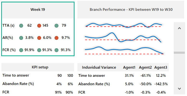
You can show weekly results by using the scroll bar to change weeks. If you want to change the week, click on the scroll bars arrow, and Excel will refresh the data in real time.
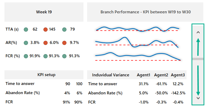
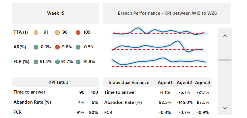
KPI Section
If you are tracking a call center performance, using rag reporting (Red – Amber – Green) traffic light style is crucial. With conditional formatting, the task is easy.
Under the KPI setup, you can apply minimum and maximum values for your indicators. Based on these rules, you can track the weekly performance in the top-left corner of the template.
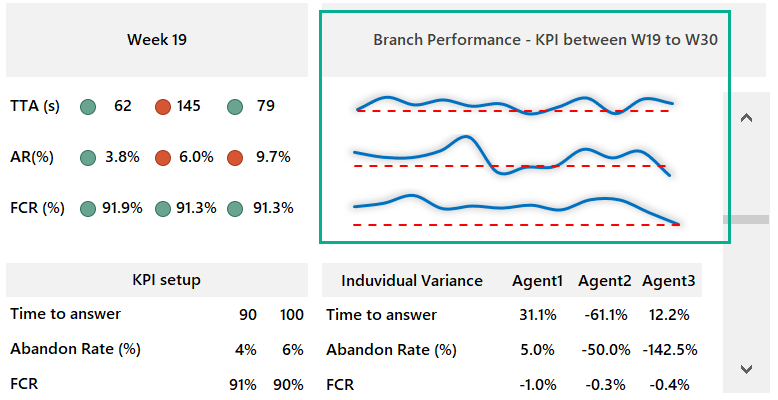
Tracking Branch performance over a 12-week period
Based on the selected period, you can compare the main indicators at the branch level. You want to show the average with a red line and the actual value. A smoothed line chart is great for this purpose.
Variance
Do you want to check the differences between Agents? No problem. It is possible to take a deep dive into the details in the bottom-right corner of the template.
Thanks for being with us today!