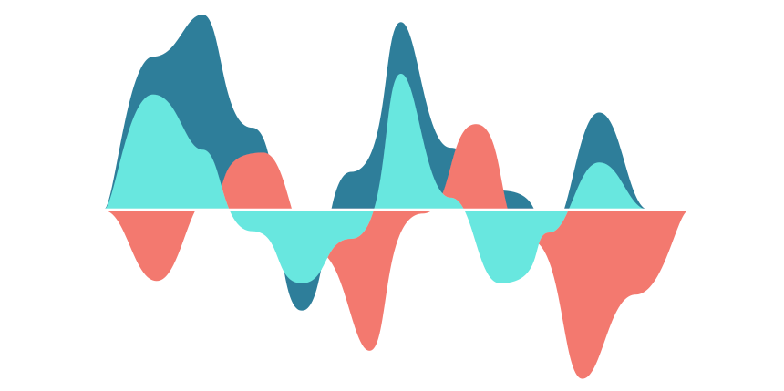
Using a stream graph in Excel, you can visualize multiple categories and easily recognize highs, lows, and patterns.
We are happy to share our latest chart template and show you how to build a stream graph from the ground up.
How to create stream graph in Excel
#1 – Prepare data
In the example, we’ll show five cities’ sales performance over time using the stream graph. The first thing that we have to do is to create a date scale using days. In column B, enter the days’ numbers from 1 to 68. We’ll show this period on the main chart. After that, create a scale in column C. Because we would like to use an easily readable chart, split the day sequence into five-days intervals. Then, between columns D and H, enter the sales data for the given locations.
Finally, insert a new column, Region.
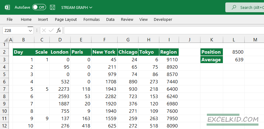
To calculate the values, we need to use the following formula:
=CEILING($L$2-SUM(D3:H3)/2+$L$3,10)Note: Copy the formula down! The CEILING function rounds numbers up to the nearest multiple of significance.
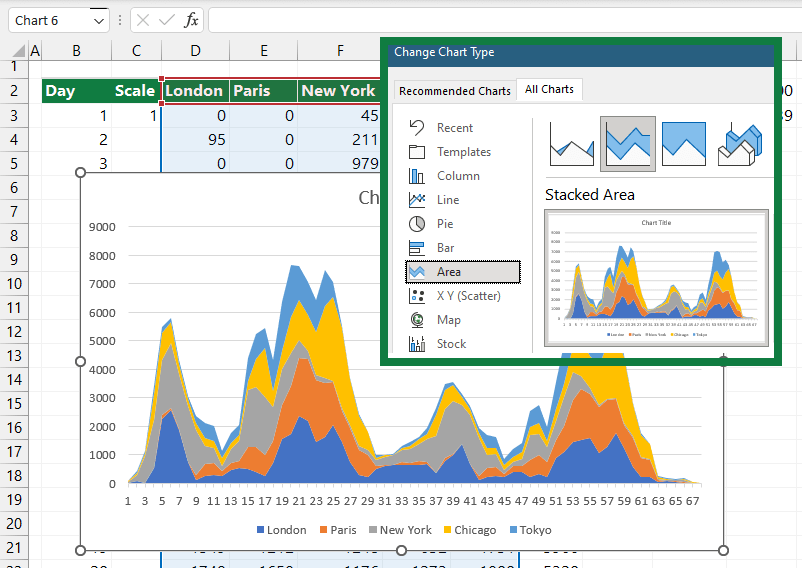
#2 – Insert a stacked area chart
To insert a stacked area chart, follow the steps below:
- Select the range that contains the sales for all Locations
- Click on Insert Tab and choose ‘Insert Recommended Chart’
- Click on the All Charts Tab
- Select the Stacked Area Chart
- Insert the chart
#3 – Add a new series to Stream Graph
We need to add a new series to the chart that contains the values in the column Region. Use the following steps:
First, right-click on the chart area, then choose “Select Data”.
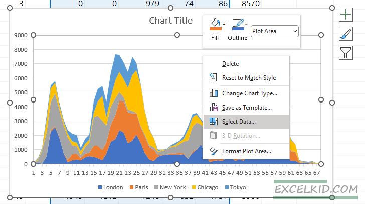
The Select Data Source window will appear. Then, under the Legend Entries (Series) section, click Add to add a new series.
The Edit series window appears:
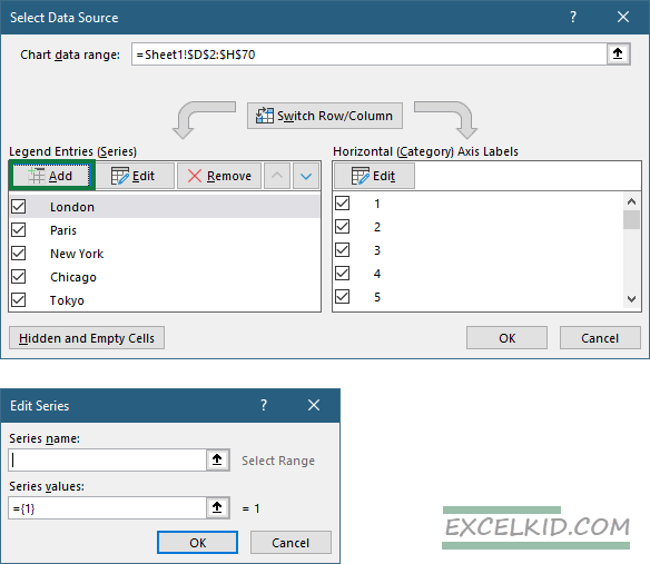
Enter a name for the newly added series; Region. After that, add series values by clicking the browse icon. Use the range I3:I70 as a source range. Click OK twice to close all windows.
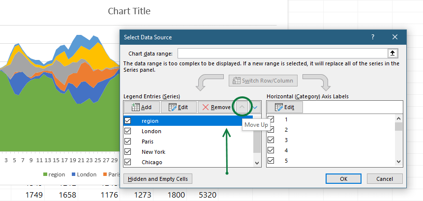
#4 – Change the position of the Region series
The next step is to change the series order and move the Region series to the top. Finally, open the Select Data Source window by right-clicking on the chart. Right-click on the chart area and move the Region series at the top.
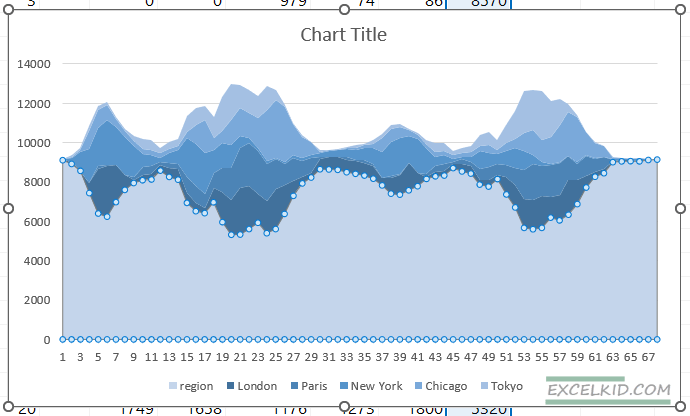
Now our stream graph looks like this:
#5 – Improve the stream graph
The last step is to apply a ‘No fill’ option on the bottom series and choose your color scale for the chart. Additionally, you can clean the chart and remove all unwanted items, like borders.
Additional resources and related articles: