
Learn how to build a forecast chart in Excel! It is a custom combination chart that uses one column and two line charts. This article will show you how to create a simple forecast chart using conditionally formatted colors.
What is a forecast chart?
Let us see the main task: we want to show the trend of the last period. In standard graphs, you can configure this view with a red arrow at the end of the line if we are in a recession and green if there is a rise.
Prepare Data
Okay, prepare the data!
The secret is to create a table using three series using the Data, Positive and Negative labels.
We will apply a green arrow if the last month’s performance is better than the past period. Elsewhere we will use a red arrow.
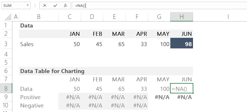
We should have to leave empty the last cell in the Data row. Why? The answer is simple. We don’t want to show this point on the chart. How to do that?
Use the “Not applicable” function to hide the given data points for charts. For example, enter the function in cell H8.
Let us see the positive and negative series!
The first four months are unnecessary because we want to display the differences between the last two months.
To hide the unnecessary lines, we will enter the “Not applicable” function into the range from cell C9 to cell F10. Then, we’ll calculate the missing values using a simple IF function.
We will hide the positive series if the actual value is higher than the previous month’s.
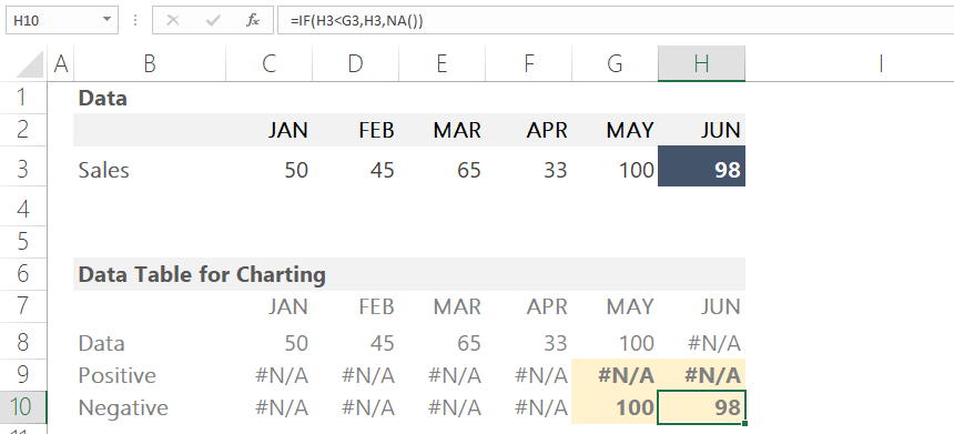
If the actual value is lower than the previous month’s value, we will show the data points for the red arrow.
Apply the following formula for cell G9 and cell H9.
=IF(H3>G3,G3,NA())
=IF(H3>G3,H3,NA())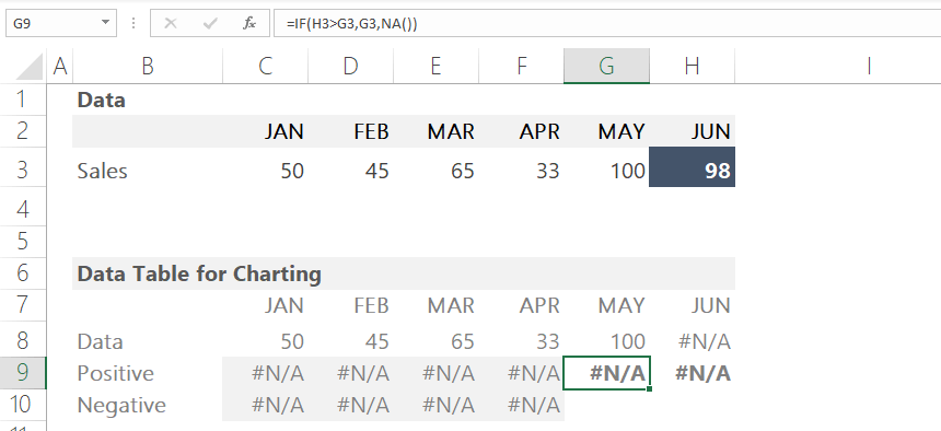
Use this formula for the negative series too.
Create a sales forecast chart
Now select the data range! Next, click on the Insert Tab and choose a line chart.
We will format the chart based on our rules. First, type a value in cell H3 greater than the previous month to create a green line.
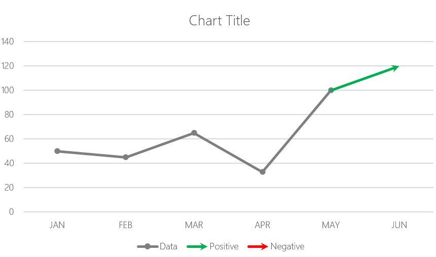
Select the last data point on the chart! Right-click and select Format Data Series from the list. Change the default color to green in the “Fill & Select” section.
Locate the ‘End Arrow Type’ field and click on the arrow icon. Now change the value in cell H3 and enter a smaller value than the previous month’s data.
Change the default color to red in the “Fill & Select” section.
Format the chart, and add a chart title and markers for the data points if you want.
Conclusion
To build a Sales forecast chart, you have to use only a few small tricks, like the NA() Excel function.
That’s all. Download the Excel Workbook!
Additional resources: