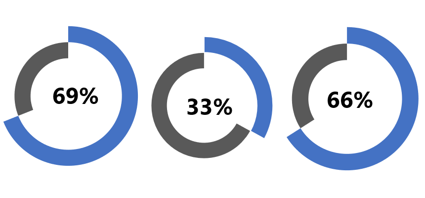
The progress circle chart displays the percentage completion towards a goal. We’ll use special formatting tricks in Excel.
Instead of boring graphs, use our chart templates to quickly present your data using a progress circle chart.
This Excel progress chart will come with a fully updatable graph. Modern Excel charts and templates are easy to build using built-in shapes, icons, and other custom formatting tricks to grab your audience’s attention.
If you are in project management, the progress chart is one of the best choices to track the completion of projects. We love this chart type because it allows us to track and display the progress of a single performance indicator. In addition, we are using infographics if we create dynamic dashboards in Excel.
Steps to create a progress circle chart in Excel:
- Set up the source data and the remainder value
- Create a double doughnut chart
- Apply custom formatting for the inner and the outer ring
- Assign the actual value to the Text Box
Build a progress circle chart in Excel
The point is that you need only two doughnut charts and a simple formula. So, let us see how to make it from the ground up!
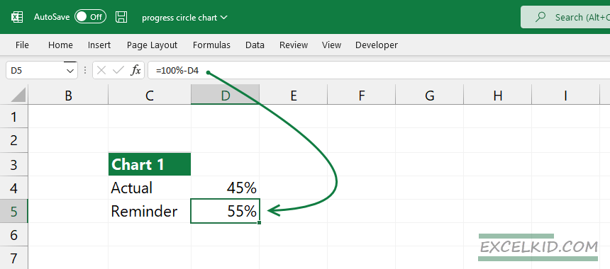
#1 – Set up the source data
First, we need to do is set up the source data. Create this initial data set below. Cell D4 will show the actual value. D5 displays the remainder value as 100%. Add the actual value, for example, 45%. After that, calculate the reminder value using this simple formula.
= 100% – D4The result is, in this case, 55%.
#2 – Create a double doughnut chart
In this example, we’ll show you a new method to create a progress circle chart. First, select the range that contains chart data. Next, go to the Ribbon, locate the Insert Tab, and select a doughnut chart.
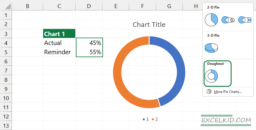
Now, remove all unwanted items from the chart area. Delete the background, title, and borders.
Select the chart and press Control + C to copy it. Next, press Ctrl + V to duplicate the doughnut chart.
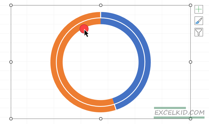
Now we have two rings. Select the reminder value section of the outer ring. Right-click, then choose Format Data Point. Use the ‘No fill’ option.
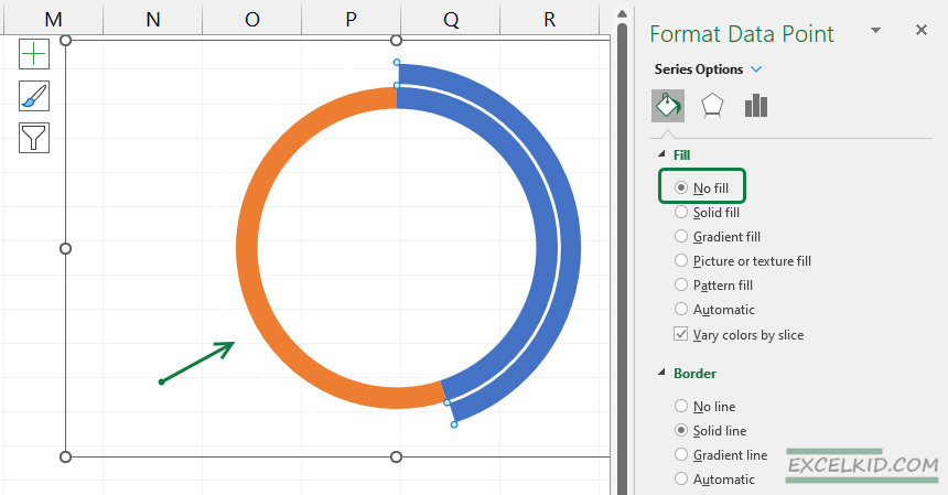
Let’s see the inner ring. First, select the actual value section. Then, apply the ‘No fill’ option.
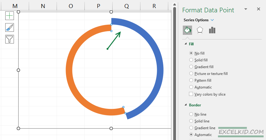
You can modify the doughnut hole size property. In this example, the value is 63%. Finally, apply your preferred color theme. Again, we strongly recommend using flat colors like blue and grey.
#3 – Insert a Text box and connect the actual value
Lastly, we’ll prepare the label for the actual value. To do this, click on the Ribbon and choose the Insert tab. Insert a Text Box. Clean up the object, remove the background and border from the Text box, and then link the actual value (in this case, cell D4) to the text box.
Select Text Box. Go to the formula bar and press “=”
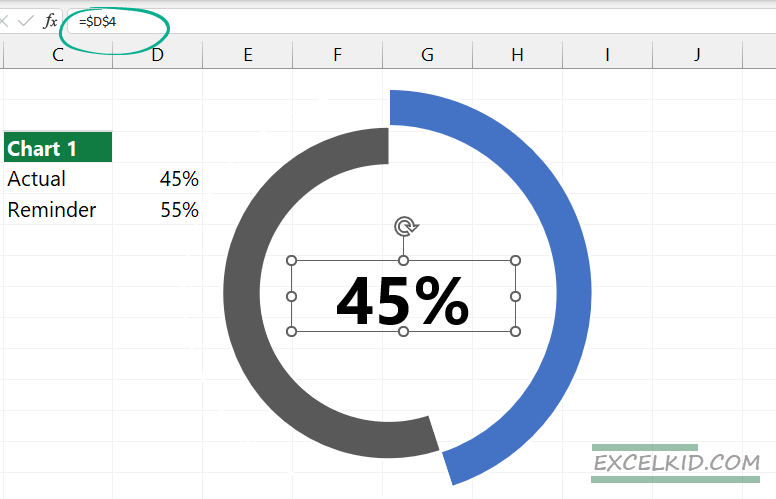
From now, if you change the actual value, the progress circle chart will be reflected in real time. In this example, our text box is not part of the chart by default.
If we move the chart, the text box holds the actual position. Hmm, very frustrating. Lock the text box and the chart in position! If we are grouping Excel objects, we can keep them in place.
How to group objects in Excel?
- Select the Text box
Click on the text box (which contains the value) and select it.
- Press Shift key
Hold down the Shift key as you click on the object you added.
- Click the Chart border.
Continue pressing down the Shift key as you click the chart border.
- Release the Shift key
Release the Shift key. The chart and the text box remain selected.
- Click the Format Tab to group objects
In the Arrange group, click the Group and select the Group option.
Quick Tip: We sometimes have to go over 100% regarding actual value. What should we do? The solution: Use this modified formula for the remainder value.
=MAX(100%,D4)-D4This transformation will modify the remainder value to zero. As a result, the donut chart will be filled with the progress complete color. The text box will show the correct percentage, too.
Progress Circle Chart – Advanced Formatting Tips
If you want to pimp, your chart applies a unique formatting method. We’ll show how to create a great-looking graph without using complex formulas.
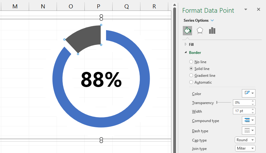
Insert a simple doughnut chart. In this case, we are using the built-in chart type. Select the actual value section. Right-click and format the data point.
Use these settings below:
- Border Width = 12px
- Border Color = White
- Cap Type = Round
- Join Type = Miter
Final Thoughts
The progress circle chart is an easily understandable solution if you need a clean and lightweight presentation. However, if you are in a hurry, use this graph to visualize your key metrics!
Additional resources: