
This tutorial will show you how to create a radial bar chart in Excel using stunning visualization to compare sales performance.
Good to know that a radial bar chart is one of the best solutions to create impressive infographic-style visualizations. Data visualization is king! First, let’s see a short introduction! After this, we’ll take you through creating the chart step by step. Finally, we’ll show you the VBA-based solution.
What is a radial bar chart?
A radial bar chart is called a multilayered doughnut chart because of its layout, but it is better to call it appropriately by its usual name because its origin is from the bar charts. It can help you get a better perspective on the numbers in your data, whether it relates to sales comparison, production, demographics, or more.
This article is a part of our Chart Templates series.
Radial Bar Chart: Differences between Cartesian and Polar coordinate systems
The radial bar chart evolved from the classical bar chart. The difference is that one uses polar and the other Cartesian coordinate systems. Let’s see the comparison with the help of a simple figure. On the left-hand side, we can see the info-graphics-style graph and, on the other hand, the classical bar chart.
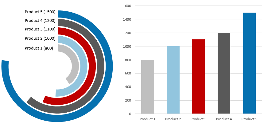
Even if you are not familiar with data visualization, you can easily decide that the bar chart is very easily understandable at first glance.
What is the reason behind all this, and when is it more useful to apply one solution? As we have said, the radial bar chart represents a much higher visualization level. The problem is that our eyes are used to boring, ordinary charts and may misinterpret their meaning. Every column (bar) closes at a different angle, so the differences look relatively larger / smaller. This is most true about the outer rings.
Finally, we can conclude: Use a bar chart if the goal is to create an old-school report. But if our object is to build an impressive presentation, we can bravely choose the new generation of data visualization. If you follow this subject closely, you have seen that, for example, Tableau can create the chart in question. The time has finally come to enable Excel for this task.
How to create a radial bar chart in Excel?
Steps to create the base chart
This tutorial will show you how to create a radial bar chart to measure sales performance. First, let us see the initial data set! After that, we’ll compare five products.
Step 1: Check this range below! You can include the Product Name and Sales fields. The first field is placed in column ‘B’, and the second field is in column ‘C’. Using this data set, we’ll build a colorful radial bar chart in Excel.
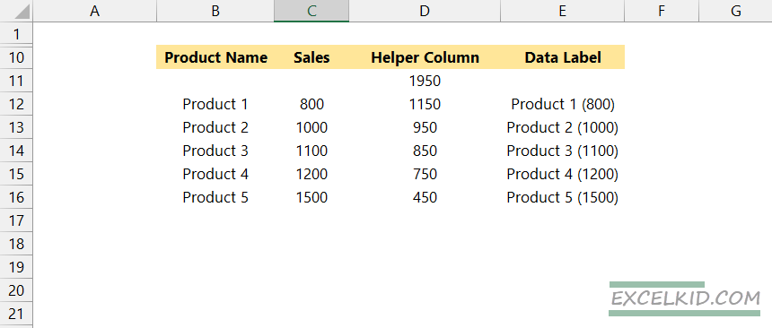
Step 2: Insert a helper column using column D. Enter the following formula in cell D11:
=MAX(C12:C16)*1.30Step 3: Add the formula “=$D$11-C12” to cell D12 and fill down the formula using the range “D12:D16”
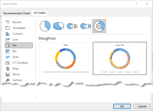
Step 4: Select the range “B11:D16”. Then, go to Ribbon and Insert tab, Chart, and Insert a Doughnut Chart.
text
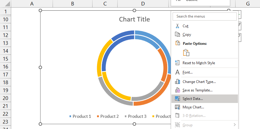
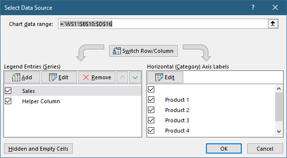
Step 5: Click on the inserted chart. Select the chart area. Right-click on the chart, and finally click on Select data”. Excel will open a new window.
Step 6: Click on the Switch Row/Column button.
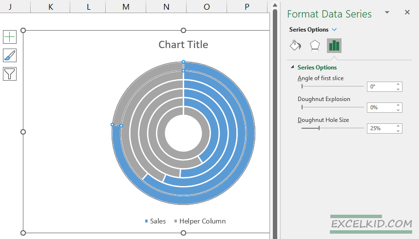
Step 7: Now, right-click on the doughnut and click on Format Data Series. Choose the donut hole size slider and set it to 25%.
Step 8: The most important step! Select the outer ring. Use the right-side pane and fill the orange area as No fill. Repeat these steps for the inner slices too.
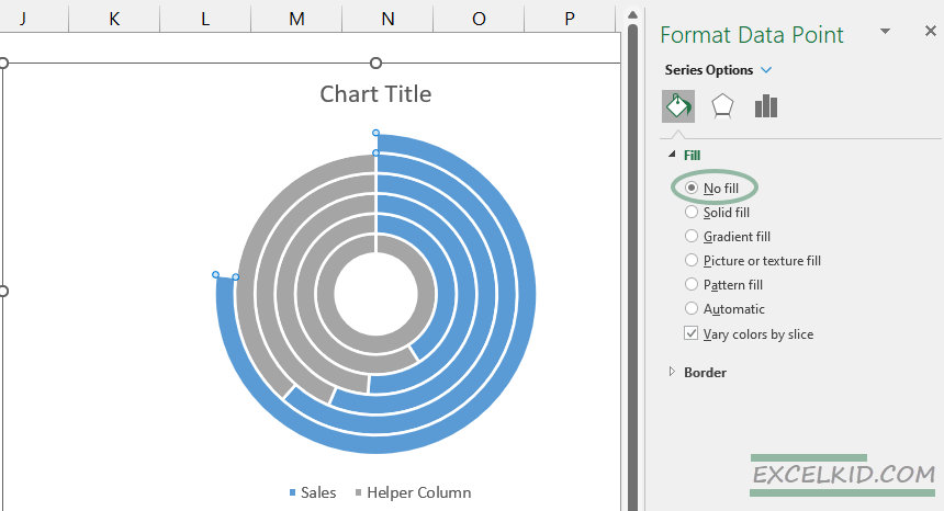
Step 9: Select the first grey slice and fill it in as your favorite color. We strongly recommend using divergent color schemes. You can create stunning schemes using ColorBrewer.
Prepare the labels for the radial bar chart
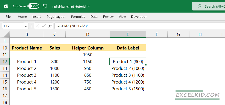
First, create a helper column for the data labels on column E. Then enter the formula =B12&” (“&C12&”)” on cell E12. You can use the CONCATENATE function also. Finally, fill down the formula for “E12:E16”.
Go to the Ribbon, and click on the Insert tab. Insert a Text box.
Now we’ll create a linked cell to the Text box. First, select the inserted text box. Next, jump to the formula bar and type: “=$E$12”.
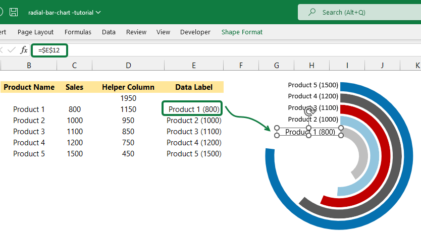
Insert the four more textboxes and link with cells D13, D14, D15, and D16.
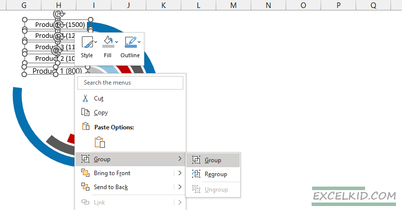
Format the labels together to create Groups
Hold Ctrl and select the five text boxes. Right-click, then choose Group from the list. You can apply various formatting methods. First, use No fill to create a transparent background for text boxes. Next, remove the border and select your favorite font.
The radial bar chart is ready to use!
Radial bar chart add-in for Excel
As you can see, it is not rocket science to create such a visualization in Excel. Of course, it needs manual work, but it’s manageable with some time. But what if we need to make ten, twenty, or even more charts in a short time? Excel doesn’t contain this type of chart as a default. Fortunately, there’s an automated answer for this challenge.
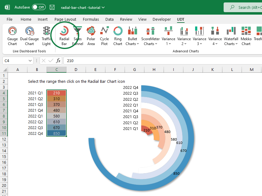
UDT is a professional Excel data visualization and chart add-in containing many special chart functions.
You can create spectacular presentations in two steps (in a mare of seconds). The dynamical radial bar chart is ready after giving the initial data sets with only one click. We don’t need to explain how much easier this makes the daily life of those involved in infographics.
The add-in is easy to use; you don’t have to go outside Excel to complete these. The workflow is easy and allows you more productivity. You can focus on your primary business goals!
Final thoughts
The relationship between Excel and the radial bar chart didn’t start easy because we had to close a hole. But the work is worth it; we get a custom, easy-to-read graph. So if you need to build a sales comparison, we strongly recommend its use.
If you are familiar with VBA, you can create unique charts. Furthermore, you can automate everything with its help that has anything to do with Microsoft Office. Let it be Excel, Word, or even PowerPoint.
Additional resources: