
Learn how to create a multi-layer doughnut chart in Excel using advanced data visualization for dashboards and reports.
If you are looking around our website, it is clear that we love data visualization and frequently use chart templates. In today’s guide, we will explain how to improve a default doughnut chart and create a graph with better usability.
Multi-Layer Doughnut Chart: The Basics
The main point of using a multi-layer design is to show multiple data series. The chart is easy to read: the highest value uses a wide ring, and we display the lowest value using a thin ring.
In the next chapter, you will learn how to create the chart from the ground up.
You can download the practice file here.
Steps to create a Multi-layer Doughnut Chart
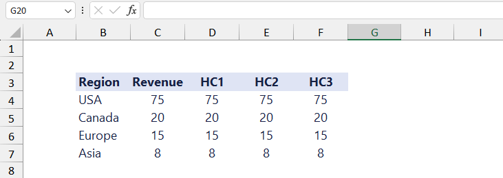
The first step is to prepare and sort your data set. You need to follow a simple rule: sort the data in decreasing order for the proper visualization.
Here is the initial data set. Columns B and C contain the regions and their revenues. To create the proper chart layout, insert three additional helper columns.
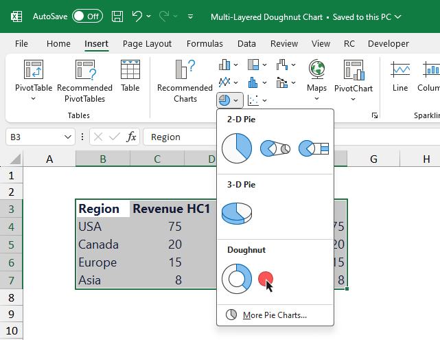
Select your data, in this case, range B3: F7. Insert a new Doughnut chart. To do that, select the Insert Tab on the ribbon. Use the drop-down menu and select a Doughnut chart.
In the example, we will use a divergent color scheme for the chart. Here is the list of color codes:
Orange: #e66101
Light orange: #fdb863
Light purple: #b2abd2
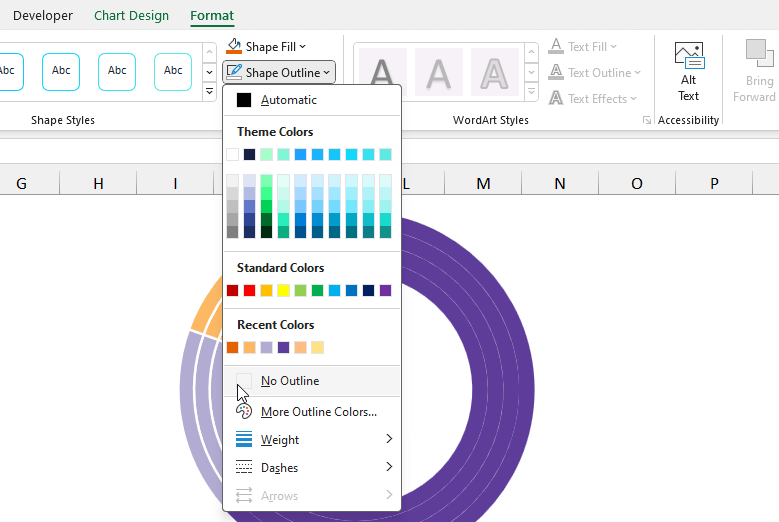
Purple: #5e3c99Now, it is time to format the chart. The first step is to remove the white borders around the chart series to improve visibility.
Select the series you want to format. After that, locate the Format Tab on the ribbon. Choose the ‘Shape Outline‘ option from the menu, then choose the ‘No Outline‘ option.
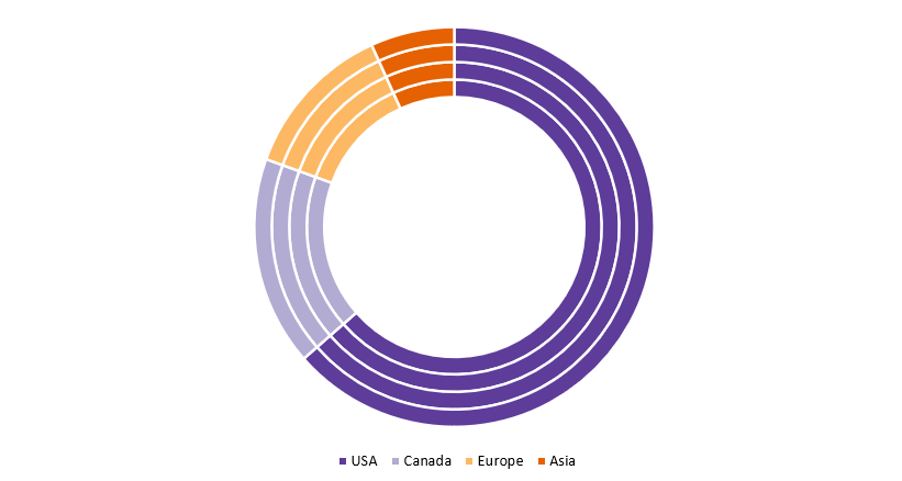
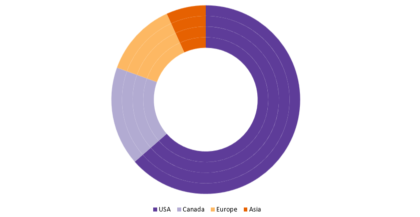
Repeat these steps for all series. Next, change the Doughnut chart hole size to 65%. The multi-layer doughnut chart looks like the picture below:
Customize the chart
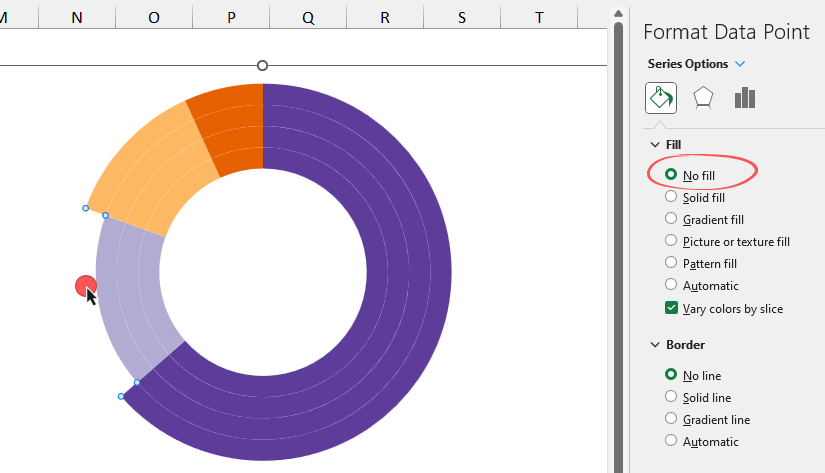
The main point is that you need to hide some parts of the charts to improve the design of the multi-layer doughnut chart. Select the part of the series you want to hide. Under the Series Options menu, apply ‘No fill’ for the selected section.
Based on the above-mentioned logic, use a single doughnut for the smallest value and keep the rings untouched for the maximum value.
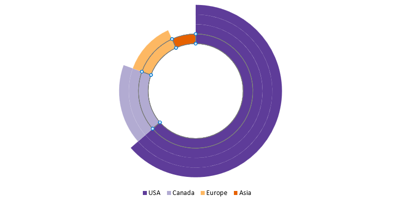
Chart Design
The chart is almost ready; apply some small improvements.
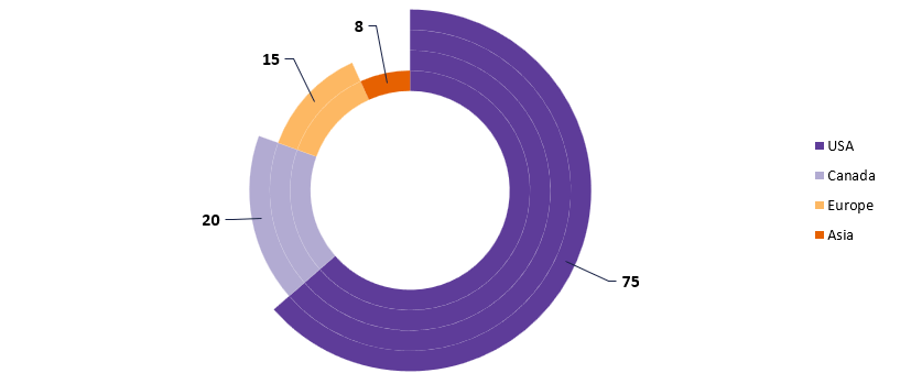
- Align the legend and move it to the right side of the chart area.
- Choose a nice color theme
- Add data labels; use connectors instead of bubble-style labels
The final multi-layered chart design looks like in the picture below:
Additional resources: