
As developers, it’s a challenge to pick the right color combinations for Dashboards. This guide shows the best color schemes and palettes.
Before we dive deep into the sea of dashboards, let’s wait a minute! A carefully picked color combination provides a clean look and makes your key performance indicators easily readable. Because every developer follows the ‘users first’ rule, building a user-friendly and color-blind safe application is the most important thing. Today’s guide will explain the most used color schemes.
Dashboard Color Schemes
Single Hue color scales
If you want to visualize only one variable, using a single-hue color scale is best. In the example, you want to create a simple heat map using Excel and conditional formatting. As you’ll see, there is a huge difference in visual quality.
The standard rag reporting uses green for high, amber for the midpoint(s), and red for the low values. Sometimes vice versa. The chart on the right side uses a single-hue color palette based on blue.
Please compare the original visualization and the single-hue color-based chart:

If you use the standard colors for RAG reporting (red, amber, green), you will face some visual clutters. You can lose focus while you try to analyze the data.
Divergent (Two-Hue) color scales
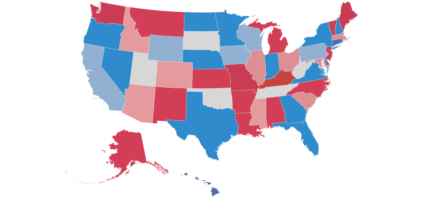
If you are mapping data and want to show the low, neutral, and high data points, using a divergent color scale is best practice. The purpose of using divergent colors is to quickly identify the transitions from the three states of KPI.
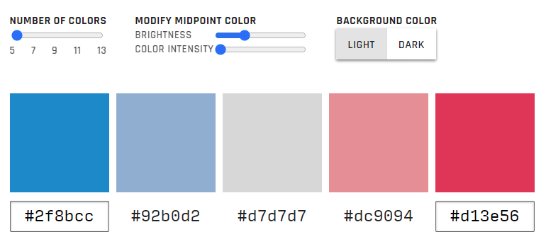
Let us see an example! The US map below shows the election results in each state. Use these color combinations to mark the midpoints as white (or light grey). The example uses five colors, but the blue, white, and red scales are perfect.
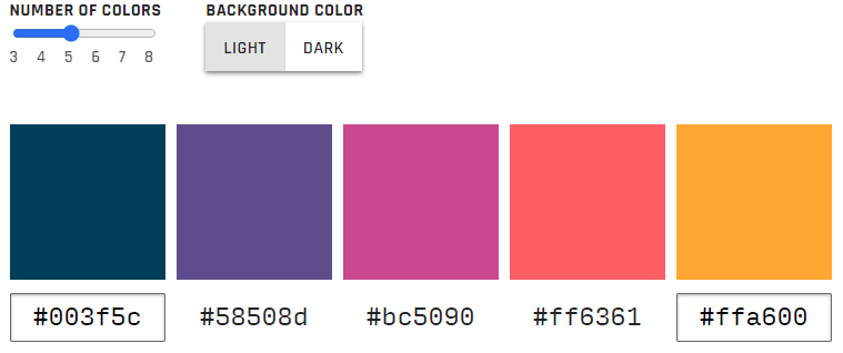
Multi-Hue Color Palettes
Sometimes, you need to find the right color palette. It can happen if you are working with multiple categories.
Now, let us see an example. The visualization shows the website traffic by source.
Everyone knows the stacked bar chart that uses some analytical software, like Google Analytics, Webmasters, or Data Studio.
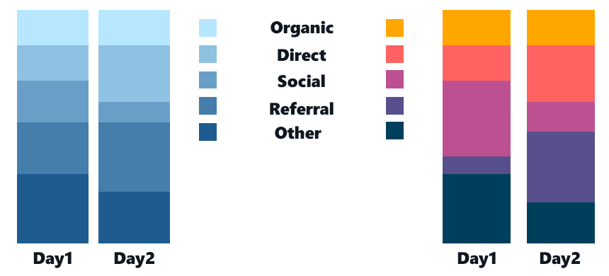
To visualize pie charts or bar charts, create a series of colors.
Tip to pick the right palette:
- Try to choose very different start and endpoint colors. Your chart will look great if you are choosing warm and cool colors at the same time. You can identify highs. lows and peaks with this palette.
Highlight key information using contrasting color combinations
In the following example, I’ll show you another useful technic. The chart uses contrasting bright, saturated hues with light greys to highlight the key information.

You can apply neutral greys to move the information into the background (temporarily). Then, to help users focus on the key information, use contrasting colors to grab the user’s attention. We recommend using the bright-contrast color scheme to reduce the visual “traffic jam” and make your chart easy to understand.
Additional resources: