
Learn how to use traffic lights in Excel! Traffic lights are built for performance tracking and enable you to display project status effectively.
In most cases, it’s not easy to create a native traffic light in Excel. Instead, you can use conditional formatting, shapes, named ranges, and linked pictures; if you are not in a hurry. As always, manual chart preparation is a time-consuming task for Excel users. Furthermore, this method is risky; avoid misspelled formulas, incorrect data inputs, etc.
It’s time to find a new way to build this infographic. We’ll use VBA to automate repetitive and routine tasks -like building a custom chart type – because it is powerful.
What are the benefits of using a Traffic Light Widget?
The answer is simple. Take a closer look at the example below!
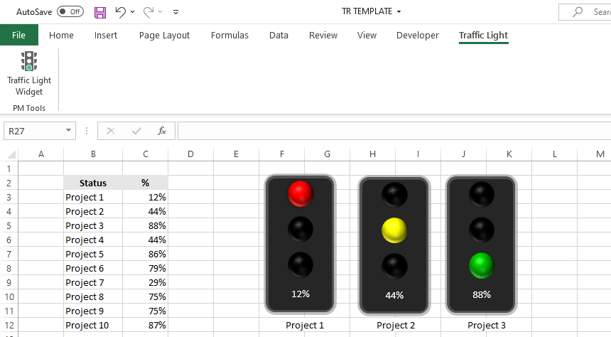
Traffic lights provide an immediate result of that KPI’s status. Check the details under the hood!
You can measure the most wanted key performance indicators. Last but not least, using widgets, you can build a dynamic dashboard in Excel.
A traffic light is a key element of project management templates. Okay, let us see how to expand Excel’s chart capabilities in seconds!
What is RAG reporting?
A simple reporting solution based on red, amber, and green tells you information. If the traffic light is red, you have an alert! If the indicator is amber, you need to pay more attention. Finally, if the signal is green, the project is on track.
For example, try to assign a KPI a threshold level of 80% for an amber score and a 90% threshold for a green score. Under 80%, the status remains red.
How to use the Add-in?
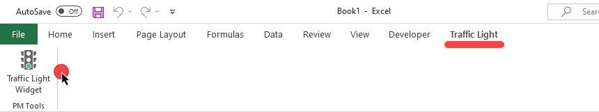
First, install the add-in; you’ll find it on the ribbon:
Insert a new widget
If you want to insert a new graph, do the following:
Then, click on the widget icon!
A new window appears with some useful settings. Let’s see the details:
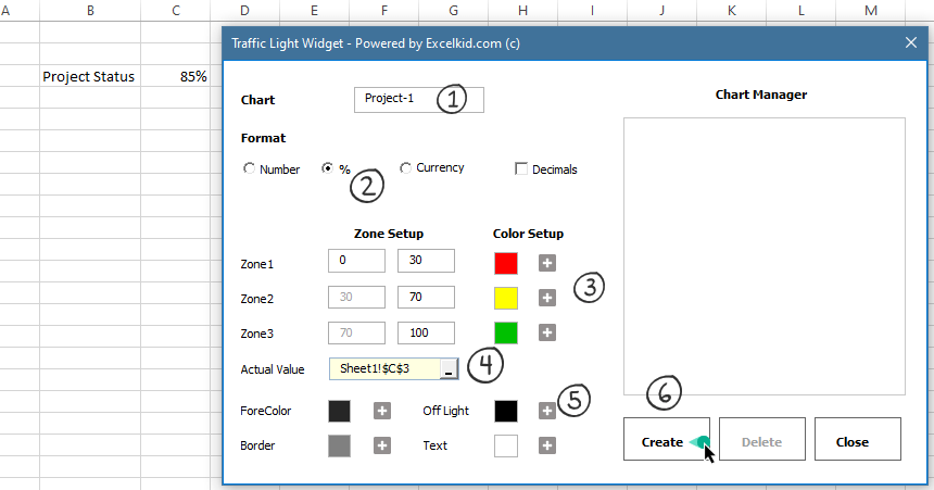
- Add a name, for example, ‘Project-1’
- Select the number format. The best choice is to use the percentage format.
- Colors and zones play an important role. For example, you can define the maximum and minimum points for the traffic lights. Furthermore, use the color picker function to change the default colors.
- Select the actual value. Click browse and add cell C3. The value is linked to the chart widget and is almost ready to use.
- If you want to change the default widget style, change the border color, background color, or text color.
- Finally, click the ‘Create’ button.
- Your traffic light widget is ready to use.
Edit a traffic light
Let’s assume that you need to customize the widget. To do that, click on the icon on the ribbon. Next, locate the Chart Manager area on the right side of the userform.
Select the widget that you want to modify.
Add new thresholds for Zone 1 to Zone 3; it can take seconds. If everything looks great, click the update button.
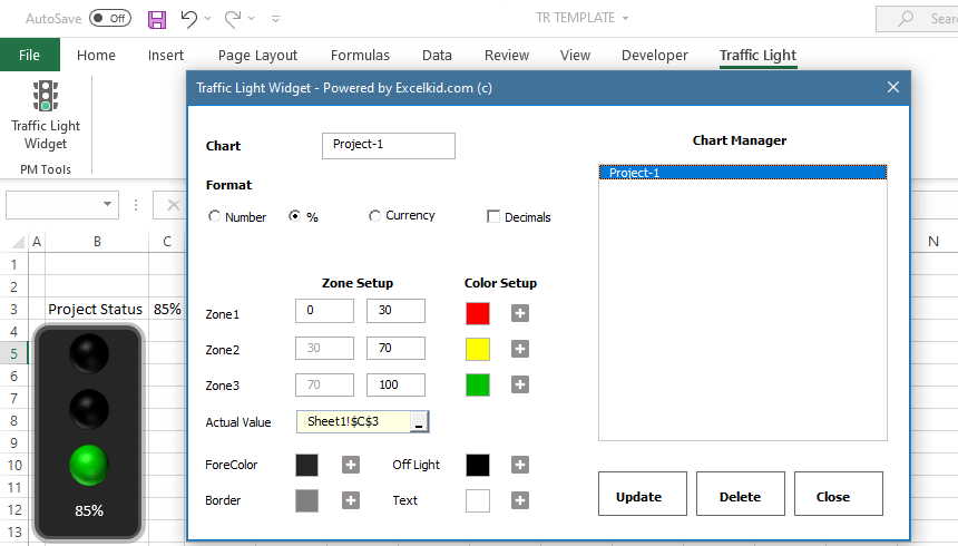
If you want to change the actual value, you don’t have to use this window. Instead, modify the cell value, and the traffic light will show the new value. That’s all.
Download the add-in and stay tuned. Check our add-ins page!
Additional resources: