Today’s guide will be all about Excel infographics. Excel is perfect for the task! We can use shapes, widgets, drawings, or texts to build a great data visualization.
What are Infographics?
Infographics are a collection of graphs and charts that give an easy-to-understand visual overview of data. No, we are not talking about a simple photo. It is more complex than a drawing and more informative than an Excel chart or a printed-out document. A well-chosen infographic is attention-grabbing.
How to use infographics?
If you want to build an Excel dashboard, we recommend using it! However, the most significant advantage of an infographic is that it can display the data in a relatively small space. This is the main cause of the use of more and more infographics on newspaper pages, and it is spread quickly in online media.
A gauge chart is a great solution to show performance using a single value. Use infographics to reveal the key metrics and trends to build KPIs. Are you an Excel guru? Try to create a great-looking scorecard using color-based shapes or heat maps.
Just a few words about how to start your do-it-yourself project. In the planning phase, sketch up the wireframe. First, you should know all the information you want to show! Then, divide your infographics into parts or even smaller or bigger units – no more boring reports.
Download Infographic Templates
In this section, you can download useful Excel infographics templates.
People Graph in Excel
Let us see the first example! This Excel infographic is one of my personal favorites. We love it! If you are in the HR area, this graph is yours! People Graph is a built-in add-in in Microsoft 365. It is small but provides great options for building dynamic charts. The infographic contains much more information to make it easy to tell a story based on your data. The app offers three chart types, seven themes for each type, and 16 shapes.
Looks great!
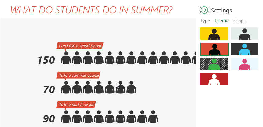
Okay, we will create a sales scorecard using the People graph in the example. If you want to track your website performance in a creative way, this type of infographic is perfect for you.
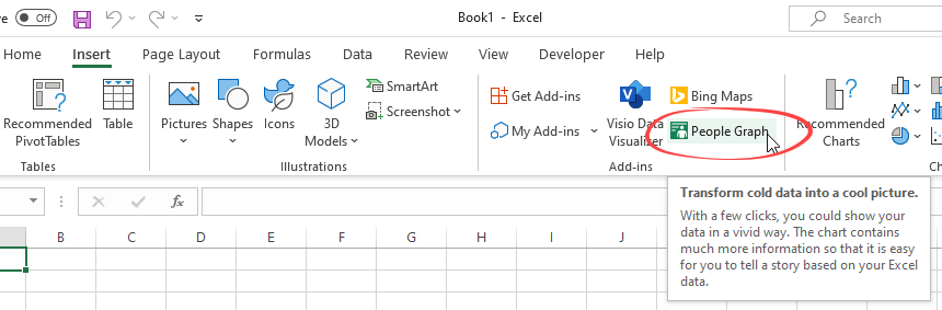
Click on the ribbon and select the Insert tab. Choose the People Graph icon. The add-in comes with sample data, but you can replace them quickly. Arrange your data into two columns and select the range. The add-in will convert your data into a great infographic with just a few clicks.
Medical Infographic Template
Infographics are a very special topic, and it’s hard to find great infographics for Excel until now. You only need an idea. Building a heatmap-style chart is not rocket science. Follow the steps below.
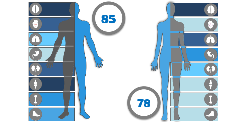
First, insert a shape that contains the parts of the human body. After that, create a table and split the range (numbers) into a few intervals using the PERCENTILE function. Finally, write a small VBA macro to assign the colors to the proper intervals. That’s it! Download the template!
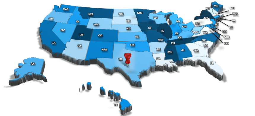
Infographics and Maps
We recommend creating a map to compare values and show the categories across regions if you are working with sales data. Our goal is to color every single state according to the revenue. We need to group shapes, and we will get one infographic-style heat map like this template below:
Battery Chart Infographic
The trick will be straightforward. First, choose the column chart from the Excel chart types and set its values so that the smallest displayable value is 0 and the largest is 100. The range will represent our scale.
The goal is to make a battery chart, so let’s find a battery shape that is a frame; the inside part of the battery is transparent. We will place the column chart behind this exactly in the position so that the frame covers the chart. So it will appear that the shape and the diagram form unity.

Finally, insert a textbox that will display the current value. After that, we set the background of the textbox transparent. Get the example.
Conclusion: Use creative Infographics
Excel offers many tools to transform a simple chart into modern infographics. When the idea is born, create a sketch, choose your preferred colors, and pick a font style. Then, connect your data to the graph and create a never-seen visualization!
Learn more about chart templates and stay tuned.