
To highlight data points (high and low points) in an Excel chart, use custom formulas and multiple chart series.
Highlighting data is an attention-grabbing method. This guide will show you the best practices, formulas, and VBA examples to perform this action. This tutorial is a part of our Chart Templates guide.
How to highlight data points in a line chart?
- Use the MIN and MAX functions to find a range’s minimum and maximum values.
- Apply the IF and NA functions to write #N/A to the blank data points
- Insert a line chart, then select the maximum series
- Format the data point and add a marker
Let us see the details!
Find the maximum value in a range
The first step is to create an additional series to highlight a single data point in an Excel chart. In the example, we want to find and highlight the maximum value on a line chart. Enter the formula in cell D3:
=IF(C3=MAX($C$3:$C$14),C3,NA())Evaluate the formula from the inside out: The formula finds the maximum value in the range C3:C14. If the condition is TRUE, it returns with the value in cell C3. In other cases, apply the NA function that returns with an #N/A error.
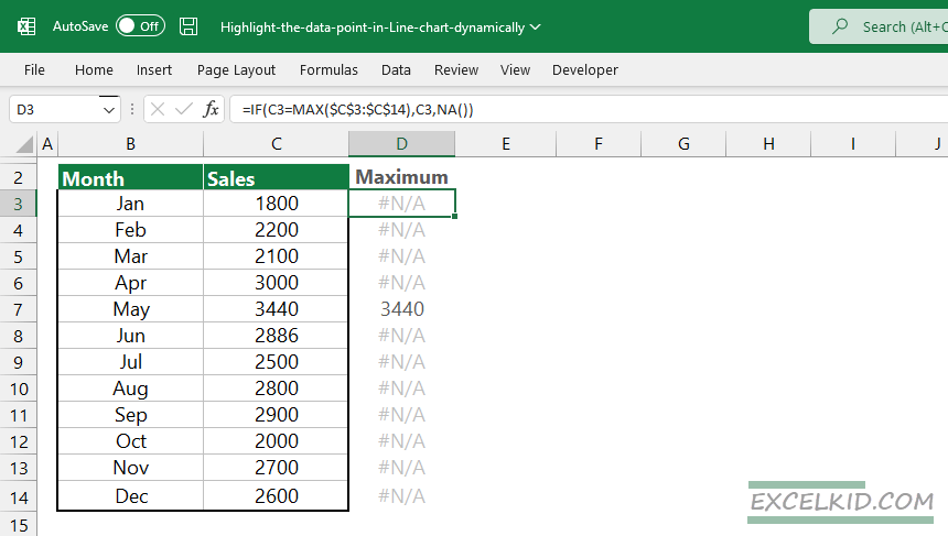
Why should we use the NA function in the formula? The main reason the Excel chart does not show errors is that this method is perfect for hiding unnecessary data points.
Insert a line chart
To insert a line chart, select the range which contains data, in this case, range B2:D14.
Locate the Insert Tab on the ribbon and select the chart that you want to insert under the Charts Group. We recommend you use the “Line with marker” chart type.
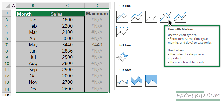
The main reason for using markers is that you can quickly identify the data point you want to format.
Format the highlighted data point
It’s time to format the highlighted data point. To do that, follow the steps below:
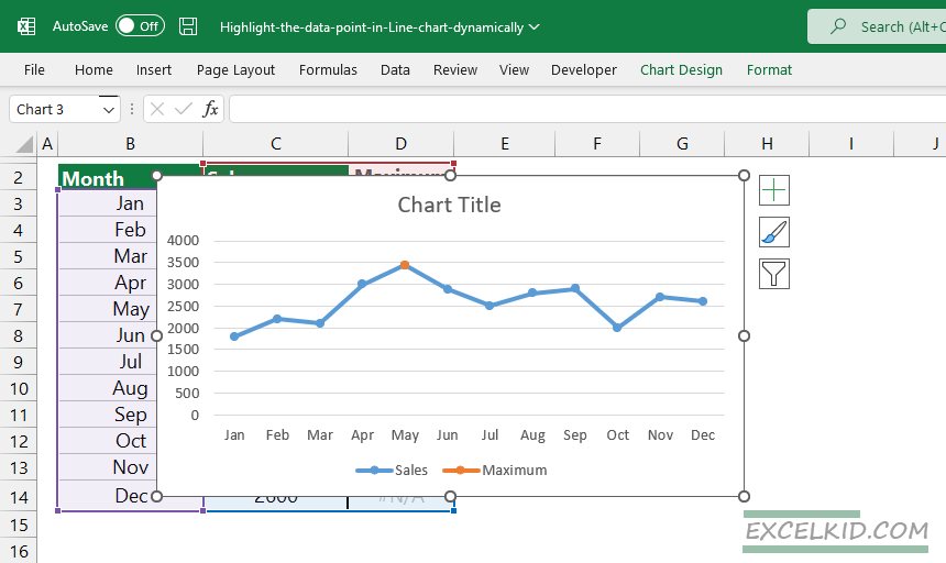
- First, select the maximum data point, then right-click on the series.
- Choose the “Format Data Series” option
- Click on the “Fill and Line” icon and choose “Marker”
- Format the “Marker”; choose a solid color and use green
- Remove the markers from the Sales series
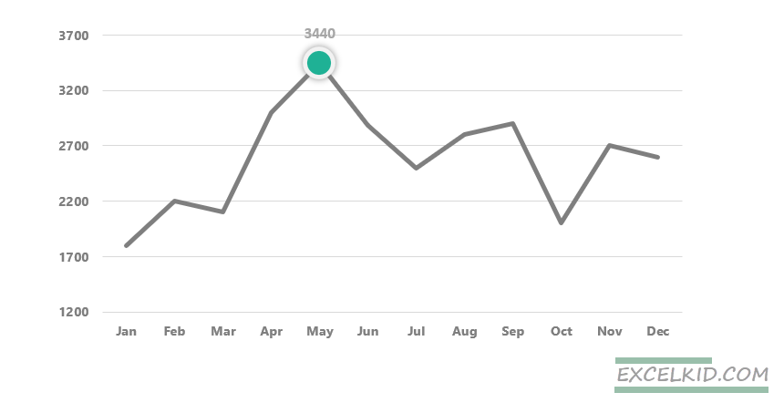
The formatted chart looks like this:
You can find the practice file here.
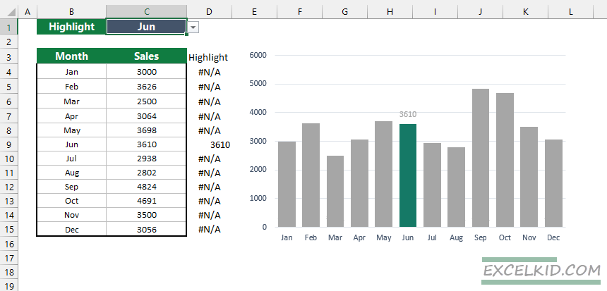
Highlight selected data points dynamically
Sometimes we want to highlight data points based on a selection. In the example, the line chart shows the selected data point.
Take a look at the formula in cell D3:
=IF(AND(CELL("row")=ROW(),CELL("col")<3),C3,NA())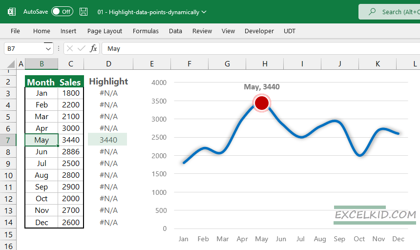
The next step is to press Alt + F11 to open the VBA editor window. Insert a new module, then copy and paste the following VBA snippet below:
Option Explicit
Private Sub Worksheet_SelectionChange(ByVal Target As Range)
ActiveSheet.Calculate
End Sub
Save the Workbook in xlsm format. From now on, you can select any month from the list, and your chart will reflect automatically.
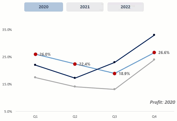
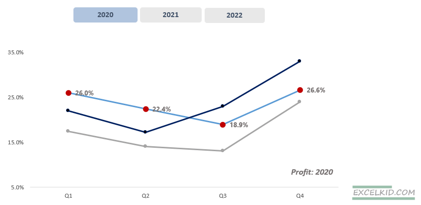
Highlight the selected chart series dynamically
Here is an example of how to highlight the selected chart when you are working with multiple series.
Apply the following formula to create an array containing the selected year’s data.
=INDEX($C$4:$E$7,ROWS($G$3:G3),MATCH($G$3,$C$3:$E$3,0))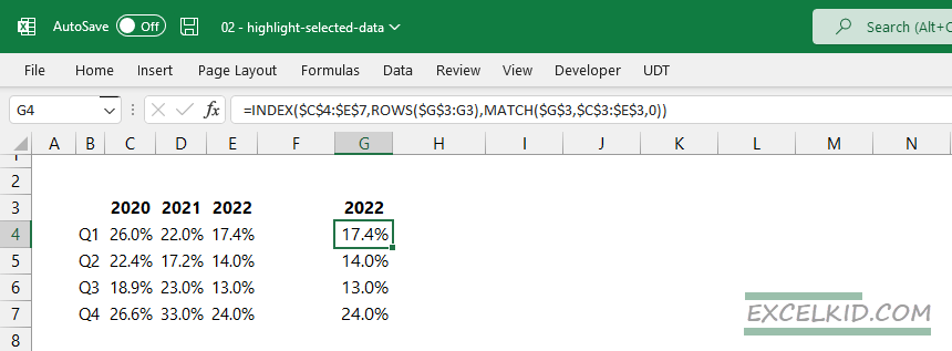
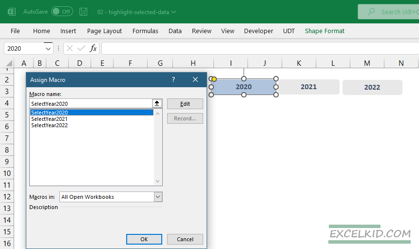
Open the VBA editor and insert the following macros:
Sub SelectYear2020()
Range("G3").Value = 2020
ActiveSheet.Shapes("2020").Fill.ForeColor.RGB = RGB(176, 196, 222)
ActiveSheet.Shapes("2021").Fill.ForeColor.RGB = RGB(232, 232, 232)
ActiveSheet.Shapes("2022").Fill.ForeColor.RGB = RGB(232, 232, 232)
End Sub

Sub SelectYear2021()
Range("G3").Value = 2021
ActiveSheet.Shapes("2020").Fill.ForeColor.RGB = RGB(232, 232, 232)
ActiveSheet.Shapes("2021").Fill.ForeColor.RGB = RGB(176, 196, 222)
ActiveSheet.Shapes("2022").Fill.ForeColor.RGB = RGB(232, 232, 232)
End Sub

Sub SelectYear2022()
Range("G3").Value = 2022
ActiveSheet.Shapes("2020").Fill.ForeColor.RGB = RGB(232, 232, 232)
ActiveSheet.Shapes("2021").Fill.ForeColor.RGB = RGB(232, 232, 232)
ActiveSheet.Shapes("2022").Fill.ForeColor.RGB = RGB(176, 196, 222)
End Sub
The next step is to insert three shapes. Then, assign the macros to the shapes! Right-click on the shape, then select Assign Macro. Select the macro you want to assign, then click OK to close the dialog box.
Now you have a dynamic chart. For example, click “2020” to highlight the data points in a chart series.
Highlight high and low data points
You must add two other series if you want to simultaneously show high and low data points in an Excel chart. Use the following formulas in cells D3 (minimum) and E3 (maximum).
=IF(C3=MAX($C$3:$C$14),C3,NA())
=IF(C3=MIN($C$3:$C$14),C3,NA())
Copy the formulas down, then create a new chart:
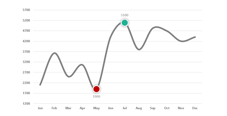
The method is the same as we mentioned above.
Finally, we have to talk about drop-down lists. If you want to connect a drop-down list with a chart, use the following example. In this case, we use bar charts and want to display the selected month’s data.
You can download the training materials here.
Additional resources: