Dynamic charts help us to improve the quality of data visualization. In this post, we will show you the most used solutions in Excel. Use these methods and save your time.
Learn more about chart templates.
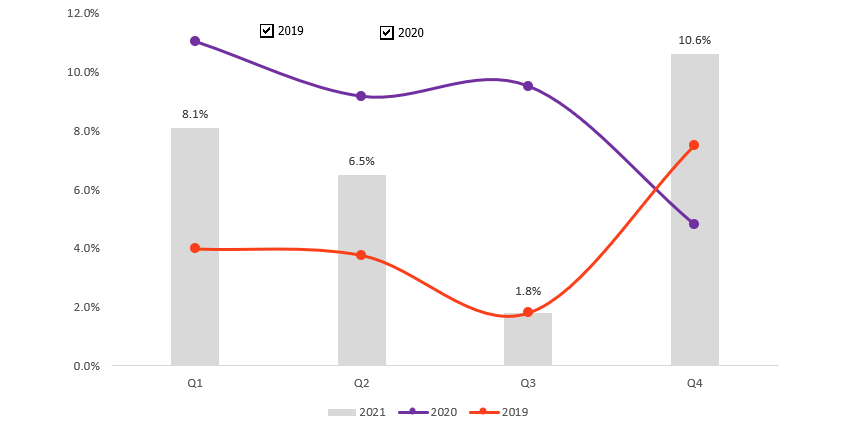
Compare Yearly Sales using dynamic charts
Let us see an example! We have said quite several times that less is more.
Okay, we have to compare three-period sales data using line charts. What is the best way to highlight the trends? Use combo charts! The graph-based is on two-line charts and a single column chart.
The picture below presents the year 2021 data using a column chart. We use line charts to show the other two years’ data.
Just a few words about Excel form controls. First, insert two checkboxes. If we do that, we can decide what years’ data will be shown on the dynamic chart.

Right-click on the inserted checkbox and add a cell link. The Format Object menu will appear. Click on the cell link option and browse cell D9. The cell value will be TRUE if you want to show the line chart. If the checkbox remains unclicked, the line chart will not show.
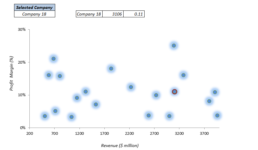
Data in Focus – A dynamic scatter chart
In the next example, we summarize the data and will show them on the chart. First, select the company from the drop-down list.
After choosing a company, a red circle will mark the current one out of the chart’s point. Creating this dynamic chart is easy; download the example and check the methods used.
To be fully effective, highlight the current data this way! When working with key performance indicators, your eyes focus on an important point. Just imagine how much more exact it would be to search for the right point. Looks great, right?
Dynamic Tooltips
We aim to place even more information using a small space, as stated above. The following example is based on a popular linked picture method.
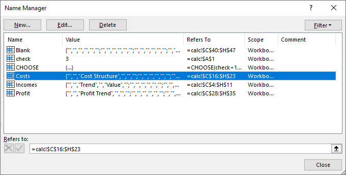
First, create the main bullet chart on the first Worksheet. Using a tooltip style, we want to display the Incomes, Costs, and Profit chart. How to do that? The answer is simple: We will build three helper tables on the second sheet and create a chart for each series.
Jump to the ‘Calc’ sheet! Now, create names from a range using the Name Manager.
After that, insert a checkbox and three radio buttons. Let us see how the trick works:
Like a switchable button, the checkbox has TRUE or FALSE values. You can select one tooltip from the three options if the button is checked.
Try to click on the Profit button. The Profit trend chart will appear! You can switch to Costs or Incomes anytime.

Download the practice files! Stay tuned.
A great-looking dynamic chart is a key element of a dashboard. Learn more on how to highlight data points in an Excel chart.
Additional resources: