
Learn how to create an Excel dumbbell chart (dot plot) to emphasize the change between two points across multiple categories.
The main point of using a dumbbell chart (dot plot) in Excel is that it is easier to see the distance of a line than the space between the length of two bar charts. A dot plot is a great choice for telling some data stories. It looks distinctive and grabs a reader’s attention.
Dumbbell charts are not built-in native chart types in Excel, so creating them takes a bit of modifying a scatterplot. This tutorial will show you how to create a dot plot in Excel. If you want to create custom visualization using various chart templates, read our definitive guide.
How to Create a Dumbbell chart (Dot plot) in Excel
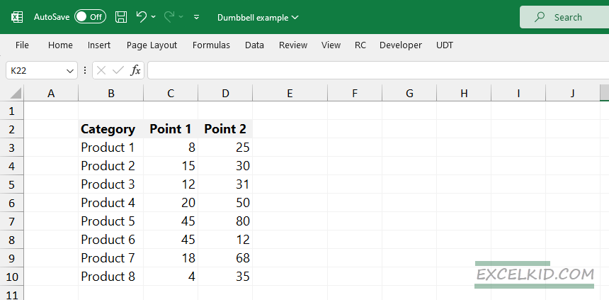
1. Format your Data
The first step is to format your data. In the example, our initial data set contains three columns. The first column has categories; the other two contain numeric values.
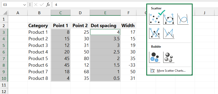
2. Add helper columns
Append your data set. The dumbbell chart required two columns of additional data. Dot spacing values should be equally distant from one another. We will use these values as the y-axis. To display the distance between two data points, use the values in the Length range.

3. Create the basic layout for the dumbbell chart
Select your first data series. Highlight the second and fourth columns. Use the Ctrl key to select multiple non-adjacent cells.
We use a scatter plot to create the layout of the dumbbell chart. The basic layout looks like the graph below:
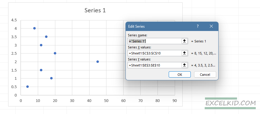
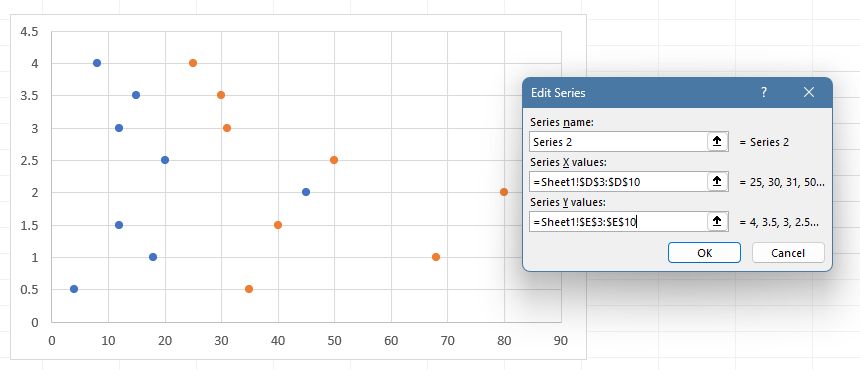
4. Add the second series to the dot plot
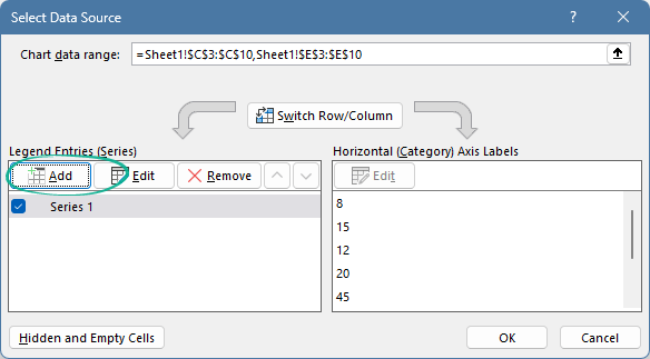
Currently, the chart shows only the starting points. The next step is to add the seconds series. Right-click on the chart, then click the “Select Data” option.
Under the Legend Entry series, click Add:
Series 2 values your next data series. In the example, we use the column 3 data. X values are in column 3, then use the Dot space column as Y values.
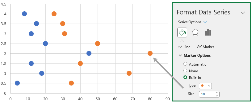
5. Format markers
To increase the size of the points (markers), use the “Format Data Series” command.
6. Clean up the dumbbell chart
Left-click to highlight, then delete the major gridlines and the Y-axis (dot plot placeholders). Right-click the X-axis, select “Format Axis”. Change the “Major tick mark” to none.
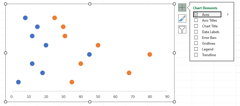
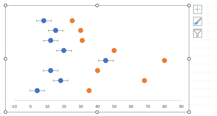
7. Add the lines connecting two data points
We will use Error Bars to create the connection between the two series. Select the Series 1 point. From the Chart Elements context menu, select “Error Bars”.
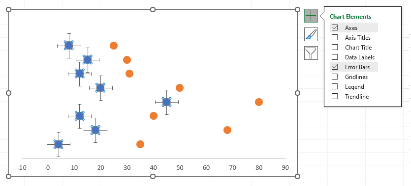
8. Delete the vertical lines
To format the dumbbell chart, delete the vertical part of the error bars. Select the data point, then delete the unnecessary part. After the cleanup, the dot plot looks like below:
9. Formatting Error Bars
The next step is to format your horizontal standard error bars to connect your two dots.
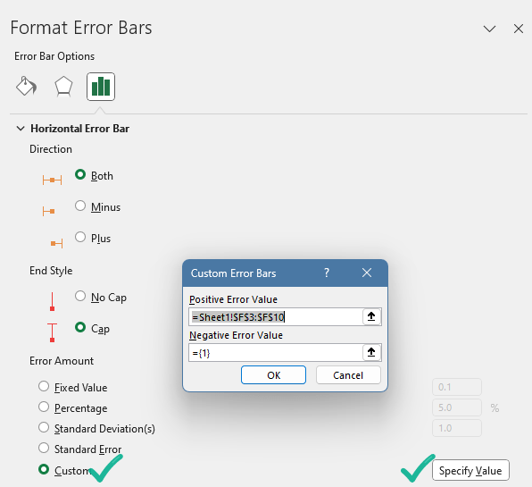
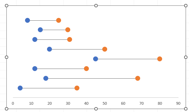
Select the “Width” column for your “Positive Error Value”. Your dumbbell chart looks like this now: two dots connected by a line.
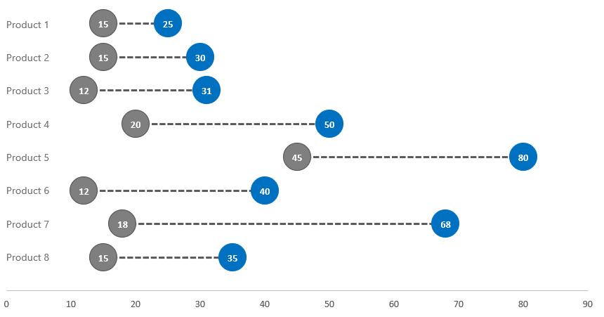
10. Add data labels and change colors
To add data labels as text boxes, insert a new textbox and link the category data. Finally, use small formatting tricks to ensure your key data story stands out.
Good to know that you can download the practice file from here.
Enhancing Dumbbell Charts for Comprehensive Data Analysis
Dumbbell charts offer a visually impactful way to compare changes across categories, making them a valuable tool for data analysis across various fields. By embracing advanced customization techniques, applying the chart in practical scenarios, and optimizing the chart for clarity and insight, users can significantly enhance their data storytelling capabilities. Continuous exploration of Excel’s evolving features and external resources will further empower analysts to leverage dumbbell charts to their full potential, driving deeper insights and informed decisions.
Advanced Customization Techniques
- Conditional Formatting of Dots and Lines: Implement conditional formatting to change the color of dots and lines based on specific criteria, such as performance thresholds or category significance. This can help in quickly identifying outliers or areas needing attention.
- Custom Labels for Insightful Narratives: Beyond simple data labels, integrating custom text boxes or shapes can provide additional context, such as highlighting percentage changes, annotating significant shifts, or explaining data anomalies.
- Integrating with Other Chart Types: Combine dumbbell charts with other chart formats, such as overlaying them on a stacked bar chart or integrating them within a dashboard alongside pie charts or histograms, to provide a multi-dimensional view of your data.
Practical Applications Across Different Sectors
- Healthcare Sector: Use dumbbell charts to compare pre and post-treatment results across different patient groups or to visualize changes in health metrics (such as blood pressure levels) before and after interventions.
- Financial Analysis: Highlight fiscal performance across different periods, such as quarterly sales growth, expense reductions, or before-and-after analysis of market share following strategic initiatives.
- Human Resources: Visualize employee satisfaction scores before and after organizational changes, compare departmental turnover rates, or track progress in diversity and inclusion metrics over time.
- Educational Outcomes: Compare student performance metrics before and after curriculum changes, visualize improvements in standardized test scores, or assess the impact of educational programs across different schools or districts.
Tips for Optimizing Your Dumbbell Charts
- Simplifying Complex Data: When dealing with numerous categories or significant variances in data points, consider simplifying your chart by grouping categories or focusing on key data points to prevent overcrowding and enhance readability.
- Interactive Elements for Dynamic Analysis: If using Excel within an environment that supports interactivity (such as with certain add-ins or Microsoft Power BI integration), consider adding interactive elements like slicers or dropdown menus to dynamically update your dumbbell chart based on user selection.
- Accessibility Considerations: Ensure your dumbbell chart is accessible by using color contrasts that are distinguishable for color-blind individuals and adding descriptive text boxes that explain the chart for those who might not be able to visually interpret the data.
Overcoming Limitations and Challenges
- Navigating Excel’s Limitations: Since dumbbell charts are not a built-in chart type in Excel, the creation process involves several steps that might be challenging for beginners. Utilize templates or add-ins designed for dumbbell charts to streamline the process.
- Data Integrity and Accuracy: Ensure that your data is meticulously prepared and verified before creating the chart. Inaccuracies in your initial dataset can lead to misleading interpretations.
- Continuous Learning and Adaptation: Stay updated with the latest Excel features and third-party tools that could further simplify the creation of dumbbell charts or introduce new visualization capabilities.
Bottom line: Advantages of using a Dumbbell Chart
Just a few words about why you should use a dumbbell chart (dot plots):
- The chart is simple, but you can create attention-grabbing visualizations in Excel.
- Dot plots provide better readability than the classic stacked column charts.
- You can create and manage the chart using a small space perfect for dashboards.
- Visualizing the difference between the plan and the actual values is easy.
Additional resources: