Would you like to see some great interactive chart tooltips In Excel? With the help of these, the chart speaks for itself.
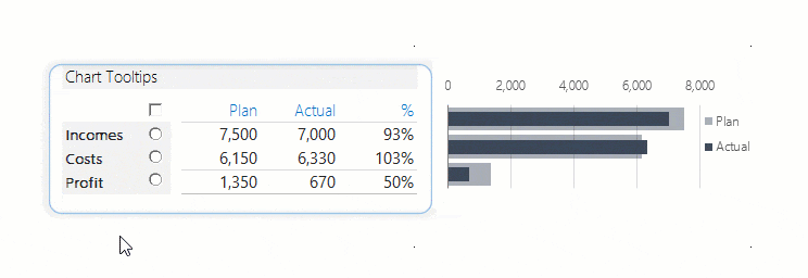
It’s time to append and improve our chart templates library! The data set is simple. There are income, expenses, and profit differences between these two. In the column Plan / Actual, we can see how the planned income and expenditures compare to the actual data. In the last column, you can find the differences in percent. If the value is over 100 %, we over-fulfilled the plan; this is the goal.
The bullet chart seems the right decision when making a plan / actual comparison. Please look at it; how spectacularly it displays the difference between the positive and negative! Let us analyze the information from the bullet chart: income fell behind the planned by 7 %, which is bad news. But, on the other hand, expenditure is 3 % higher than previously expected. According to this (not too hard to guess), profit has also fallen behind expectations.
A nominator who belongs to the table displays the pop-up charts. There is a 1-1 radio button for all three categories; we can get more information about the chosen category by choosing between these. For example, the pop-up window informs about the development of income/expenditure/profit with the help of different kinds of charts. So, using chart tooltips in Excel is a great advantage; you can analyze multiple variables in a single chart.
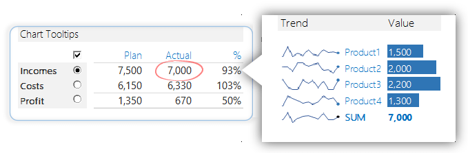
Use Interactive Chart Tooltips to show Trend
Analyzing a 12-month trend, we gather enough information to form an opinion about the chosen year’s performance. For example, sparklines show the volume of the product has been above or below average. We love this kind of chart and don’t need to wander through a jungle of numbers; it’s enough to glance at it and see the bottom line!
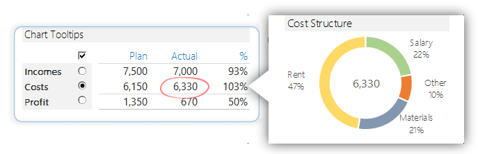
Cost Structure
If the radio button is checked next to the Costs field, we can see the expenditure structure on a donut chart; if the casts can be summed up in 4-5 categories, then helpful to apply this chart. We must use a different chart to organize 8-10 costs, products, or categories.
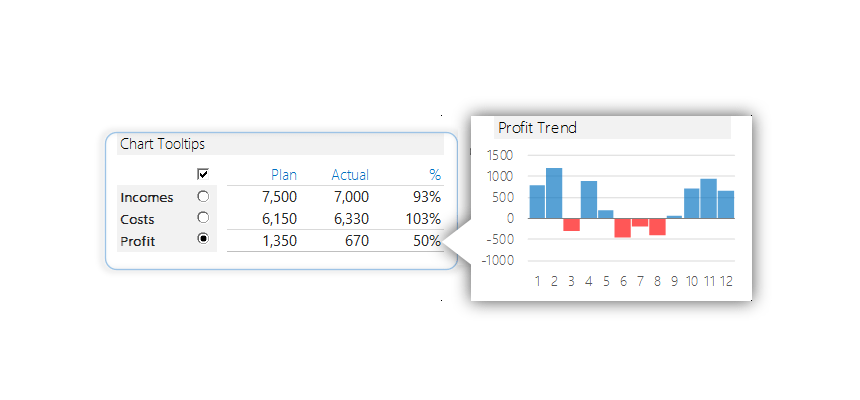
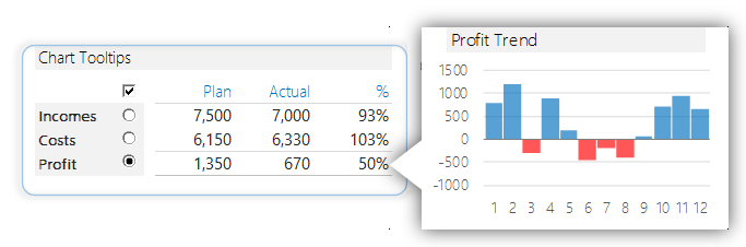
Profit section
If the radio button is checked next to the Profit field, we can see the profit development in the monthly breakdown. Looking at the picture, we can easily see that February and June-July-August were creating a deficit and that we are performing especially well in the last three months of the year.
You can download the Workbook that contains the interactive chart tooltips. Dear Excel users, thank you for the many e-mails and support we received in the last few months. This trust gives us much energy to carry out many more great projects.
Download the practice Workbook.
Additional resources: