In this tutorial, we will show you how to use a small multiples chart in Excel to create a weekly sales chart.
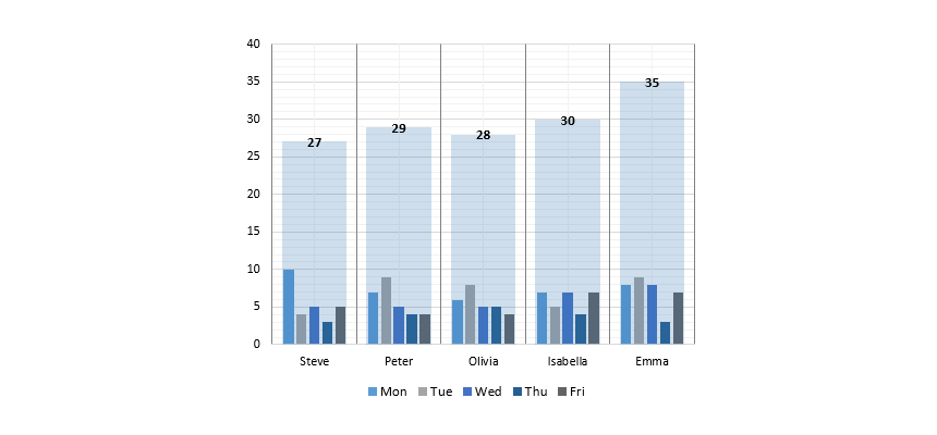
Sometimes, we must present multiple data sets using a small space and provide quick analysis for the given user. This article will show you how to create a weekly sales report using a free chart template. Using small multiples is an effective way to show the sales trend in a single chart. We assign small columns for each sales representative. Follow the step-by-step guide below to analyze your business activity.
How to create a Small Multiples chart
Creating small multiples is a straightforward process. Follow the steps below; your chart will be ready in 5 minutes.
Prepare Data
First, – as usual – prepare the data set. In the example below, we have 5 sales reps, and our goal is to create a small multiple chart based on the daily sales.
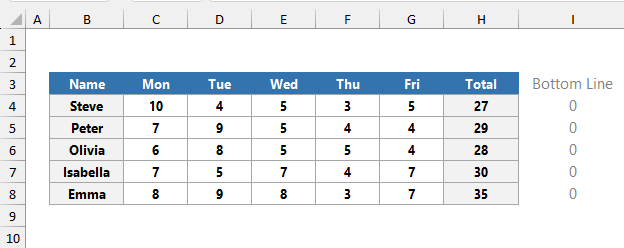
To build a proper chart layout, insert a helper column that contains zeros.
Insert a clustered column Chart
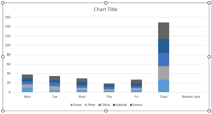
Select the range B3:I8 that contains the sales data. Select the Insert Tab on the ribbon, then choose the Charts Group. Insert a 2D clustered column chart.
After inserting a new column chart, our small multiples look like here:
Format Chart Series
To format the inserted chart, right-click on the chart first. Click on Select Data.
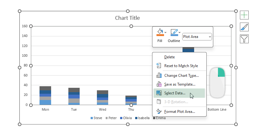
The Select Data Source window will appear. To replace Horizontal (Category) Axis Labels and Legend Entries (Series), choose the Switch Row / Column command.

Click OK. After the switching operation, our small multiple chart looks like this. Select the “Total” column, right-click, and then select the “Change Series Chart Type” option.
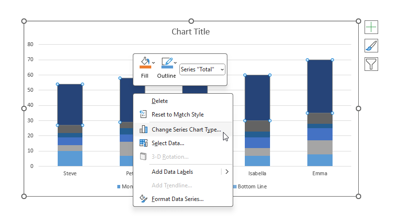
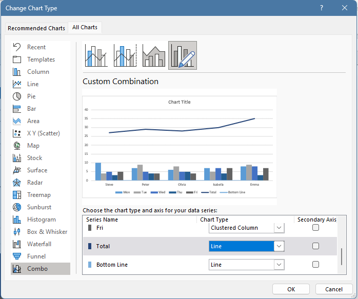
The next step is to change the default chart series to columns and lines using the Change Chart Type dialog box. Click “Combo” on the left side list, then change the following chart types. Under the “Choose the Chart type and axis for your data series” group, select the “Total” series. Change the default Clustered column chart to a Line. Next, do the same using the “Bottom Line” series.
Finally, click OK to close the dialog box.
Add Up and Down Bars to the small multiples chart
To add Up/Down bars, select the “Total” series (line chart). Use the Chart Element context menu and choose the Up/Down Bars command.
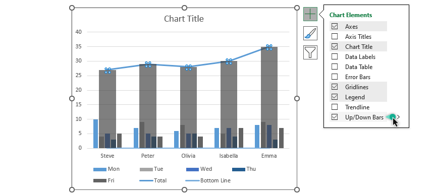
After that, select and format the bars.
Final steps: Format the chart
To format the bars, we will use the following settings:
- Gap width
- Bar transparency
- Remove the Total line chart
- Remove the Bottom line
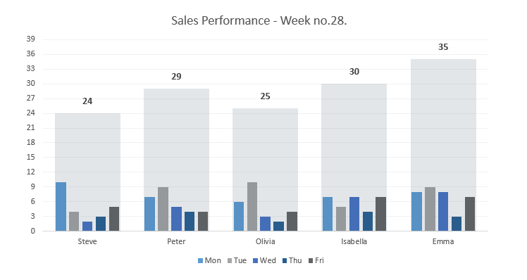
Tip: Good to know that hiding a line series is not equal to a delete operation.
First, select the total line and right-click on it. The Format Data Series taskbar will appear. Choose “No line” for both line charts. This operation keeps your data untouched, but it will be invisible.
You can download the practice file here.
Additional resources: