
Polar Plot is not a native chart type in Excel. Learn how to create it to compare two variables using a polar coordinate system.
A polar plot helps us locate a point in a polar coordinate system instead of using the usual x and y coordinates. We use two values to describe each point on a polar plane. The first is the distance from the center. We call it the Radius. The second variable is the angle from the reference angle, called Theta.
The example below compares the service level in two call centers using 12 months. The two company is “ABC Inc.” and “XYZ” Inc. This Excel chart type provides a quick, easy comparison option and helps us make the right decisions.
If you want to learn more about charts in Excel, visit our definitive guide.
How to create a Polar Plot in Excel?
The following step-by-step tutorial will show you how to build a polar plot visualization in Excel from the ground up.
- Calculate the Angle and Radius values.
- Calculate x and y for axis values.
- Prepare the Grid for the Polar Plot
- Insert doughnut charts
- Modify the Doughnut Hole size
- Customize the Chart grid
- Add data to the Polar Plot
- Change the default chart type
- Set up the horizontal and vertical axis scales
- Insert and Format Data Labels
You can download the practice file here.
Step #1: Calculate the Angle and Radius values
When creating an Excel chart, the first step is to set the initial data table and create additional columns if necessary. We will calculate the polar coordinates first. After that, convert the coordinates to regular x- and y-axis values.
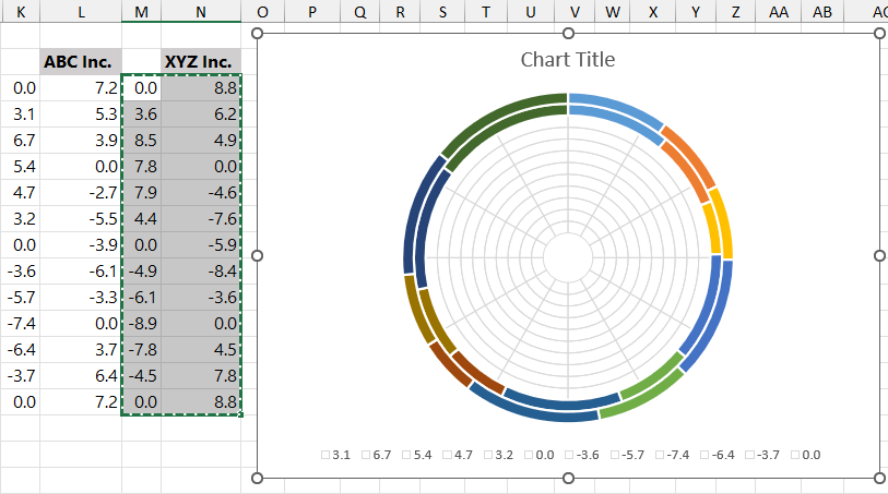
The column “Month” (B4:B15) contains the months’ names and is linked to column F. The “Angle” columns contain the theta values for the angle of the reference. Place a zero in cell G3. The “ABC Inc” and “XYZ Inc” columns contain the radius. With its help, we will display the service level performance through the given period.
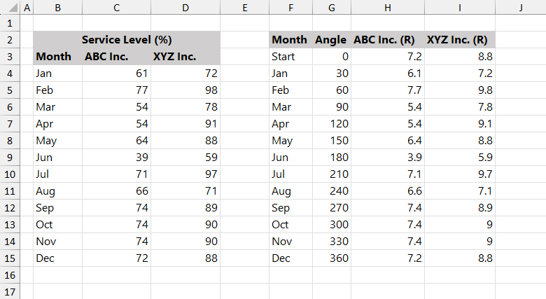
The formula in column G:
=G3=360/12 then =G5=G4+360/12To calculate the radius in columns H and I, divide each score by 10:
=H4=C4/10 and I5=D4/10We created this table to build a polar plot layout using 10 doughnut charts.
Step #2: Calculate x and y for axis values
The next step is to convert and place the polar coordinates to x- and y-axis values. Using simple math functions, you can perform the task with two formulas.
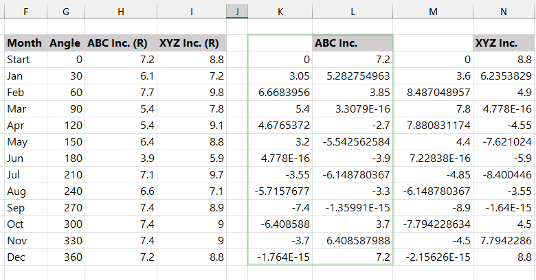
We will use math functions to calculate the X-axis values:
=K3=H3*SIN(G3/180*PI())
=M3=I3*SIN(G3/180*PI())
Apply the formulas to get the Y-axis values:
=L3=H3*COS(G3/180*PI())
=N3=I3*COS(G3/180*PI())
Now, our table is ready.
Step #3: Prepare the Grid for the Polar Plot
One of the exciting parts of the tutorial is the data set for the polar plot. The initial data set looks like this:
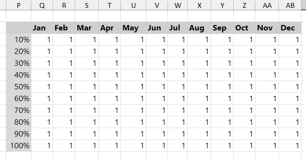
The idea behind this method is to build a layout using doughnut charts.
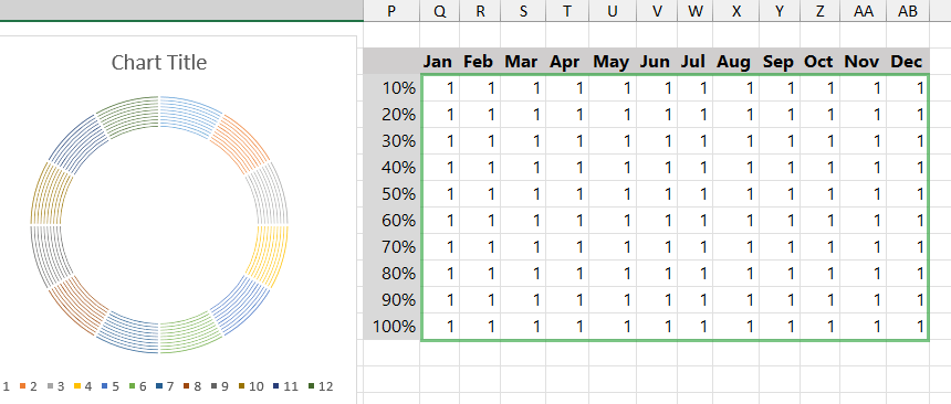
Step #4: Insert doughnut charts
Select the range Q3:AB14. Locate the Insert Tab on the ribbon. Insert a doughnut chart.
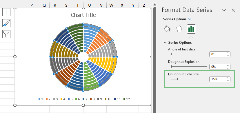
Step #5: Modify the Doughnut Hole size
To modify the doughnut chart hole size, right-click the chart, then select “Format Data Series”. Set the Doughnut Hole Size to “15%.”
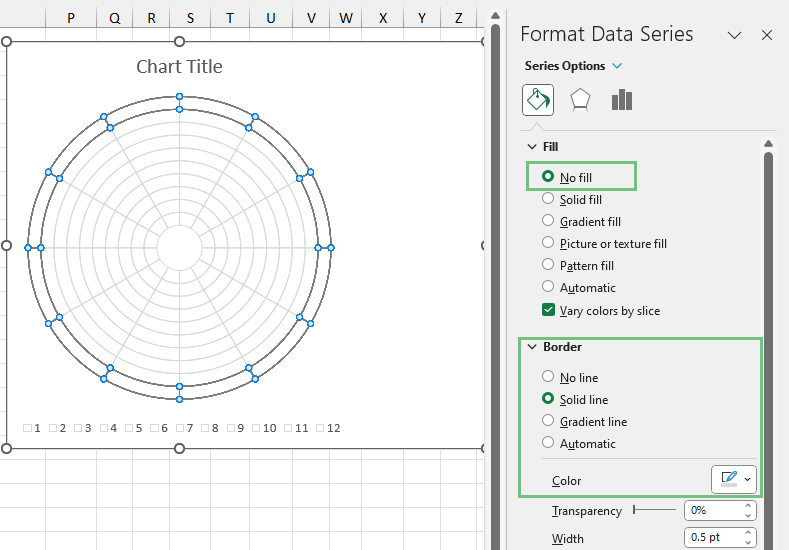
Step #6: Customize the Chart grid
First, select the outer ring, then apply the steps below for all rings.
- Select the Fill & Line tab.
- Under the “Fill” Group, select “No fill.”
- Choose “Solid line” under the “Border” section.
- Use the color picker and select a semi-transparent gray.
- Set the line Width to 0.5 pt.
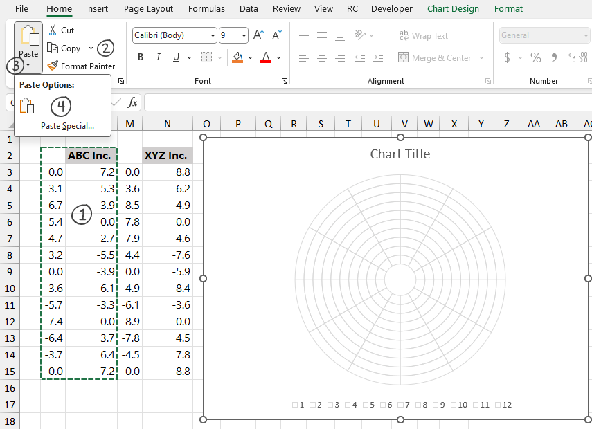
Step #7: Add data to the Polar Plot
Our layout is ready; it is time to show the service performance on the chart. To place the data in the polar plot, follow the steps below.
First, select the chart!
- Select the range K2:L15.
- Click “Copy”
- Click the “Paste” drop-down menu.
- Choose “Paste Special.”
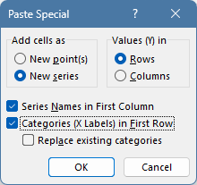
The “Paste Special” dialog box will appear.
- Select “New series” under the “Add Cells as” group
- Choose “Columns” under the “Values (Y) in” group
- Make sure that the “Series Names in First Row” and “Categories (X Labels) in First Column” boxes are checked.
- Finally, Click “OK.”
Repeat these steps for the XYZ Inc. The result looks like this:
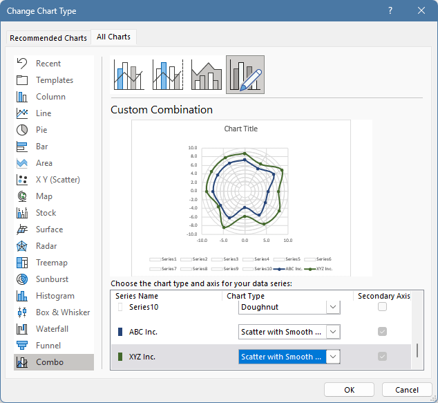
Step #8: Change the default chart type
The next step is to change the chart type from doughnut chart to scatter plot. Right-click on the series, then choose “Change Series Chart Type”.
The Change Chart Type dialog box appears. Select the Combo icon to change the default chart type for the “ABC Inc” and “XYZ Inc.” series. Apply “Scatter with Smooth Lines and Markers”. The secondary Axis checkbox will enabled by default.
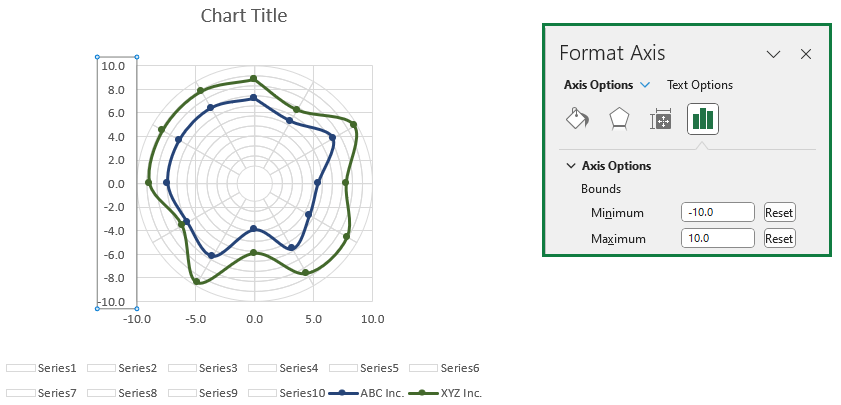
Step #9: Set up the horizontal and vertical axis scales
Adjust the horizontal and vertical axis scale using the minimum and maximum bounds. The procedure is the same as for the horizontal and vertical axis.
- Right-click on the axis.
- Select “Format Axis.”
On the Format Axis pane, change the “Minimum Bounds” value to -10 and set the “Maximum Boounds” value to 10.
Step #10: Improve the Polar plot to Insert and Format Data Labels
It is time to remove all unnecessary components from the chart. Delete the X and Y axis. Add data labels by right-clicking on the outer ring. Then, select “Add Data Labels.” Now, right-click again on a label and select “Format Data Labels.”
- Jump to the Label Options tab.
- Make sure to check the “Value From Cells” box.
- Click “Select Range”, then browse the range containing labels (B4:B15).
- Finally, click “OK.”
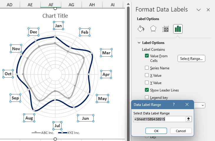
Finally, align the labels and uncheck the “Show Leader Line” checkbox as a last step. The polar plot is ready.
Additional resources: