
How to insert sparklines in Excel? In this article, you will learn all about sparklines. Get some useful examples! Now, I have created this post to be a follow-along lesson. You can download the Excel file that I used during the article.
Sparklines are in-cell Excel charts, and we use these graphs to show variance or trends. We recommend using sparklines for data visualization purposes. It is worth using it! You can save space, which is important for working with a large data set. This tutorial is a part of our chart templates series.
Three types of Sparklines
- Line
- Column
- Win-Loss
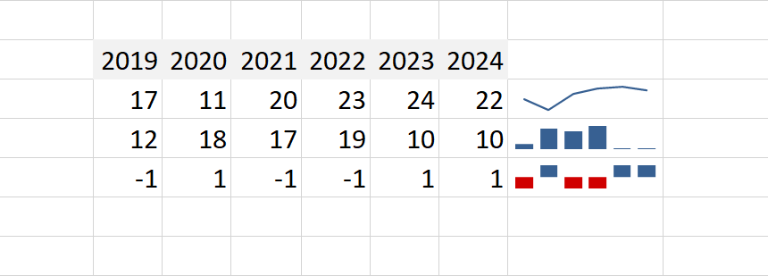
Take a quick look at the example below. You can easily identify these sparkline types.
Let us see the most important things about sparklines:
- Sparklines are dynamic in-cell charts. If you update your data set, the chart will be reflected automatically. So, the tool is perfect if you want to create an Excel dashboard.
- The size of the main graph is connected to the source cell. What does this mean? If you increase the cell, sparklines will be greater. And vice versa.
- Sparklines are user-friendly graphs. Change the color of the main elements (high and low points) with a few clicks!
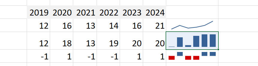
How to insert Sparklines in Excel
In this section, you will learn how to insert sparklines using a few steps. In the picture below, you can see the final result:
1. Select the cell where you want to place the chart.
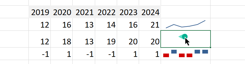
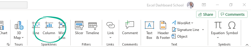
2. Select the Insert tab.
3. In the Sparklines group, choose the Column option.
4. Choose the data you want to use as a data range.
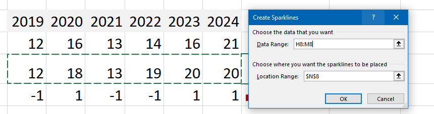
5. Click OK, and the Sparkline will appear in cell N8.
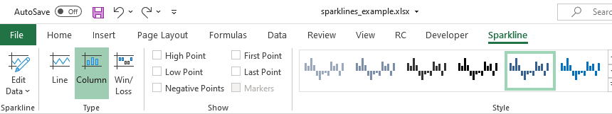
Use the same steps to insert a ‘Win-loss’ or ‘Line’ sparkline. At first look, the chart is a little bit simple. No worry, there are some customization options! Try to select a single cell that contains sparklines.
A new contextual tab will appear, and with its help, you can change the selected type.
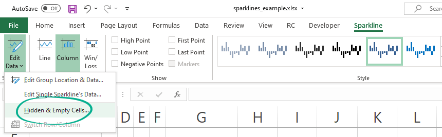
How to edit Sparkline’s data set?
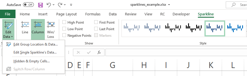
Let us see how to edit the existing chart using the ‘Edit Data’ drop-down menu.
- Edit the location and data source for the selected sparkline group.
- Edit only the data source for the selected Sparkline
Eliminating the Gap: Hidden and Empty Cells
We will explain what will happen when you have a missing data point in the series. Take a closer look at the picture below:
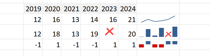
In the example, the value for the year 2023 is missing. Our chart is broken and looks bad.
Okay, follow these steps below to fix the series:
- Click the source cell, in this case, cell N8.
- Select the Sparkline tab and choose the ‘Hidden and Empty cells..’ option
A new dialog box will appear. Select what you want to display:
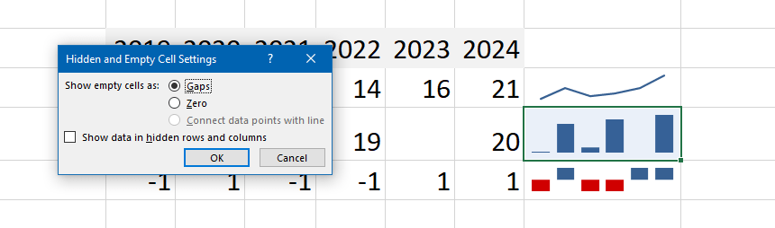
You can choose how you want to show the empty cells:
- Gaps
- Zero
- Connect the data point (in case of line type)
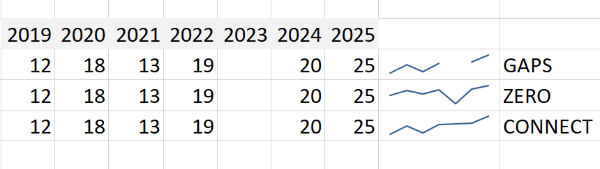
- The first example shows the gap in the line
- The second case gets a continuous line using zero
- When you want to display a continuous line, use the third option
How to change the Sparkline type
In this section, you will learn how to change your chart type quickly. Select the cell first! After that, locate the type group:
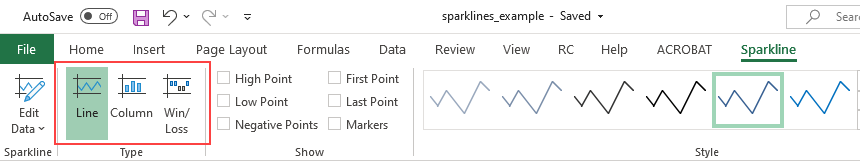
You can convert the default type to another type with a single click.
Highlight Data Points on the Chart
For better readability, placing markers to highlight the key data points on the chart is important. You can also apply color markers for the max and min points and negative data points. Furthermore, you can highlight the series’s first and last data points.
The example below shows you how to apply colors to highlight the min and max data.
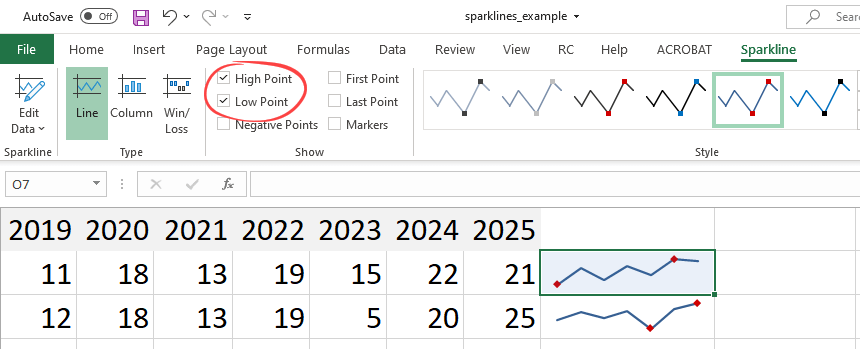
Under the Show section, you have four options:
- High and Low Point: Highlight the selected group’s highest or lowest data point.
- Toggle First and Last Point: You can highlight the first or last data point in the selected sparkline group.
- Negative Points: You can highlight the negative values on the selected series with a different color or marker.
- Markers: Apply markers for all data points on the line. It is good to know that this marker is valid for only one line!
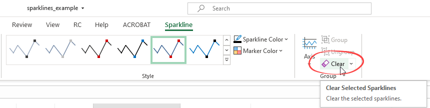
Deleting the Sparklines
If you want to delete a cell containing a sparkline, apply a little trick. Try to use the delete key; nothing will happen.
To delete the cell content, use the steps below:
- Select the given cell
- Click the Sparkline Tab
- Clear the cell content by clicking on the ‘Clear’ icon.
Additional resources: