Learn how to use a customer service dashboard template to track and measure activities on a single screen.
Providing great customer service is important; you must check your company’s customer support KPIs. Then, identify what you need to improve and do the right things!
You should focus on what you want to track and how to do it. So, use key performance indicators! For example, if you are in customer service, you must know which reps respond quickly. You can improve your customer satisfaction if the first response time looks good. Analyzing the results of each metric can help team managers identify the weak points and focus on the necessary training. All demonstrated KPIs are perfect for call centers.
We have a definitive guide about Excel Dashboard, so, in this case, we will take a quick overview of the possible solutions in Microsoft Excel. Handling and processing large data sets is not easy; you learn how to manage a large call records database with simple formulas.
Decision support: What do you want to show
First, create a wireframe using custom shapes. It can help! Our goal is to track customer service performance using different locations and products. If you download the practice file, you will see why it is worth using Excel tables. Tip: Tables can easily manage large data sets.
Our table contains the headers below:
- Products
- Timestamp
- Category
- Call Duration
- Resolved Calls
- Satisfaction Index
Setting up KPIs for Customer Services
Let us see the industry standards for each KPI. Excel has many tools to highlight data and show the high or low values. You can set up the accepted values, ranges, and colors using conditional formatting rules, like the example below. Show the result using red, amber, and green regardless of RAG reporting.
Create a new rule, and under the ‘Select a Rule Type’ group, choose ‘Format all cells based on their values.’ Use icon sets, and select your preferred icon style.
Use the following setup for ‘resolved calls’:
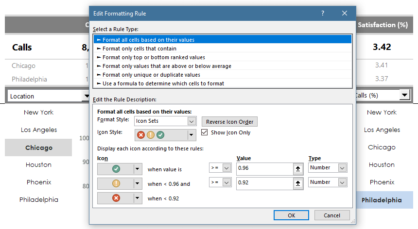
Excel will display the green icon when the cell value is greater than or equal to 0.96 (96%). The cell is yellow if the value is less than 96% but greater than 92%. Under 92%, this KPI is bad, so we use a red traffic light icon.
Click OK to validate the rule.
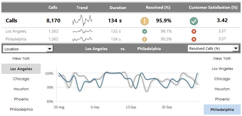
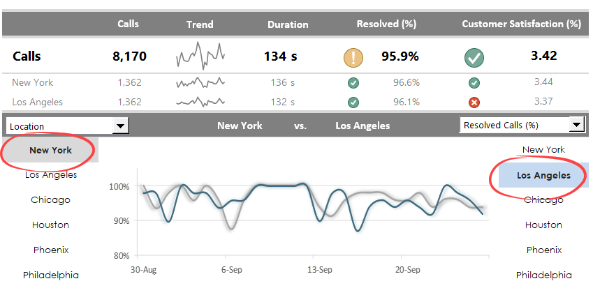
Customer Service: Performance Comparison
The second part of the template enables you to compare the customer service performance side-by-side. In the example below, you will show the resolved calls between the selected locations. To do that, use a drop-down list.
The overall performance is 95.9% in the header. The main indicator is yellow because you added 96% as a limit for the green range.
But why do we see a green flag (great performance, in this case) for the selected locations? The answer is simple. The first row represents all call records, with weak results like those of Chicago and Philadelphia.
Data Visualization using linked pictures
Just a few words about the comparison charts! You can combine and show different KPIs in a small area; using the linked pictures is worth it.
The two drop-down lists enable us to use many options for comparisons. However, to display the chart in seconds, you must find a tricky way to use linked pictures.
You need to use a helper sheet, Calculations. First, create the charts, then copy them, and finally, use the ‘Paste as Linked Picture’ option from the context menu. This is a simple and effective way to show various charts in the same small space.
Related posts: