Excel’s Quick Analysis Tool is the easiest way to analyze your data instantly using different tools (Formatting, Charts, Totals, Tables, or sparklines)
Today’s lesson will explain how to use this feature in Excel.
Table of contents:
- What is a Quick Analysis Tool in Excel
- How to turn on the Quick Analysis feature
- Formatting Ranges using Quick Analysis Tool
- Inserting charts using QAT
- Quick Analysis with TOTALS (Sum, Average, Count, Running Total)
- Tables
- Sparklines
What is a Quick Analysis Tool in Excel
The Excel Quick Analysis Tool offers a quick and intuitive way to discover and show data with just a few clicks. This feature works like a Swiss knife for data analysts, granting instant access to powerful options. You can use charts, totals, tables, and sparklines. Whether you want to highlight key figures, visualize trends, or summarize data, the Quick Analysis Tool allows you to turn raw numbers into meaningful insights without using complex menus or calculations. The biggest advantage of the Quick Analysis Tool is that anyone can quickly look into the details.
How to turn on the Quick Analysis feature?
You can choose two methods to activate the tool.
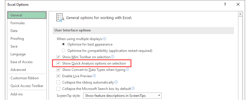
Go to the Excel Option on the General tab. Check Show Quick Analysis options on selection. From now the QAT toolbar will appear by default.
If you like using Excel shortcuts, apply the Ctrl + Q combination.
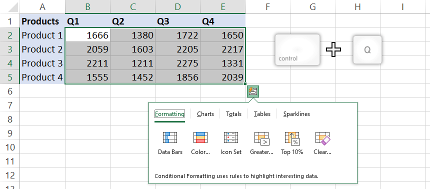
Click the Quick Analysis button on the bottom-right corner of the range. The custom toolbar appears. You can choose from the following tools: Formatting, Charts, Totals, Tables, and sparklines.
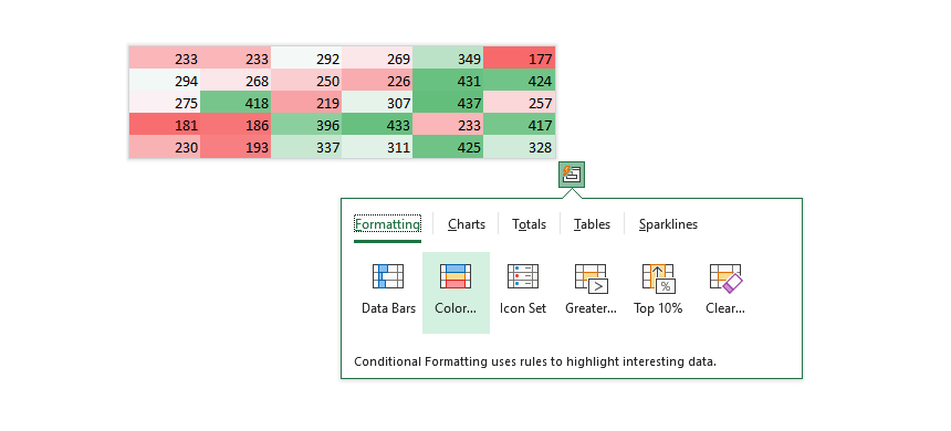
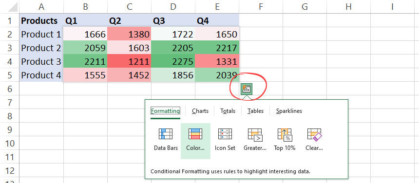
Formatting Ranges using Quick Analysis Tool
Now let us see how to apply conditional formatting using QAT. We strongly recommend our definitive guide if you want to learn all about conditional formatting.
The key differences between QAT and regular methods:
We get a quick live preview, and select the option you want. The Quick Analysis Tools provides the most used functions:
- Data Bars, color-based highlighting, icons sets
- ‘Greater than’ quick formulas
- Top N percentage
- Clean formatting rules
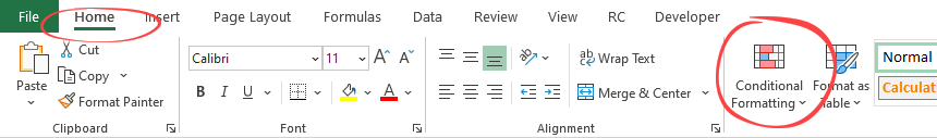
That is all we require! Let us assume you prefer the common way to use all conditional formatting features. Go to the Home Tab and click on the ribbon.
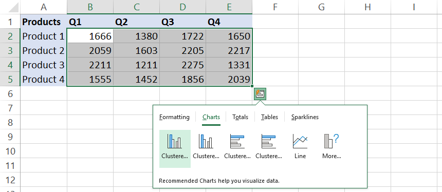
Inserting charts using the Quick Analysis Tool
Select the data range, then click Charts on the floating toolbar. The button appears at the bottom right corner of the selected range.
Based on the selected data type, you’ll see the most recommended chart types with previews. If you choose another chart type, go to the Chart tab on the ribbon or click ‘More…’ on the floating toolbar.
After that, select your preferred chart type and click it.
Quick Analysis with Totals
The Totals function is useful if you want to perform a quick analysis. Pick one of the available options, and a new row will be inserted. The Totals tab is yours if you’re going to calculate the most common metrics!

Select Quick Analysis, then click the ‘Total’ tab to use the feature.
Sum of Rows
In the example, we’ll analyze the range, which contains products and periods. For the row-wise calculation, click on the ‘Sum’ icon. A new row will appear with a live preview.
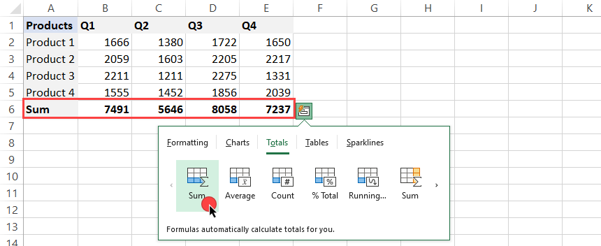
In this case, the Quick Analysis Tool will show the total sales by quarter. Click the yellow icon if you want to apply a sum for each product. A new column will appear in column ‘F’.
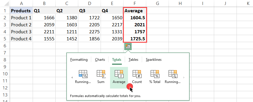
Average
In the following example, try to calculate the average sales for each product. To do that, click on the yellow ‘SUM’ icon:
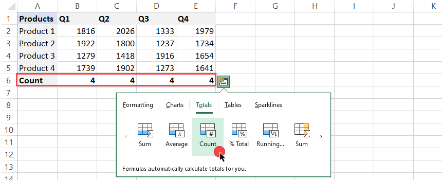
Count
If you want to count the items in a given column, click on the ‘Count’ icon.
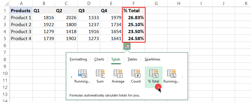
Get the percentage of the total (% of Total)
In the example, we’ll show you how the function works. Using a formula that divides an amount by the total is unnecessary. Instead, click the Totals tab and choose the ‘% Total’ icon.
Check the result below:
Running Total
Creating a Running Total (cumulative sum) with a single click is a great feature. Select the Quick Analysis Tool, go to Totals, and click the ‘Running Totals‘ icon.
Example: Take a closer look at the newly inserted row.
B6 = SUM(B2:B5)
C6 = SUM(B2:B5) + SUM(C2:C5), in other words: C6 = B6 + SUM(B2:B5)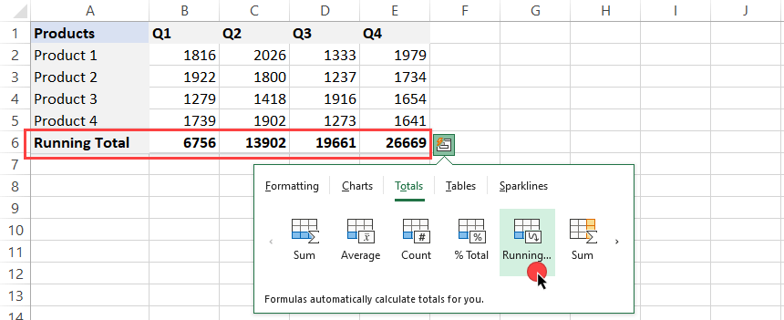
The final result in cell E6 = 26 669.
Tables
Excel Tables play an important role in data analysis. Click on the Table icon to convert the current range into a table. If you have a larger initial data set, you can create Pivot tables too. Tables help you sort, filter, and summarize data.
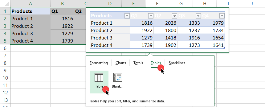
Select the’ Table’ icon on the ‘Tables’ tab. Excel will transform the range into a Table.
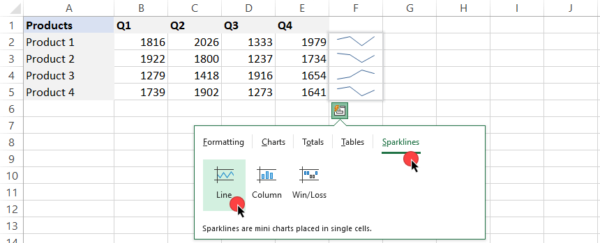
Sparklines
Sparklines are in-cell mini charts, and with their help, we can create a line, columns, and win/loss chart in single cells. On the Quick Analysis Tools tab, locate the Sparklines section.
Choose your preferred chart type and apply it by clicking on it.
Final thoughts
The Quick Analysis Tool is a great time-saving Excel feature containing some pre-defined actions. If you are an Excel newbie, we highly recommend it.
Additional resources: