A profit and loss statement template shows a company’s income versus expenses over a period. P&L statements can compare business performance over a month, a quarter, or a year. Furthermore, effectively review cash flow and predict future business performance.
Today’s guide will be about how to show your data using Excel. Our profit and loss statement template can fully display the result using a monthly and yearly view.
The simplified formula is:
Net Income = Total Revenues – Total Expenses
What is a multi-step income profit and loss statement?
A multiple-step P&L statement splits different revenue and expense types and provides detailed analysis. Before we show you how the P&L statement works in Excel, take a quick look at the main categories.
P&L Statement: Categories
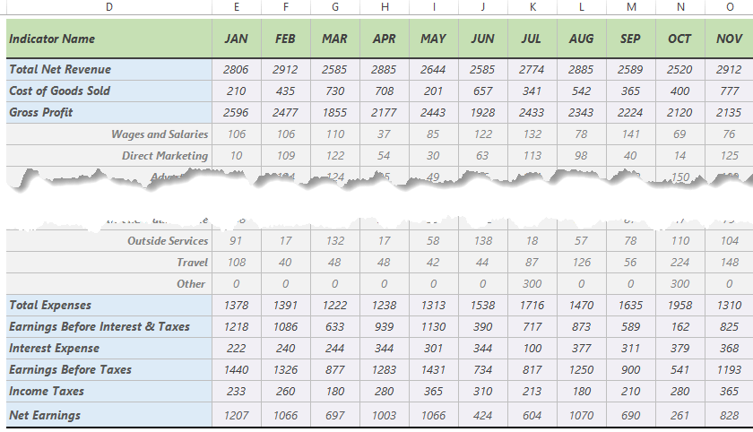
- Total Net Revenue is the sum of net sales in a given period.
- Cost of Goods Sold contains all of the costs and expenses straight linked to the production of goods. This metric is the difference between the net revenue and gross profit.
- Gross profit is the income a company has left after paying all direct expenses.
- Total Expense is a great metric to compare a spending nature over time. It can break down into salaries, marketing costs, office supplies, and other expenses. Revenues will subtract from this row.
- EBIT is a KPI of profitability and shows the amount of operating income. To calculate EBIT, use the simple formula: Net Income + Interest + Taxes
- Interest Expense is the cost of borrowing money.
- Income Taxes
- Net Earnings is the bottom line of the profit and loss statement and is equal to a Profit.
Excel P&L Statement Template
The main goal is to compile this (sometimes boring) report into a visually effective template.
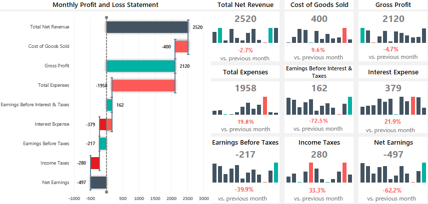
The waterfall chart is the best visualization tool for complex profit and loss statements. However, we want to save space on the main screen using a rotated waterfall chart in the example.
Microsoft Excel does not provide this must-have chart type so that you can decide. If you are not in a hurry, build the rotated waterfall manually. Otherwise, we recommend you our chart add-in, UDT.
Let us see how the Excel P&L template works!
Let us see how the Excel P&L template works! Nothing is surprising: we are using our framework, which can handle a financial year. You can use a drop-down list on the main dashboard sheet to select the month you want to analyze.
In the example, sparklines help us to show the trends using a single cell. We love this tool; a small space brings great value!
Are you happy with it? If yes, we recommend you look closely at our solution for customer services or HR scorecards.
Recommended tutorial: