In Excel, social media dashboard templates are essential for tracking your Twitter, YouTube, Pinterest, Facebook, and Reddit activity.
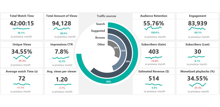
Today’s article will demonstrate two dynamic spreadsheets that use key performance indicators. The first one uses an attention-grabber radial bar chart to visualize the traffic sources on a given website. In addition, it uses 12 customizable metrics.
The second template uses a Polar area (Windrose) chart to track your followers using various social media channels.
How to use a Social Media Dashboard Template
If you are a social media manager, you frequently use dashboards to take a quick overview of your website referral traffic. The first template lets you track your visitors monthly using scorecard-style widgets and a custom chart named radial bar chart. Create a radial bar chart manually (you can find the step-by-step tutorial here) or use a chart add-in to build the chart immediately.
In the first example, we’ll use a dataset on the ‘Data’ Worksheet containing historical data about the last N months. For the sake of simplicity, we are using 12 months.
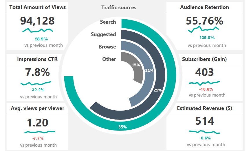
The main chart is connected to the monthly data and will be updated when you change your source data.
Tracking Social Media Performance
Even if you are an Excel power user, frameworks are worth using because they can reduce the development cost and resources. For example, the demonstrated template uses our framework, enabling users to easily replace the source data or KPIs without changing the template structure.
To create a monthly breakdown for your data, use the drop-down list on the top-right corner of the main dashboard screen. First, select the month you want to examine. All scorecard widgets will be updated using the drop-down list when you change the month.
Using cards (widgets)
Cards and widgets play an important role, not just in Microsoft Excel. For example, look at your website’s Google Analytics report layout: The customizable card contains information about the selected period and gives you an overview of trends, highs, and lows.
All cards have the following components:
- Link the widget label from the main Data sheet
- Link the Actual value
- Create a trendline using a simple line chart or sparklines.
- Calculate the variance between periods: To display the variance between the selected and previous periods, use a nested IF or XLOOKUP formula.
The most used Metrics in Social Media
Here is the list of the most common and often-used website or social media channel metrics:
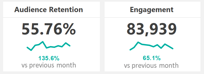
- Audience retention, Engagement
- Average time on site
- Impressions and reach
- Subscribers Gain/Lost
- Share of voice
- Conversion
- Referrals
The advantages of using Conditional Formatting
Conditional formatting is useful if you want to display alerts using colors. Select the target cell where you want to highlight the value, then create a new rule.
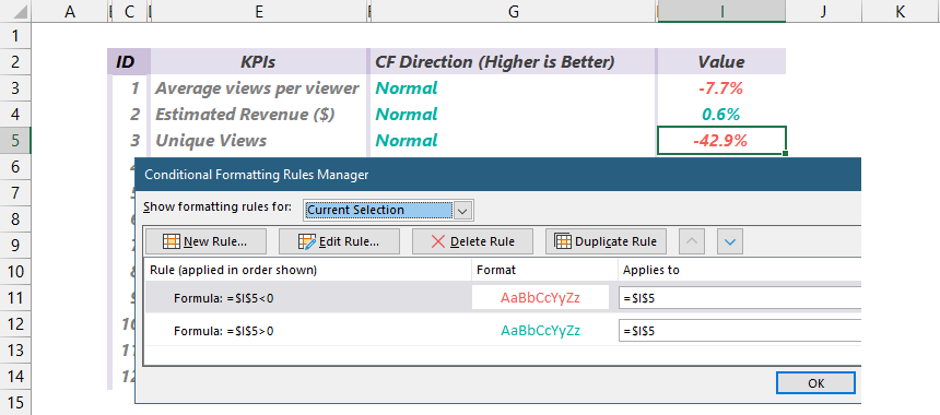
Good to know that some metrics work in reverse order. For example, if the “Unique views” indicator has increased, use green to display the variance. But if the “Bounce rate” has increased – because it is a negative effect – show the variance using red.
Template to track social media activity using Polar Area chart
You can see an alternative to the previous template in the picture below. The card layout remains the same, but we used a stunning visualization using the Windrose chart.
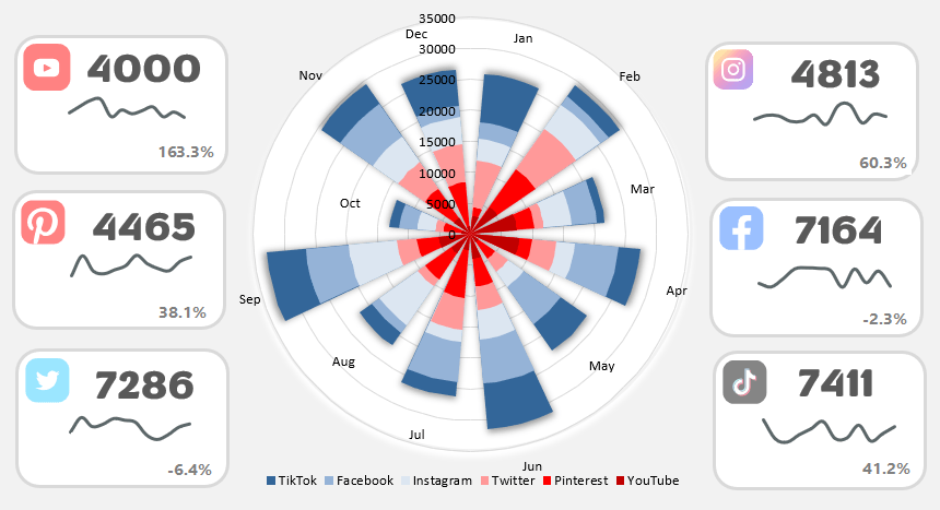
Don’t forget to choose a suitable color scheme for better readability!
Final words
Thanks for being with us today! In the future, we will continuously improve our template library. So stay tuned and visit our website regularly to receive the latest freebies.