Our new product line will be started in November 2024. We completely changed the programming language from VBA to C# and the .NET ecosystem to provide an enterprise-level solution. The add-in is a high-performance solution for Excel to create advanced charts and graphs in seconds with no code.
If you buy our add-in through Paypal, you’ll get all UDT .NET releases for FREE.
Frequently Asked Questions
Absolutely. We focus on the C# programming language. Soon, all UDT functions will be integrated.
No, you will receive the updates for free.
Yes, we do not apply subscriptions. We provide lifetime free updates also.
Not restricted, you can manage any number of charts.
Fast
Our add-in is built on the strong foundation of C# and .NET, delivering lightning-fast processing speeds and providing seamless integrations with the Microsoft Excel ecosystem.
Easy-to-use
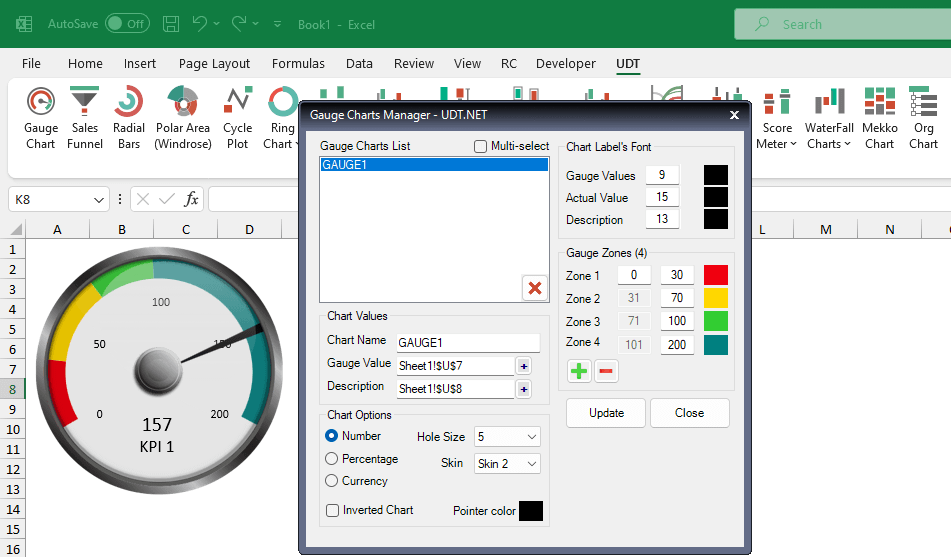
Creating and managing multiple speedometers is easy. Using a single form, you can reach all functions.
Secure
.NET provides enhanced security; no more VBA macro warnings! We sign all codes using a trusted code signing certificate.
System requirements:
- Office: Microsoft Office 2013 or newer release (up to Microsoft 365)
- OS: Windows 8, Windows 10, or 11.
- Software pre-requisites: .NET 4.8 Framework (or above)
- The add-in is not compatible with Mac