Create a sales funnel chart in Excel to tell a story from the first call to the completed purchase and track the process using a pipeline.
Today’s article is divided into two parts. First, we’ll show you how to create a sales funnel template in Excel, and also, we’d like to talk here about the background. This tutorial is a part of our Excel chart series. Check our advanced tool to create professional sales funnels in seconds.
What is a sales funnel chart?
Let’s start with the most important thing. Sales Funnel has stages, and stages represent an activity.
- At the top of the sales funnel, a customer goes to the store and window-shopping.
- A less or more percentage of these people make a decision and step into the store. This is the next stage of the sales funnel graph.
- Next, the customer looks around and checks a rack of shoes on clearance. If they find a perfect shoe, we are on the next stage of the funnel.
- Finally, the customer brings the decision at the end of the funnel and completes the purchase. At this moment, we have reached the bottom stage.
The chart demonstrates when the sales funnel narrows at a lower rate than average change. In addition, it illustrates areas using multiple levels in a process. For example, you could use a control chart to demonstrate the number of sales leads at each stage in a product sales funnel. In most cases, the values decrease gradually, providing the bars resemble a funnel.
You can use this free Excel template to present the number of your leads visually turned into sales, profits, or earnings.
What are the stages?
We use an abbreviation to remember the four sales funnel stages: AIDA.
- Awareness: In this phase, you must catch your consumer’s attention. It might be a great blog post or a social media campaign. A sales toolbox is almost endless.
- Interest: If your customer is in the interest stage of the funnel, they will compare the prices and think about their opportunities.
- Decision: If your customer is in the sales funnel’s decision stage, the customer is ready to buy something from your shop.
- Action: It is the bottom stage of the funnel. Your customer has decided and will buy.
How to build a Sales Funnel Chart in Excel?
Here are the steps to create a sales pipeline:
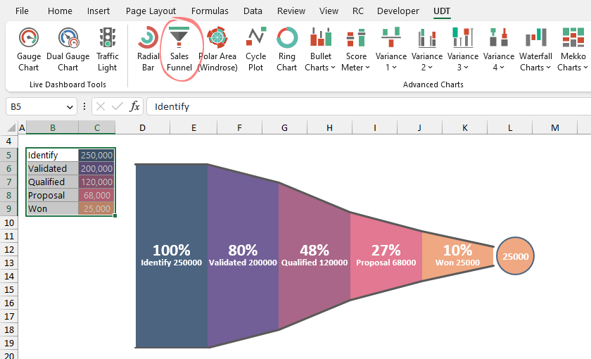
- Install the UDT chart add-in.
- Select the range that contains the data.
- Click on the Sales funnel icon.
- Excel will create the chart automatically.
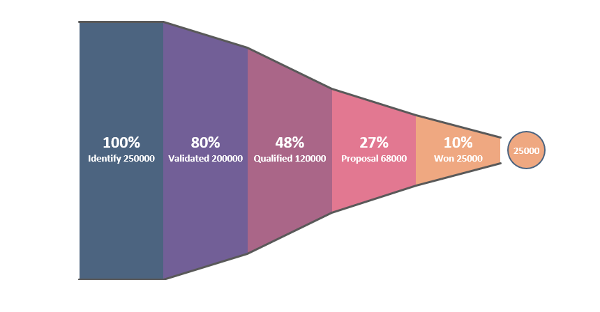
Take a look at the picture below:
Check this video below and use our chart add-in to create stunning presentations! If you understand your funnel, you can optimize it. But it’s specific, targeted, and designed for your target customer.
Why is the chart so important? Your funnel illustrates the path website visitors take before purchasing items. Understanding your sales funnel can also help you find the holes in the funnel – where visitors drop out and never convert.
How to build a basic Sales Pipeline in Excel?
We are lucky because the chart is one of the built-in chart types in Excel. So you’ll need to do only a few steps to build your chart templates. As you see, the function is straightforward, and the result is a basic graph.
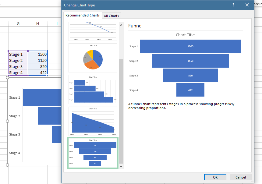
If you want to use the built-in (basic) version, follow the steps:
- Add data to two columns, one for a description and another for values.
- Select the range which contains data.
- Select the Insert tab on the ribbon, and choose ‘Recommended Chart.’
- Use the left pane to insert a new chart.
- Customize the graph.
Sales Funnel – Under the hood
The sales funnel chart displays the strengths and weaknesses of each sales stage from beginning to end. I hope you like it. A typical example of a pipeline starts with the sales leads on top, then down to the qualified leads, the hot leads, and the closed deals. This graph type should be an essential element of sales templates.
We could best represent creating a marketing procedure by looking at the Excel funnel chart as a real funnel regarding the goal always focusing on the sale. At the top, you can find the inquirers. As we advance downward by the end of the procedure, we have sold the product.
And what happens in the meantime? We try everything to keep the potential customer! At every part, we can influence the outcome of the procedure. First, we know who the genuine customer is. We can quickly assess who is willing to pay money for our product. Finally, it is not complicated to filter out the ones who only took a look at our products. The series value determines the region’s size as a ratio of the total of all values. To change the chart, update your data in the main cells.
Ideally, the visualization displays an activity that starts at 100% and ends with a smaller percentage where it can be noticeable at what levels the fallout occurs and at what rate. If the chart is combined with analysis, meaning quantified dimensions of how many objects are lost at every step of the sales or order completion process, then the funnel chart indicates where the biggest jumps are.
Sales Funnel Example
Now it’s time to show you a real-life example! The dashboard uses best practices, widgets, conditional formatting, linked pictures, and grids to provide a quick sales performance overview.
Conversion rate is one of the crucial metrics, but it’s easy to calculate. First, divide the total number of conversions by the total leads. We measure this metric using percentages, so multiply the result by 100. A picture is worth a thousand words, so let’s see the solution for measuring activities:
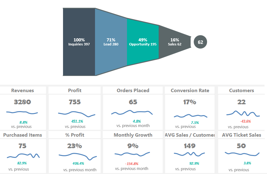
You have ten small widgets for key performance indicators. The spreadsheet uses the following KPIs:
- Revenues
- Profit
- Orders Placed
- Conversion Rate
- Customers
- Purchased items
- % Profit
- Monthly growth
- Average Sales / Customer
- Average Ticket Sales
Good to know: These are not hard-coded metrics. Jump to the ‘Data’ worksheet and change the built-in types to create something else. It’s easy! Download the practice file.
Conclusion
The first step of the sales procedure is when someone looks in and finds something good. After that, we do not let the visitor go away! It is important to communicate that we are offering something handy for them here. If we can contact the visitor, the customer is already in the marketing system. So, for example, a prospective client is totally up to us to sell them something in the future.